The street food culture in the Philippines is a vibrant montage of delicacies cooked right in front of you. Take, for example, eye-catching orange kwek-kwek and Ilocos empanadas, and purple puto bumbong. But how often do you stop at a food cart — not for what it’s selling, but for how the kariton itself looks? This is exactly how I discovered Samosa St.
The food cart of Samosa St. stands out. Its front panel is adorned with painstakingly rendered brushstrokes of an obviously talented artist. The beef and potato samosas being sold, on the other hand, are culinary wonders.


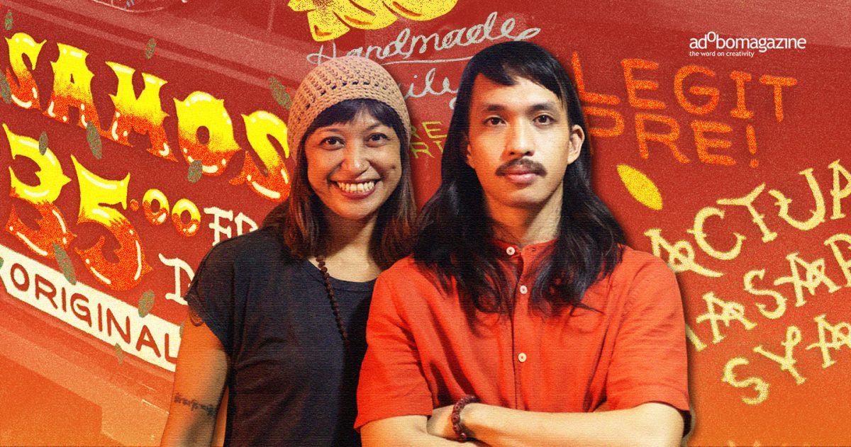
Scrolling through social media led to the discovery of the artist behind those brushstrokes: Erning Pikit, who also happens to be the co-founder of Samosa St. alongside his partner, Janis. Schedules aligned, and a meeting with Erning and Janis was set. Finally, an opportunity to unravel the mystery behind that aesthetic kariton.
Visual art meets culinary ambition


Erning, a fine arts graduate, is also a tattoo artist who describes his style as “old school, traditional to neo-traditional, with a hint of oriental.” Janis, on the other hand, is a former musician who performed classic, alternative, and folk rock.
In an exclusive interview with adobo Magazine, Janis shared that she had always been passionate about culinary arts. Her exposure to Malaysian-inspired ingredients and flavor profiles while growing up in Brunei prompted her to self-study Asian cuisine.
It was her dream to start a food business, and Erning supported her, even suggesting, “Pwede natin i-meld together ang business and art” (We can meld business and art together).


Both based in Sta. Mesa, Manila, Erning and Janis initially planned to set up their business there. Rent was high and clearing operations frequent, so they explored other options. When word got around that Fête de la Musique would be held in Poblacion in June 2025, the couple decided to try their luck that weekend.
They started small and simple. They placed their first-ever cart, hand-painted by Erning, in front of Cragens Beverages on P. Burgos St. It was a huge success. People loved the samosas, prompting the couple to pursue the business full time.
But there was a catch: they had to walk their cart over five kilometers from Sta. Mesa to Poblacion every day. Eventually, they found a space within Poblacion to park it.


Erning and Janis currently operate Samosa St. carts in three locations: in front of Krapow (Don Pedro St.), Kampai (Alfonso St.), and Cregens Beverages (P. Burgos St.). They are exploring the possibility of adding a fourth cart that will be used to peddle samosas around the area.
A moving exhibition
Erning designs every cart, and he considers these carts, collectively, as a gallery of his work, aiming to sell a visual-cum-gustatory experience rather than just art or just food.
He explains: “Hindi lang siya gallery na parang dadaanan ng tao [to] observe [and] criticize. For me, itong kariton na ginagawa namin ngayon, it’s an experience,” (It’s not just a gallery that people walk through [to] observe [and] criticize. For me, this cart is an experience). He and Janis perceive their culinary journey as a harbinger of creative energy, and this is extremely beneficial when brainstorming new menu items.
While some people are intimidated by art and deem it exclusive to the upper class, Janis notes that food, however, is universal. In Janis and Erning’s case, bridging culinary art and visual art serves as an avenue for Poblacion’s patrons –regardless of social standing– to access both.


“Habang kumakain sila, nakikita nila yung cart na, ‘Wow, pwede pala ‘to. Pwede pala gawing art ang kariton.’ (While they’re eating, they see the cart and think, ‘Wow, this is possible. The cart can be turned into art.’) It opens people’s minds to the possibilities,” Janis said.
It’s always about art
Erning believes that creatives should allow themselves to try different things in order to evolve, and learn to work with passion – rather than based on comparison.
For Janis, giving up shouldn’t be an option even when things get tough.
“The ones who survive the tough times and who stay long enough are those who eventually succeed,” she said.
The biggest lesson for Erning was embracing the struggle to build character, and learning to “surrender” his worries along the way.


Stationed in neon-soaked Poblacion is Samosa St. – serving as a reminder that creativity isn’t always displayed behind a velvet rope or inside a glamorous studio; sometimes, it sits quietly on the pavement, fueled by grit and infused with the smell of freshly-cooked food.
“It’s always about art. So kahit anong gawin namin (whatever we do), our goal is we feel that we can put art and business together. Business is our financial stability and art is our spiritual and mental nourishment,” Janis explained.
Samosa St. has become a vessel for artistic expression and human connection. By embracing everyday struggle and surrendering to the process while being true to themselves, its founders, – Janis and Erning – push the boundaries of what a street vendor can be. Together, they transform the daily grind into a moving masterpiece, all in the name of art.