LOS ANGELES, USA – The J. Paul Getty Trust—known simply as Getty to most audiences—serves many roles around the world: a destination for art across two museum sites, home to one of the largest art research libraries, a center for conservation science, and a funder of hundreds of cultural organizations. Its newly announced brand identity aims to define what makes the institution distinct, reflecting the breadth and complexity of its work.
“This new design reflects Getty’s personality and where we are headed,” said Katherine E. Fleming, president and CEO of the J. Paul Getty Trust. She noted that the refreshed identity gives visual form to a more connected, outward-looking Getty—one that invests in ambitious ideas, supports visionary work across the arts, and expands global access to art and knowledge. The identity, she said, helps unify how the institution communicates its story and impact.
Over the decades, the Getty logo has taken different forms, including the travertine-inspired square created by Saul Bass in 1997 for the opening of the Getty Center. As the institution evolved, the existing identity no longer fully reflected the scale of its programs or the diversity of its audiences.
Getty therefore set out to develop a visual system capable of representing its interconnected divisions while capturing the global scope of its mission. To achieve this, it partnered with Fred & Farid New York, known for its work with cultural and lifestyle brands.
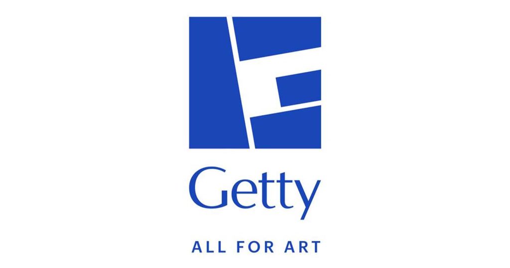
The result is a new “G” symbol designed as a visual companion to the current logo. The form is inspired by the travertine blocks of the Getty Center, while its four mosaic-like components reference artworks at the Getty Villa and represent the institution’s four core programs: the Museum, Foundation, Conservation Institute, and Research Institute.
Farid Mokart, Creative Chairman at Fred & Farid New York, said the institution’s range of programs shaped the strategic foundation for the rebrand. The team defined a single ambition rooted in Getty’s founding purpose—expanding access to art and cultural heritage worldwide—which is expressed through the tagline “ALL FOR ART.”
The flexibility of the new “G” allows a wide range of imagery—from collection objects to archival materials, architecture, and contemporary visuals—to be integrated into the design. It can be scaled, rearranged, and reinterpreted, enabling multiple iterations that reflect Getty’s open access philosophy.
Yasmine Vatere, Assistant Director of Brand Management and Marketing, said the goal was to create a distinct visual identity capable of unifying the institution’s global presence. Through extensive iteration, the team refined the system so every element—including the tagline—could scale consistently across the organization.
At its core, the evolving “G” is intended to signal Getty’s next chapter, reflecting forward-looking leadership and a commitment to accessibility through free admission, free programs, digital research, and global philanthropy.
Desiree Zenowich, Senior Director of Communications, noted that Getty engages new audiences across platforms worldwide while remaining rooted in Los Angeles. From its beginnings as a seaside museum to its current status as an international cultural institution, she said, the organization has changed profoundly—and the new identity offers a more authentic reflection of how it connects with people today.
The new branding will be rolled out over the coming months, supported by a refreshed color palette anchored in Getty’s signature blue and complemented by vibrant accents inspired by its collections, architecture, and gardens. New merchandise and promotional materials will also debut.