NEW YORK CITY, USA – New York City Mayor-elect Zohran Mamdani didn’t just win the hearts of the younger generation; he decisively led the race in the recent elections. Securing over 1,036,051 popular votes, or more than 50.4%, he finished ahead of all other mayoral contenders.
Zohran’s campaign was recognized not only for his platforms and plans for the Big Apple, but also for its unconventional graphic design — a refreshing yet nostalgic visual style that truly stood out.
Political aspirants always present a strong brand and visual identity, aiming for instant recognition to ensure public recall. This is exactly what Zohran’s team achieved by moving away from the traditional American political aesthetic.
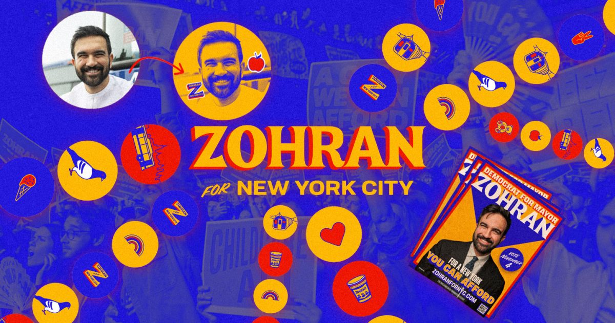
While the public is used to the typical red, white, and blue branding for a political campaign, Zohran’s team completely deviated, instead utilizing vibrant colors and unconventional typography.
While the colors red and blue are conventionally associated with the Republican and Democratic parties, respectively, Zohran Mamdani completely broke design barriers by using orange as the primary campaign color of his typography. This choice was rich in significance: not only is orange the third color of India’s flag, but it also served as an homage to the streets of NYC, evoking the familiar tones of yellow-orange taxis, distinctive subway signages, and other vital city elements.
The resulting visual identity is a creative combination of New York City motifs infused with a hint of vintage Bollywood reference, which is a nod to Zohran’s Indian roots. The designers drew specific inspiration from bodega signages found on nearly every city corner.
Furthermore, Zohran’s team elevated the design by including localized references that stemmed from different boroughs: for instance, Brooklyn featured the Nathan’s Coney Island imagery, while Queens was represented by the Silvercup Studios sign, among many others.
The brand imagery wasn’t just for aesthetic appeal; it also reflected the working-class spirit of New York City. From the iconic signs of bodega store owners, hotdog vendors, and food carts, to the familiar yellow taxi cabs, the visuals were instantly relatable to the general public. This strategic choice powerfully underscored the fact that the city is, indeed, a melting pot of culture.
The overall brand identity was developed by Forge Design, led by designer Aneesh Bhoopathy, who hand-lettered the name. The campaign posters, on the other hand, were created by Tyler Evans, a former art director for Bernie Sanders.
In addition to his strong visual identity, Zohran’s social media presence also helped boost his win. He regularly posted on his TikTok and Instagram accounts throughout the campaign period and it helped attract voters.
Zohran’s win was a masterclass in modern political campaigning. By blending iconic New York imagery infused with a strong, youth-focused social media strategy, his team didn’t just win a campaign — they crafted a bold, innovative blueprint for how future leaders can engage and mobilize a diverse a diverse, modern electorate, ushering in a truly new era for New York City.