MANILA – While the polarizing designs created by Plus63 have their fans and detractors, Design for Tomorrow’s head creative officer, Ric Gindap, recently posted his eloquent defense of the re-envisioned logos for the UP Fighting Maroons. As one passionate design maven speaking up for another, Gindap was unabashed in his respect and admiration of Dan Matutina and his team, and when asked by adobo to further comment on the matter, simply said that he thought the work had many positive and solid merits he had already enumerated online. (What follows is his post, which can be viewed here.)
Designing Dissent
(Sorry Mirko Ilic, I had to reappropriate your book title!)
Dan Matutina doesn’t need an apologist.
His remarkable design portfolio can stand its ground against mindless detraction. He has contributed illustrations and design assignments for the most prestigious publications, brands and programs, all commissioned by marquee/high profile art/design directors in the world. Very few young Filipino designers can boast to have achieved such a feat. (And Dan remains modest all these years.)
Earlier today, I unsuspectingly opened my Facebook feed, only to be assailed by outcries about his recent identity design proposal for the UP Maroons athletic team.
So I opened the album containing the schematics of the ident proposal. Then scratched my head.
Firstly, as I have mentioned in the comments section of his post, Dan and team have delivered a solid proposal.
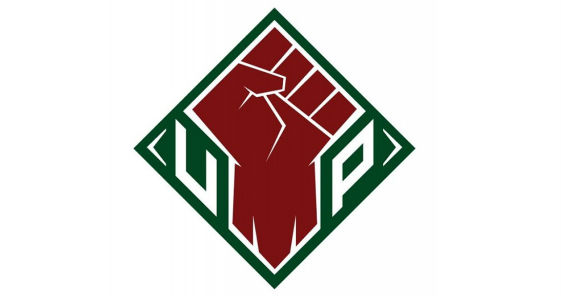
Secondly, the clenched fist strongly captures not just the sporting/fighting spirit but the very essence of UP’s “equity” of being in the forefront of “activism” – it has, through the decades, been an irrepressible denouncing voice, rallying for all the right causes. (The very nice touch is the “left” fist which makes it more nuanced given the strong progressive reputation of the academe).
Objectively, I have a minor issue on the “U” and “P” wordmark surrounding the main logomark but overall it is a solid identity. It’s active, energetic and essentially reminds me of those Russian constructivist designs closely associated with action and revolution (Again, a very nice articulation of the UP brand essence, distilled in graphic form).
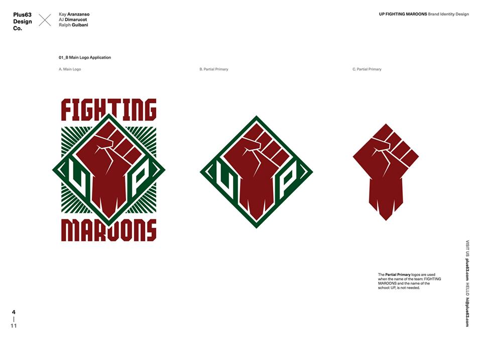
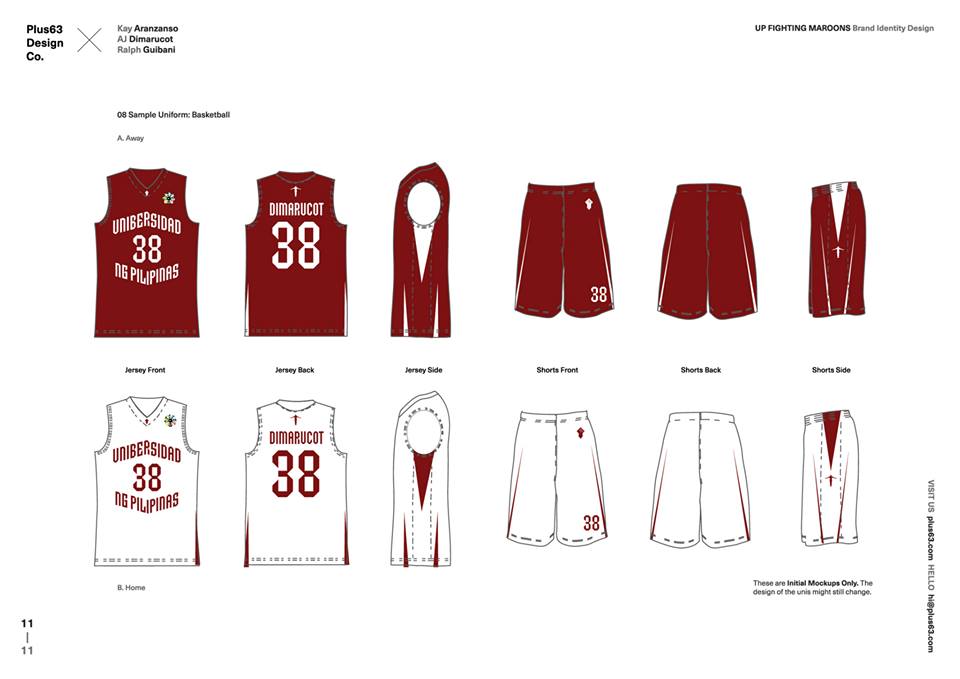
The applications demonstrate how scalable and adaptable this new identity is, which, in my view, is a home run. It’s a versatile brand design and the ident would shine whether embroidered on a sports cap, hoodies and pullovers, etched in metals or glass or consigned to ink and print. Should this be adapted to kinetic applications, it can be more alive in a dynamic way.
Strategically/structurally, trigger-happy design “critics” should understand that this IS an athletics/sports team branding and NOT the academic brand/masterbrand that should put the oblation front and center. From the sub-brand perspective, this is a strong piece of work. The UP team that commissioned this shouldn’t falter and should stand behind this proposal. It is great piece of work that’s apt for its intended brand function.
What really made my mandibles hit the floor was this very brilliant piece of reasoning:
“…let me make clear that those who are in the advertising industry know that the people in design team are all what is called ‘ADVERTISING SUPPLIERS’ they are not the ones who provide strategies in moving the brands unlike the names I previously mentioned…”
What follows that grand argument really made me lose my will to live:
“These people on your design team are just tasked to shoot commercials. They did not create commercials they’re at the end of the process and not the beginning.”
This had better be a fine piece of satire or a well-aimed parody.
Yet after rereading the impassioned bombasts, I can only suppose that whoever made these prodigious suggestions seem to be very earnest, and, quite passionately riled up enough to expose his/her vast reserve of twisted sense of humor, laced with unrestrained ignorance of branding dynamics.
Before I get into this designer-is-an-advertising-supplier comic sketch, let me say that, with all due respect to the roll call of illustrious advertising names mentioned (and they all deserve every ounce of esteem and accolade in the advertising/film-making sector), identity design is NOT advertising. And vice versa.
Advertising and identity design are allied disciplines (complements if you must) in the grand arena of branding/brand-building. With a very slim exception of quite a few rare practitioners in the field, it is extraordinary to have people who have navigated this duality. Therefore, calling for award-winning advertising/film-making legends to design an identity is like commissioning an embroiderer from Lesage to design and build the Burj Khalifa.
If this is not absurd enough, the punctuating argument really goes beyond the outer galaxies of ridiculousness:
“[after enumerating revered names in advertising]…Google them so you’ll see what I mean of powerhouse credentials.”
This is where the commentator’s floodgate of design illiteracy is flung wide open for public viewing.
I’ve mentioned in Dan’s comments section earlier that “Great design IS great design regardless of who did it. Design and art history is crammed with prodigies that are not “credentialed.”
The most legendary, revered names in identity design (read Paul Rand, FHK Henrion, Milton Glaser) do not own metals/awards for their iconic brand “designs.” They were NOT advertising suppliers either.
Yet they have crafted identities that still resonate today.
In fact, another design hero of mine, Bruce Mau, in his celebrated “Incomplete Manifesto For Growth” stipulated against this award-chasing culture when he flatly wrote: “Don’t enter awards competitions. Just don’t. It’s not good for you.”
So I am not making a biased defense of Dan’s (and team’s) good work. Their proposal has enough merits to withstand assaults.
What I am against is this sweeping generalizations about design, compartmentalizing it into an outmoded perspective that it is as a mere footnote in branding programs.
Unless you are one of those Japanese combat commandos roaming the wild jungles thinking WWII is still in full swing, then you’d know that in the past couple of decades, design and strategy have emerged as crucial building blocks of branding preceding advertising in the mix.
A strategy has to be defined, before it is designed, before it is expressed (advertising.)
Lourd De Veyra notoriously said that in this age, “Bawal maging tanga. GMG!” Conversely, since we are in the age of excitable—albeit ill-informed—commentary and unsolicited advices, let me offer a nugget stolen from a Hollywood blockbuster: “Do not speak if you cannot improve the silence.”
So, Dan + Team + The UP Athletics Commission, stick to your guns.
Take it from Tibor Kalman (another legendary designer, another hero of mine): “Good designers create trouble.”
###
In an interview with adobo magazine, team leader and award-winning designer Dan Matutina said, “As a designer I don’t like defending my work. The only is issue about the girl’s rant on why we need to get an advertising person to do a designer’s job and the fact that she belittled all of us. Although, I don’t see how this can be addressed because that’s how some people in the ad agencies see designers. [laughs].
“I think the reason why I wanted Ric to talk about it is because he’s more eloquent in explaining those things. The difference of the two disciplines. It doesn’t even have to be about the UP Fighting Maroons logo.
In fact, the feedback on the redesigned logo were really good. But of course, a lot of people will still not like it. That’s how creative work is–not everyone’s going to be happy about it,” he added.
AJ Dimarucot, also a part of the design team, shared his two cents about all the hullabaloo:
“This whole idea of being an ADVERTISING SUPPLIER has actually come full circle for me. I used to be a web designer in this small web development company back in the early 2000s, and we did some work for some ad agencies. We were definitely considered suppliers, no real creative input but tapped for our technical expertise.
Then also having worked as an Art Director in OgilvyOne, I experienced working with third-party suppliers. The general view I felt coming from within the agency was that the suppliers were implementors, and that the most important factor for tapping them was cost.
After leaving the ad agency life, I’ve only done work for an ad agency once, at least locally. I’ve been told by insiders they got me because I quoted the lowest fee and not because I was the best one for the project.
So a supplier to me is really a partner, not just an implementor. I try my best to work with clients who hire me for what I can bring to the table, including creative and strategic input and technical knowhow.”
Also, I was only in the ad industry for 5 years, so things might be different after I left.
Optima Digital President and COO Pete Jimenez, and the client who gave the brief to Plus63 designs touted,“The raised clenched left fist is very UP… Kilala ang UP dyan! At UP lang ang pwedeng mag-claim nyan! It symbolizes a solid community of thinkers who think differently… critical & radical in heart, mind & spirit! Hanggang sa sports, dala namin ‘yan!”
Leigh Reyes, President and Chief Creative Officer of Lowe Philippines, lauded the team for its work, “I especially liked the left fist and the M that looks like a gauntlet. This is the best team for this work. And it is meaningful, impactful, stuff of legend work. Congratulations!”