by Sharon Desker Shaw
MANILA — Trust in the audience’s ability to discern the subject matter from the visual clues presented in a design, educator and design luminary Lucille Tenazas told the audience at the adobo Masterclass.
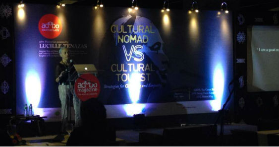
Tenazas said she often asked herself if there was really a need to present everything on a silver platter for the audience in her exploration of the Masterclass theme, Cultural Nomad vs Cultural Tourist, where the former is curious, permeable, ready to let himself be absorbed by different places and experiences, while the latter makes cursory contact and remains unaffected by foreign experiences.
To Tenazas, a designer is a cultural nomad, a belief she instills in her students and one she practices by making it a point to learn from her class whether teaching in New York or overseas.
The belief also reflects Tenazas life’s journey, which has seen her leave the Philippines to further her education in San Francisco’s then California College of Arts and Crafts in the late 70s, then relocating to the acclaimed Cranbrook Academy of the Arts in Michigan before going to live in New York, California and Rome.
“Our role as creative people is to allow enough opportunities (for the audience) to say, let me sit through this one,” said Tenazas, recipient of the American Institute of Graphic Arts medal, Henry Wolf professor in the School of The New School for Design and founder of New York-based communications graphics and design firm Tenazas Designs.
It’s a design ethos that informs her wide body of client work, be it a magazine about San Francisco, book covers, brand identity for an architectural firm, lecture announcements for the San Francisco Museum of Modern Art (MOMA) and work for Parsons’ School of Constructed Environments.
Her design for the San Francisco city magazine took a low-key approach than ran counter to the category’s penchant for screaming headlines and personality-based covers. There was no mention of the city’s name in her proposed series of logos; instead she worked on a “miracle association” – using mathematical configurations based on the peninsula’s geography – black and white photos and seven key stories of equal weight. However, a difference of opinion on the look led Tenazas to resign the job. “They thought I was too sophisticated to them. They thought they were just not ready for me and I thought I’m not ready for you,” she said.
For architectural company Ross Drulis and Crusenbery, she played with the name, abbreviating where possible, such as the stationery application. Rather than feature images of the firm’s finished buildings, she made it about the company’s philosophy, thought process, the materials used in designing other applications. Again, her philosophy is to assume the audience is intelligent enough to extrapolate from the myriad of design cues provided.
One Masterclass delegate touched on her ‘less is more’ approach, asking if how she knew when to stop in her design.
For Tenazas, it was a question of growing maturity. “When you are younger you have a lot to prove, you have to show off… I have a lot of tricks under my sleeve. I was very good at it but, over time I thought, this is not me anymore, I want to be more minimal. I want to be more thoughtful,” she said, acknowledging her younger work was at times over-the-top.
“For me to realize it’s feels heavy going, so how can it be light but impactful, minimal but powerful. So you have to assume you are giving one half of the equation… you assume people who are looking at your work are smart.”