MANILA, PHILIPPINES — TikTok unveils TikTok: The Stage, an inaugural virtual event, where it introduced new creative, branding, and commerce solutions to help brands and agencies engage with their communities and drive business impact.
Now, more than ever, people are craving new ways to find positivity and meaning – whether that is in the form of learning a new skill, seeking volunteering opportunities, or finding creative ways to keep connected with loved ones. As more people discover their purpose and what makes them truly happy, brands need to also ride on this wave of positivity that their customers desire.
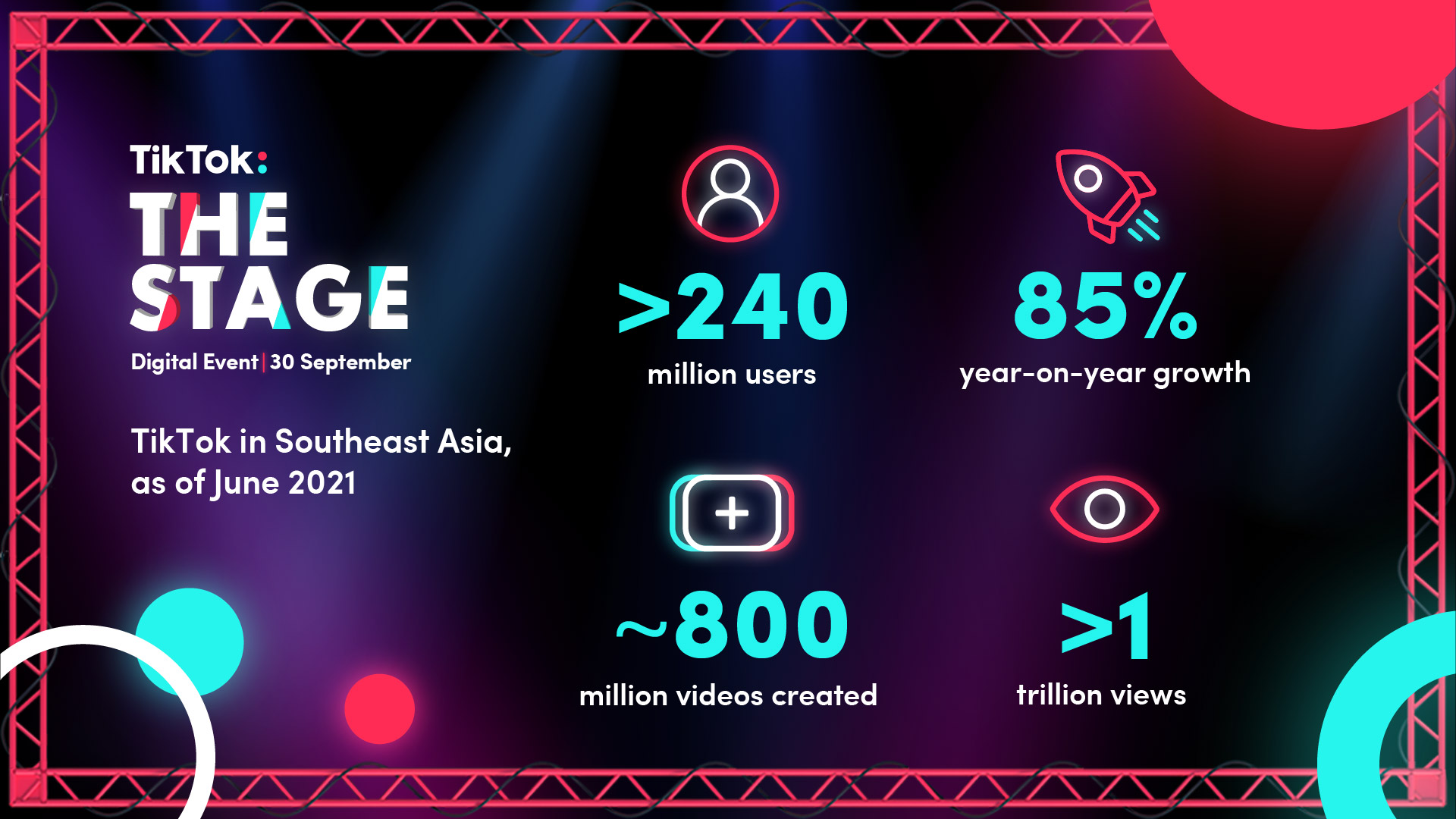
Joyful engagement with more than 240 million users in Southeast Asia
As more people discover the joy of being on TikTok, the platform continues to see strong growth in its audience reach and engagement. More than one billion people around the world come to TikTok every month, with nearly one out of four global users from Southeast Asia. As of June 2021, TikTok‘s user base in Southeast Asia has exceeded 240 million, up by 85% year on year. Furthermore, around 800 million videos were created by users in Southeast Asia, reaching more than a trillion video views in June alone.
With the mission to inspire creativity and bring joy, TikTok has become the platform that people turn to experience entertainment throughout their day. According to a Nielsen report commissioned by TikTok in June 2021, users in Southeast Asia said they were 1.34x more likely to prefer TikTok for content, 1.27x for creators, and 1.28x for authenticity.
“We all need a steady dose of positivity and happy users make for more engaged consumers. Understanding this, we have rolled out the next phase of advertising on TikTok that enables brands to bring those everyday moments of joy to our community in an authentic and entertaining way,” said Sam Singh, TikTok Head of Global Business Solutions, APAC. “We look forward to helping brands in the region to not only grow their business but also take part in this mission of bringing joy to more people in Southeast Asia.”
Highlights from TikTok: The Stage
- Measuring the value and impact of TikTok – Recently TikTok partnered with Nielsen to quantify the impact of TikTok advertising through Marketing Mix Models. The report noted that every dollar spent by brands on TikTok will lead to incremental returns on their revenues and that TikTok delivers 1.6 times more ROI than traditional and digital media platforms*. (* Other Media includes TV, Radio, Out of Home, Cinema, Digital Display & Video; excludes Facebook & Google).
To further help brands to measure the success of their campaigns and track performance, TikTok has launched a suite of new tools including Reach & Frequency Buying, Brand Lift Study, Viewability Partners, TikTok Inventory Filter, and more.
- Building a brand-safe environment – As TikTok continues to grow its presence in the region so does its commitment to helping that everyone feels safe and secure to authentically express themselves on the platform. This also includes the thousands of brands who have chosen TikTok as a place to engage their audiences. With that, TikTok has launched Brand Safety Inventory Filter Solution, a proprietary solution that advertisers can utilize to gain more control over where their ads run, and a new partnership with OpenSlate which aims to provide advertisers with a solution for their brand safety need by mitigating risks around content.
- Strengthening brand and creator collaboration with creative tools – TikTok has introduced a suite of solutions that enable advertisers to embrace creativity while driving more engagement with their community. Southeast Asia creative solutions include TikTok Creator Marketplace, TikTok For Business Creative Center, Video Editor, Dynamic Scene, Canva, and interactive formats to unlock engagement.
- Connecting community, entertainment, and commerce – Over the past year, brands have experienced the power that TikTok‘s community and platform hold for their businesses and ultimately, their business. TikTok has launched an enhanced suite of commercial products, solutions, and partnerships to help brands capture the untapped potential of TikTok to influence purchases and drive sales both on and off the platform. Commerce solutions include Collection Ads, Dynamic Showcase Ads (DSA), and new partnerships.
For the full details of our suite of solutions, please visit here.
TikTok: The Stage is a Southeast Asia-focused event that follows the global TikTok World event which took place on September 29. At TikTok World, the company showcased new, innovative ad products and global solutions while sharing its 2022 product vision with the world.