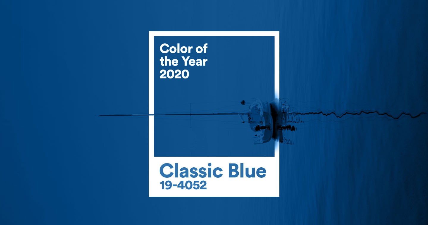

CARLSTADT, N.J. – Pantone, provider of professional color language standards and digital solutions, today announced PANTONE 19-4052, Classic Blue, as the Pantone® Color of the Year for 2020; a timeless and enduring hue elegant in its simplicity. Suggestive of the sky at dusk, the reassuring qualities of the thought-provoking PANTONE 19-4052 Classic Blue highlight our desire for a dependable and stable foundation from which to build as we cross the threshold into a new era.
“We are living in a time that requires trust and faith. It is this kind of constancy and confidence that is expressed by PANTONE 19-4052 Classic Blue, a solid and dependable blue hue we can always rely on,” said Leatrice Eiseman, Executive Director of the Pantone Color Institute. “Imbued with a deep resonance, PANTONE 19-4052 Classic Blue provides an anchoring foundation. A boundless blue evocative of the vast and infinite evening sky, PANTONE 19-4052 Classic Blue encourages us to look beyond the obvious to expand our thinking; challenging us to think more deeply, increase our perspective and open the flow of communication.”
Imprinted in our psyches as a restful color, PANTONE 19-4052, Classic Blue brings a sense of peace and tranquility to the human spirit, offering refuge. Aiding concentration and bringing laser-like clarity, PANTONE 19-4052, Classic Blue re-centers our thoughts. A reflective blue tone, Classic Blue fosters resilience.
As technology continues to race ahead of the human ability to process it all, it is easy to understand why we gravitate to colors that are honest and offer the promise of protection. Non-aggressive and easily relatable, the trusted PANTONE 19-4052, Classic Blue lends itself to relaxed interaction. Associated with the return of another day, this universal favorite is comfortably embraced.
“The Pantone Color of the Year highlights the relationship between trends in color and what is taking place in our global culture at a moment in time, a color that reflects what individuals feel they need that color can hope to answer.” added Laurie Pressman, Vice President of the Pantone Color Institute. “As society continues to recognize color as a critical form of communication, and a way to express and affect ideas and emotions, designers and brands should feel inspired to use color to engage and connect. The Pantone Color of the Year selection provides strategic direction for the world of trend and design, reflecting the Pantone Color Institute’s year-round work doing the same for designers and brands.”
To fully bring to life the true meaning of PANTONE 19-4052 Classic Blue, Pantone has translated PANTONE 19-4052 Classic Blue into a multi-sensory experience. By extending the sensory reach of PANTONE 19-4052 Classic Blue, Pantone is hoping to reach a greater diversity of people to provide everyone with an opportunity to engage with the Color of the Year 2020 in their own unique way.
“As we all head into a new era, we wanted to challenge ourselves to find inspiration from new sources that not only evolve our Color of the Year platform, but also help our global audiences achieve richer and more rewarding color experiences,” added Pressman. “This desire, combined with the emotional properties of PANTONE 19-4052 Classic Blue, motivated us to expand beyond the visual, to bring the 2020 Pantone Color of the Year to life through a multi-sensory experience.”
Classic Blue in Fashion
PANTONE 19-4052 Classic Blue is a poised and self-assured blue hue elegant in its simplicity. Genderless in outlook and seasonless in endurance, this foundational anchor shade enables color mixes throughout the spectrum, as well as making a strong statement on its own. Emblematic of heritage but at the same time highly contemporary, versatile PANTONE 19-4052 Classic Blue takes on distinct appearances through application to different materials, finishes and textures from shimmering metallics, lustrous sheens and high-tech materials to hand crafted looks and more fragile fabrics.
Classic Blue in Beauty
In the ultimate display of personal expression, PANTONE 19-4052 Classic Blue makes a dramatic statement for eyes, nails and hair in a variety of finishes from glittery and glam to dusty matte.
Classic Blue in Home Décor
Offering the promise of protection PANTONE 19-4052 Classic Blue is a pervasive favorite for home. Creating a stable foundation from which to build, PANTONE 19-4052 Classic Blue injects creative confidence into interiors, transforming a space through unique color combinations and tonal statements. Easily applied across so many different materials, textures and finishes, PANTONE 19-4052 Classic Blue is a dependable blue that can take you in different directions expressing tradition and elegance as well as unexpected boldness.
Classic Blue in Graphic Design and Packaging
Because of PANTONE 19-4052 Classic Blue’s relation to the sky at dusk, something we see every day, it maintains a perception of dependability and constancy. A color we respond to viscerally as being trustworthy, PANTONE 19-4052 Classic Blue is an ideal shade for many applications of graphic design. This is especially true for packaging where PANTONE 19-4052 Classic Blue conveys the message of honesty, credibility and reliability that today’s consumers are connecting to.
Classic Blue in Food and Beverage
Blue foods and beverages including PANTONE 19-4052 Classic Blue like shades are rich in anthocyanins. With this relationship to wellness and self-care these blue foods help to build a solid foundation, acting as a form of protection for good health. In addition to their natural health benefits, these blue foods also bring style and sophistication to the table.
Classic Blue as a Multi-Sensory Experience
In addition to releasing the iconic Pantone color swatch for PANTONE 19-4052 Classic Blue, Pantone has collaborated with a number of sensory experts from the worlds of music, food, fashion, beauty and technology to envision PANTONE 19-4052 Classic Blue as a sound, a smell, a taste, and a feeling. Taken together, all of these sensory inputs have been designed to inspire creatives and consumers to think about color differently, to uncover new patterns and associations, and to encourage them to create new experiences that speak to people’s hearts as well as their minds. Members of the media can request a free, limited edition, Pantone Color of 2020 Multi-Sensory Kit by emailing [email protected].
About the Pantone Color of the Year
The Color of the Year selection process requires thoughtful consideration and trend analysis. To arrive at the selection each year, Pantone’s color experts at the Pantone Color Institute comb the world looking for new color influences. This can include the entertainment industry and films in production, traveling art collections and new artists, fashion, all areas of design, popular travel destinations, as well as new lifestyles, playstyles, and socio-economic conditions. Influences may also stem from new technologies, materials, textures, and effects that impact color, relevant social media platforms and even up-coming sporting events that capture worldwide attention. For 21 years, Pantone’s Color of the Year has influenced product development and purchasing decisions in multiple industries, including fashion, home furnishings, and industrial design, as well as product packaging and graphic design. Past selections for Color of the Year include:
- PANTONE 16-1546 Living Coral (2019)
- PANTONE 18-3838 Ultra Violet (2018)
- PANTONE 15-0343 Greenery (2017)
- PANTONE 15-3919 Serenity and PANTONE 13-1520 Rose Quartz (2016)
- PANTONE 18-1438 Marsala (2015)
- PANTONE 18-3224 Radiant Orchid (2014)
- PANTONE 17-5641 Emerald (2013)
- PANTONE 17-1463 Tangerine Tango (2012)
- PANTONE 18-2120 Honeysuckle (2011)
- PANTONE 15-5519 Turquoise (2010)
- PANTONE 14-0848 Mimosa (2009)
- PANTONE 18-3943 Blue Iris (2008)
- PANTONE 19-1557 Chili Pepper (2007)
- PANTONE 13-1106 Sand Dollar (2006)
- PANTONE 15-5217 Blue Turquoise (2005)
- PANTONE 17-1456 Tigerlily (2004)
- PANTONE 14-4811 Aqua Sky (2003)
- PANTONE 19-1664 True Red (2002)
- PANTONE 17-2031 Fuchsia Rose (2001)
- PANTONE 15-4020 Cerulean (2000)
The color selected as our Pantone Color of the Year 2020 was taken from the Pantone Fashion, Home + Interiors Color System, the most widely used and recognized color standards system for fashion, textile, home, and interior design.
For more information on the Pantone Color of the Year for 2020, please visit www.pantone.com/color-of-the-year-2020.
About The Pantone Color Institute™
The Pantone Color Institute is the business unit within Pantone that highlights the top seasonal runway colors, selects the Pantone Color of the Year, forecasts global color trends, and advises companies on color for product and brand visual identity. Through seasonal trend forecasts, color psychology, and color consulting, the Pantone Color Institute partners with global brands to effectively leverage the power, psychology, and emotion of color in their design strategy.
About Pantone
Pantone provides the universal language of color that enables color-critical decisions through every stage of the workflow for brands and manufacturers. More than 10 million designers and producers around the world rely on Pantone products and services to help define, communicate and control color from inspiration to realization – leveraging advanced X-Rite technology to achieve color consistency across various materials and finishes for graphics, fashion and product design. Pantone Standards feature digital and physical color specification and workflow tools. The Pantone Color Institute™ provides customized color standards, brand identity and product color consulting as well as trend forecasting inclusive of Pantone Color of the Year, Fashion Runway Color Trend Reports, color psychology and more. Pantone B2B Licensing incorporates the Pantone Color System into different products and services, enabling licensees to communicate and reproduce certified Pantone values and improve efficiencies for their users. Pantone Lifestyle brings color and design together across apparel, home, and accessories. Learn more at www.pantone.com and connect with Pantone on Instagram, Facebook, Pinterest, and LinkedIn.