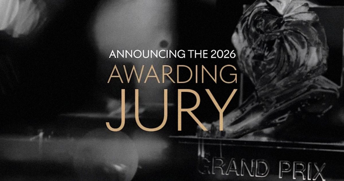
The Cannes Lions International Festival of Creativity, taking place June 22–26, 2026, has announced its Awarding Jury line-up for this year’s Festival. This exceptional group of global experts will convene in Cannes this June to set the global benchmark for creative excellence.
This year’s Juries reflect the growing diversity of the voices shaping the global creative industry, with fresh perspectives from independent agencies and brands across an array of sectors. Amongst those making their Jury debut is French brand, AXA, following its success in 2025, winning 13 Lions. The line-up also welcomes increased representation from across Africa, Pacific, MENA and LATAM, including first-time Jurors from the Dominican Republic and Venezuela.
Commenting on this year’s line-up, Simon Cook, CEO, LIONS, said: “The impact of the Cannes Lions Jury can’t be underestimated. Their time and expertise in recognizing groundbreaking work sets the global creative benchmark for the year ahead and provides a view of the future shape of creativity. Each year, our Juries are carefully selected to uphold this standard, and this year is no exception. Welcoming new expert voices across a breadth of markets and disciplines, we are delighted to bring together some of the industry’s most well-respected leaders to define the creative standards driving our industry forward and celebrate the transformative power of creativity to create change, shape society, and build business.”
Marian Brannelly, Global Director of Awards, LIONS, added: “The composition of this year’s Juries speaks to how creativity is evolving – it’s becoming more interconnected, more diverse, and more influential across every part of business. With more markets than ever represented and a growing number of leaders from independent agencies and brands, this year’s line-up will ensure that the work is judged through a truly global and contemporary lens. This is critical to setting the benchmark for creative excellence today. We thank all our experts for the care and dedication they will bring to the judging process.”
The 2026 Awarding Jury
Audio & Radio
- Oriel Davis-Lyons: Chief Creative Officer, Mother, USA — Jury President
- Beto Nahmad: Executive Creative Director, VCCP, Spain
- Claudia Hesse: CEO, Hesse Voices GmbH, Global
- Chesley Maddox: CEO, American Urban Radio Network, USA
- Edu Luke: Sound Creative, HEFTY Music & Sound, Brazil
- Fran Palines: Creative Director, VML Manila, Philippines
- Gautam Wadher: Chief Creative Officer, Memac Ogilvy, UAE
- Jabulani Sigege: Group Executive Creative Director, Machine_, South Africa
- Simon Langley: Chief Creative Officer, Bastion, Australia
- Zuza Duchniewska Sobczak: Chief Creative Officer, TBWA\Warsaw, Poland
Brand Experience & Activation
- Rafael Pitanguy: Deputy Global Chief Creative Officer, VML, Global — Jury President
- Amy Weston: Executive Creative Director, Clemenger BBDO, Australia
- Brisa Vicente: Co-CEO, Droga5 São Paulo (Accenture Song), Brazil
- Britt Nolan: Chief Creative Officer, McCann, North America
- Defri Dwipaputra: Chief Creative Experience Officer, Dentsu Creative, Indonesia
- Helen Rhodes: Chief Creative Officer, Grey London, UK
- Julie Hogan: VP of Global Brand Experiences, Meta, Global
- Ricardo Avilés: Chief Creative Officer, LePub, Mexico
- Satoshi Chikayama: Executive Creative Director, Hakuhodo, Japan
- Zizwe Vundla: Chief Marketing Officer, Safaricom | MPESA, Kenya
Creative B2B
- Ty Heath: Global Director, Thought Leadership, GTM Strategy, LinkedIn, Global — Jury President
- Adelise Ashdown: Global Head of Brand and Client Experience; Regional Marketing Lead APAC, JLL, Global/APAC
- Andre Athayde: Agency Partner, Meta, Brazil
- Benedict Buckland: Managing Director, alan., UK
- Jim Curtis: Chief Creative Officer, LePub NY, USA
- Kelly McConville: VP of Marketing, Fourthline, Netherlands
- Megha Dutta: Executive Creative Director, The Partnership Africa | Publicis, Africa
- Park Wannasiri: Chief Creative Officer, VML, Thailand
- Sam Stuchbury: Executive Creative Director & Founder, Motion Sickness, Aotearoa New Zealand
- Simon Higby: Nordic Creative Director, NORD, Nordics
Creative Business Transformation
- Gugu Mthembu: Chief Marketing Officer, Telkom, South Africa — Jury President
- Andres Arlia: Executive Creative Director, Dentsu Creative, USA
- Clare Pickens: CEO, Leo, Australia
- Diego Guerhardt: Executive Creative Director, Fbiz, Brazil
- Ikuko Ohta: Chief Strategy Officer, Droga5 Tokyo (Accenture Song), Japan
- Nadja Bellan-White: Group CEO, M+C Saatchi, North America
- Rakesh Menon: Chief Creative Experience Officer, Ulka, India
- Tarek Miknas: CEO, FP7McCann, MENAT
- Virginie Berçot: Global Brand Director, AXA, Global
- Virginie Briand: Partner, Deloitte, Germany
Creative Commerce
- Phil Camarota: Chief Creative Officer, Flywheel, Global — Jury President
- Giant Kung: Chief Creative Officer & Writer, Ogilvy, Taiwan
- Ian Loon: CEO Media & Digital Singapore; Chief Transformation Officer SEA, Publicis Groupe, Singapore/SEA
- Kim Pick: Group Executive Creative Director, VML, Aotearoa New Zealand
- Mario Lagos: Chief Creative Officer, Name, Colombia
- Matt Gay: Executive Creative Director, adam&eve\TBWA, UK
- Oriane Canfrin: Head of Marketing & Communication, Ecobank, Ivory Coast
- Ruxandra Papuc: Global Executive Creative Director & Partner, AIN’T, Global
- Thanh Anh Nguyen: Head of Marketing & Commercial, Grab, Vietnam
Creative Data
- Anupriya Acharya: CEO, Publicis Groupe, South Asia — Jury President
- Félix del Valle: Chief Creative Officer, MRM, Spain
- Koert Bakker: Head of Insights & Innovation, PwC Netherlands, Global
- Mary Anne He: Head of Data & Insights, Havas Media, Middle East
- Pipo Morano: National Executive Creative Director, MARURI, Ecuador
- Susana Albuquerque: Executive Creative Director & Partner, Uzina, Portugal
- Tracey Cooke: Chief Marketing Officer (SVP), Nestlé, Canada
- Veli Ngubane: Founder & Chief Creative Officer, Avatar, AMEA
- Xavier Serrano: CEO, TBWA\Colombia, Colombia
- Yuliya Tushina: CEO, Creative Division, DASM, Kazakhstan
Creative Effectiveness
- Bertille Toledano: CEO, BETC & Havas Creative Middle East; President, Havas Creative Network, Global — Jury President
- Aakriti Goel: Head of Strategy, Leo, UAE
- Adam Gerhart: Global Chief Client Officer, WPP Media, Global
- Ayu Sasaki: Executive Creative Director, Dentsu Inc., Japan
- Brent Smart: Chief Marketing Officer, Telstra, Australia
- Danielle Jin: Chief Marketing Officer APAC, Visa, APAC
- Glen Lomas: CEO Europe, Omnicom Advertising, Europe
- Jane Wakely: EVP, Chief Consumer & Marketing Officer; Chief Growth Officer – International Foods, PepsiCo, Global
- Mpume Ngobese: Managing Director, Joe Public, South Africa
- Vinicius B. Reis: Partner & CEO, Crispin; President, Stagwell, Brazil/LatAm
Creative Strategy
- Sarah Lemarié: Chief Strategy Officer, Publicis, France — Jury President
- Alejandro Fischer: Chief Strategy Officer, Havas, Middle East
- Bethany Omeri: Head of Strategy, SPECIAL, Aotearoa New Zealand
- Boris Nihom: CEO, Dentsu, Benelux
- Dan Hill: Global Chief Strategy Officer, Wieden+Kennedy, Global
- Dheeraj Sinha: CEO, McCann, India
- Ellie Bamford: Chief Strategy Officer, VML, North America
- Jen Costello: Global Chief Strategy Officer, TBWA\Worldwide, Global
- Neo Makhele: Chief Strategy Officer, Ogilvy, South Africa
- Renan Damascena: Co-Founder & Chief Strategy Officer, MUVUKA & AUÊ, LATAM
Design
- Greg Quinton: Chief Creative Officer, Design Bridge and Partners, Global — Jury President
- Ben Miles: Chief Design Officer, R/GA, APAC
- Kyungsin Kim: CEO & Executive Creative Director, Paulus, South Korea
- Lulu Raghavan: President, Landor, APAC
- Özge Güven: Visual Communication Designer, Studio Özge Güven, Turkey
- Patrick Bennett: Chief Creative Officer, Global
- Simone Rossum: Executive Creative Director, SHIFT, South Africa
- Vitor Hugo Favero: Global Design Lead, McCann, Global
- Yasmin Sindi: Senior Creative Director, Saatchi & Saatchi, Saudi Arabia
- Yoshihiro Kono: Senior Art Director, TBWA\HAKUHODO, Japan
Digital Craft
- Andrés Ordóñez: Global Chief Creative Officer, McCann, Global — Jury President
- Gurbaksh Singh: Chief Creative Officer & Chief Innovation Officer, Dentsu Creative, India
- Hannah Johnson: Head of Creative Strategy DACH, Snap Inc., DACH
- KK Walker: Executive Creative Director, Google, Global
- Martin Rabaglia: CEO, Genosha, Global
- Stephanie Mazingi: Creative Managing Director, Havas, South Africa
- Tiago Abreu: Chief Creative Officer, GUT São Paulo, Brazil
- Tim Devine: Global Chief Invention Officer, AKQA, Global
- Vicky Lee: Executive Creative Director, Medialand Digital Strategy, Taiwan
- Youssef Gadallah: Head of Creative Studio, TikTok (Bytedance), METAP
Direct
- Joaquín Cubría: Chief Creative Officer, GUT, Argentina — Jury President
- Hadi Alaeddin: Senior Creative Director EMEA, .Pomelo, EMEA
- Juan Manuel Gaitán: Chief Creative Officer, Ogilvy, Dominican Republic
- Khethiwe Makhubo: Creative Group Head, McCann Joburg, South Africa
- Lili Jiang: Executive Creative Director, Cheil Worldwide, Hong Kong SAR
- Lorena Berges: Creative Director, DDB Latina Puerto Rico, Puerto Rico
- Mark Elwood: Chief Creative Officer, Leo, UK
- Sophie Kelly: SVP Global Tequila & Mezcal, Diageo, Global
- Tanja Grubner: Global Marketing Director, Essity, Global
Entertainment
- Chris Beresford-Hill: Worldwide Chief Creative Officer, BBDO Worldwide, Global — Jury President
- Damisa Ongsiriwattana: Co-Founder & Chief Creative Officer, SOUR Bangkok, Thailand
- Farah El Feghali: Executive Creative Director, McCann Paris, France
- Firas Ghannam: Executive Creative Director, VML Riyadh, Saudi Arabia
- Jason Williams: Head of Creative Excellence APAC, Publicis Groupe, APAC
- Jung A Kim: CEO & Chief Creative Officer, Innocean, South Korea
- Ned McNeilage: Head of Creative, Sphere, USA
- Prachi Narayan: Managing Partner, Havas Play, India
- Rafael Donato: Chief Creative Officer, Ogilvy, Brazil
- Sophia Lindholm: Head of Creative, Forsman & Bodenfors, Sweden
Entertainment Lions for Gaming
- Lolly Thomson: Joint Global Chief Creative Officer, M+C Saatchi Group, Global — Jury President
- Amitesh Rao: CEO, Leo, South Asia
- Asako Okuno: Global Creative Director, Hakuhodo, Global
- Danni Pinch: Executive Creative Director, Accenture Song, South Africa
- Gabriel Caramelo Eccher: Marketing VP, Clash Royale (Supercell), Finland
- Josh Gross: Chief Creative Officer, BBDO Chicago, USA
- Rogério Chaves: Co-Chief Creative Officer, Africa Creative, Brazil
- Teddy Kossoko: Founder, GARA & Masseka Game Studio, France
Entertainment Lions for Music
- Matt Murphy: Global Chief Creative Officer, 72andSunny, Global — Jury President
- Corinna Martínez: Partner & Head of Production, Mastodonte Films, Mexico
- Fizo Younis: Chief Creative Officer, Publicis Groupe, Middle East
- Phiona Okumu: Head of Music, Spotify, Sub-Saharan Africa
- Prerna Suri: VP Communications, Sony Music Entertainment, Asia/Middle East
- Rick Sakurai: Creative Director & Managing Director, MassiveMusic Tokyo, APAC
- Ryan McManus: Chief Creative Officer, VML, UK
- Sergio Franco Tosso: Chief Creative Officer, Fahrenheit DDB, Peru
- Subhajit Mukherjee: Music Composer, India
- Toni Wallace: Partner & Head of Global Music Brand Strategy, United Talent Agency, Global
Entertainment Lions for Sport
- Shannon Washington: Chief Creative Officer & Managing Partner, 11 Ounces, Global — Jury President
- A.P. Chaney: Senior Director Creative, The Coca-Cola Company, North America
- Andre Toledo: Chief Creative Officer, DAVID New York, USA
- Binda Dey: Global Chief Marketing Officer, Knight Riders Sports, India
- Bukky Moemeke: Independent Consultant, Sport & Entertainment Marketing, Global
- Guy Futcher: Regional Executive Creative Director, Octagon, APAC
- Jhon Da Silva: CEO & Creative Director, La Web Figital Agency, Venezuela
- Lucy Basden-Smith: Managing Director, Fuse International, Global
- Melody Li: SVP Business Development, Dentsu Sports International, APAC
- Mohammed Sehly: CEO, BigTime Creative Shop, Saudi Arabia
Film
- Pelle Sjoenell: Former Worldwide Chief Creative Officer, Droga5 (Accenture Song), Global — Jury President
- Alexis Ospina: Chief Creative Officer, Grey, Mexico
- Alice Chou: Chief Creative Officer, Dentsu Creative, Taiwan
- Ash Chagla: Chief Creative Officer, Science & Sunshine, UAE
- Ben Sun Erhei: CEO & Chief Creative Officer, Havas Creative China, Mainland China
- Femi Odugbemi: Founder & CEO, Zuri24 Media, Nigeria
- Janne Lysø: Executive Creative Director, POL, Norway
- Maiya Kinoshita: Creative Director, TBWA\Media Arts Lab Tokyo, Japan
- Marcelo Vergara: Executive Creative Director, Publicis Conseil, France
- Micah Walker: Founder & Chief Creative Officer, Bear Meets Eagle On Fire, Australia
Film Craft
- Pip Smart: Executive Producer & Partner, Revolver, Australia — Jury President
- Asma Humayun: Global Creative Director & Senior Producer, Shiny Toy Guns, Global/Pakistan
- Atta Hemwadee: Director, Attah Film, Thailand
- Eddy Rizk: CEO, BIG KAHUNA FILMS, UAE
- James Brook-Partridge: Head of Production, WPP Production, UK
- John Bleeden: SVP Global Executive Creative Development, McCann, Global
- Maureen Hufnagel: Film Director, Landia, Argentina
- Mbithi Masya: Director, Fat Rain Africa, Kenya
- Melissa Tifrere: Chief Production Officer, Havas, USA
- Tato Bono: President, Publicis Production, Brazil
Glass: The Lion for Change
- Monique Nelson: Executive Chair, UWG, USA — Jury President
- andre (g.) gray: Chief Brand Officer, Overtime, USA
- Anna Johannes: Co-Founder, Culxtured, USA
- Breana Auberry: Global Brand Director, Culture Marketing & Collaborations, The LEGO Group, Global
- Rana Sadek: Senior Creative Director, IMPACT BBDO Dubai, UAE
- Sonita Alizadeh: Rapper, Global
- Suhana Gordhan: Chief Creative Officer & Founder, LoveSong, South Africa
- Zoe Hamilton: Global Chief Strategy Officer for Unilever, Ogilvy, Global
- Viviane Duarte: CEO, Plano Feminino, Brazil
Health & Wellness
- Kainaz Karmakar: Chief Creative Officer, Ogilvy, India — Jury President
- Allison Ceraso: Chief Creative Officer, Digitas Health, USA
- Amanda Fuller: Managing Partner, Omnicom Health, Oceania
- Donevan Chew: Chief Creative Officer, Havas, Malaysia
- Joseph Bonnici: Chief Creative Officer & Owner, Tadiem, Canada
- Marília Zanoli: Chief Marketing Officer, Kimberly-Clark, Brazil
- Muhannad Kadi: Chief Marketing Officer, King Faisal Specialist Hospital & Research Centre, Saudi Arabia
- Norkor Duah: CEO, MullenLowe Accra, Ghana
- Raimundo Undurraga: Chief Creative Officer, VML, Chile
- Séverine Autret: Global Creative Excellence Lead, Opella, Global
Industry Craft
- Rafael Gil: Chief Creative Officer, Artplan, Brazil — Jury President
- Alistair Thompson: Executive Creative Director, DMB., Austria
- Damon Stapleton: Chief Creative Officer, Droga5 ANZ (Accenture Song), AUNZ
- Derek Green: Chief Creative Officer, TBWA\RAAD, MENA
- Hiroyuki Kato: Creative Director, Dentsu Inc., Japan/Global
- Krystle Mullin: Chief Creative Officer, john st. and T&P, Canada
- Lauren Kimball: EVP Experience Design Director, Edelman, Global
- Liana Liebenberg: Creative Partner, Design Bridge and Partners, South Africa
- Maud Robaglia: Head of Art, Publicis Conseil, France
- Michael Wilk: Global Head of Art, Serviceplan Group, Global
Innovation
- Kazuhiro Shimura: Executive Creative Director, Dentsu Inc., Japan — Jury President
- Anna Nicanorova: Chief Technology Officer, Annalect, Global
- Craig Elimeliah: Chief Creative Officer, Code and Theory, Global
- Daniel Payan: Chief Creative Officer, VML, Colombia
- Emma Lax: Global Head of Intelligence & Innovation, Havas Creative Network, Global
- Hadleigh Sinclair: Group Creative Director, Colenso BBDO, Aotearoa New Zealand
- Juliet Ehimuan: Founder & CEO, Beyond Limits Global, Nigeria
- Kika Douglas Castroviejo: Chief Creative Officer, LePub, Netherlands
- Pablo Vitale: SVP Executive Creative Director, Monks Buenos Aires, Argentina
- Sabaa Quao: Founding President, PlusCo Venture Studio, Canada
Media
- Sindhuja Rai: Chief Client Officer, WPP Media, APMEA — Jury President
- Anisha Iyer: CEO, OMD, India
- Azhar Siddiqui: CEO, Mediaplus Middle East, MENA
- Dashni Vilakazi: Managing Director, The MediaShop, South Africa
- Fabrice Plazolles: Managing Director & Chief Creative Officer, Havas Play, France
- Kendra Hatcher King: Global Chief Design Officer, Spark Foundry, Global
- Marta García Alonso: VP Marketing, HEINEKEN, Mexico
- Paulo Ilha: Co-Founder & Chief Media Officer, Galeria Holding, Brazil
- Will Swayne: Global Practice President Media & Integrated Solutions, dentsu, Global
Outdoor
- Aaron Starkman: Global Chief Creative Officer, Rethink, Global — Jury President
- Habiba Allam: Creative Director, Careem, Global
- Jake Barrow: Chief Creative Officer, VML, Czech Republic
- Leisa Wall: Chief Creative Officer, McCann New Zealand, Aotearoa New Zealand
- Marie Julie Gerbauld: Chief Creative Officer, DAVID São Paulo, Brazil
- Peter Dobbyn: Creative Director, Publicis Dublin, Ireland
- Pooja Manek: Creative & Founding Member, Talented Agency, India
- Sergio Chinchilla: General Creative Director, Garnier, Costa Rica
- Stéphane Gaubert: Chief Creative Officer, Havas Paris, France
- Tim Wasicki: Group Creative Director, OUTFRONT Media, USA
Pharma
- Tracey Brader: Chief Strategy & Innovation Officer, Remedy Edge, UK — Jury President
- Aleisia Gibson Wright: Founder & President, GW Health Public Relations, USA
- Alex Okada: Chief Creative Officer, Havas Lynx, UK
- Andrea Lillis: SVP Executive Creative Director, Klick Health, North America
- Chris Charles: Executive Creative Director, 21GRAMS, USA
- Mandi Fine: CEO & Founder, FINE, South Africa
- Paola Aldaz: Chief Marketing Officer & Head of Marketing, Keralty Group/Colsanitas, Colombia
- Ryan Wallman: Executive Creative Director, Wellmark, Australia
- Sharon Tan: Head of Client & Growth, Publicis Health, APAC
- Wei Fei: Group Executive Creative Director, Ogilvy Shanghai, Mainland China
PR
- Dana Tahir: CEO, HAVAS Red, Middle East/Egypt — Jury President
- Elaine Rodrigues: Managing Director, Golin, Brazil
- Hillary Andoh: Founder & CEO, HSA PR, Africa
- Jean Paoli: Executive Creative Director, Weber Shandwick, Europe
- Joe Mackay-Sinclair: Founder & CEO, The Romans, Global
- Lauren Thomson: VP Creative Strategy & Integrated Communications, MSL, Canada
- Mina Sakai: Chief Consultant, Dentsu PR Consulting, Japan
- Simone Gupta: Co-Founder, Supermassive, Australia
- Taj Reid: Global Chief Creative Officer, Burson, Global
- Tim Green: Chief Creative Officer, Edelman, APAC
Print & Publishing
- Jessica Apellaniz: Chief Creative Officer, Wieden+Kennedy, Mexico — Jury President
- Alexis Bronstorph: Chief Creative Officer, No Fixed Address, Canada
- Dhruv Warrior: Executive Creative Director, VML, India
- Fernando Pellizzaro: Global Executive Creative Director, AKQA, Global
- Iron Brito: Creative Director, AlmapBBDO, Brazil
- Jason Murison: Creative Lead, DAMAC Properties, Global
- Lorenz Langgartner: Global Executive Creative Director, Serviceplan Group, Global
- Mo Chen: Executive Creative Director, TBWA\China, Mainland China
- Nkgabiseng Motau: Co-Founder & Chief Creative Officer, Think Creative Africa, Africa
- Riccardo Fregoso: Chief Creative Officer, Dentsu Creative, SEMENAT
Social & Creator
- Mihnea Gheorghiu: Global Chief Creative Officer, LePub, Global — Jury President
- Asia Ali: Founder & Managing Director, MKV Digital, UAE
- Anny Havercroft: Global Head of Product MarComs & Industry Education, TikTok, Global
- Ary Nogueira: Creative Director, Wieden+Kennedy São Paulo, Brazil
- Guillermo Vega: Chief Creative Officer, Ogilvy North America & Global Creative Network Lead, The Coca-Cola Company
- Katariina Ollari: Head of Social & Content, NoA | Bob the Robot, Finland
- Khangelani Dziba: Brand Communications Consultant, Independent, South Africa
- Munya Chawawa: Comedian, Actor & Founder, Munz Made It, UK
- Pedro Perez: Chief Creative Officer, TBWA\Chiat\Day LA, USA
- Victor Nguyễn-Long: Group Social Creative Director, Google, Global
Sustainable Development Goals
- Kazoo Sato: Chief Creative Officer & CEO, Earth Centric Design, Japan — Jury President
- Bogosi Motshegwa: Founder, CEO & Chief Strategy Officer, Thinkerneur, Africa
- Flavia Martins: Founder & CEO, Diversidade Sustentavel, Brazil
- Laura Rogers: Executive Creative Director, AMV BBDO, UK
- Marcela Melero: Chief Growth Marketing Officer, Dove (Unilever), Global
- Mary Catherine Fixel: Managing Director & Head of Sustainability, Accenture Song, Global
- Nicolai Smith: Chief Creative Officer, AKQA, EMEA
- Rob Galluzzo: CEO & Executive Producer, FINCH, AUNZ
- Sergiy Biloshytskiy: Creative Director, Saatchi & Saatchi, Ukraine
- Sherri Aldis: Director, United Nations Communications, United Nations, Western Europe
The 73rd edition of the Festival takes place from June 22–26 in Cannes, France. Pass options can be found at www.canneslions.com.