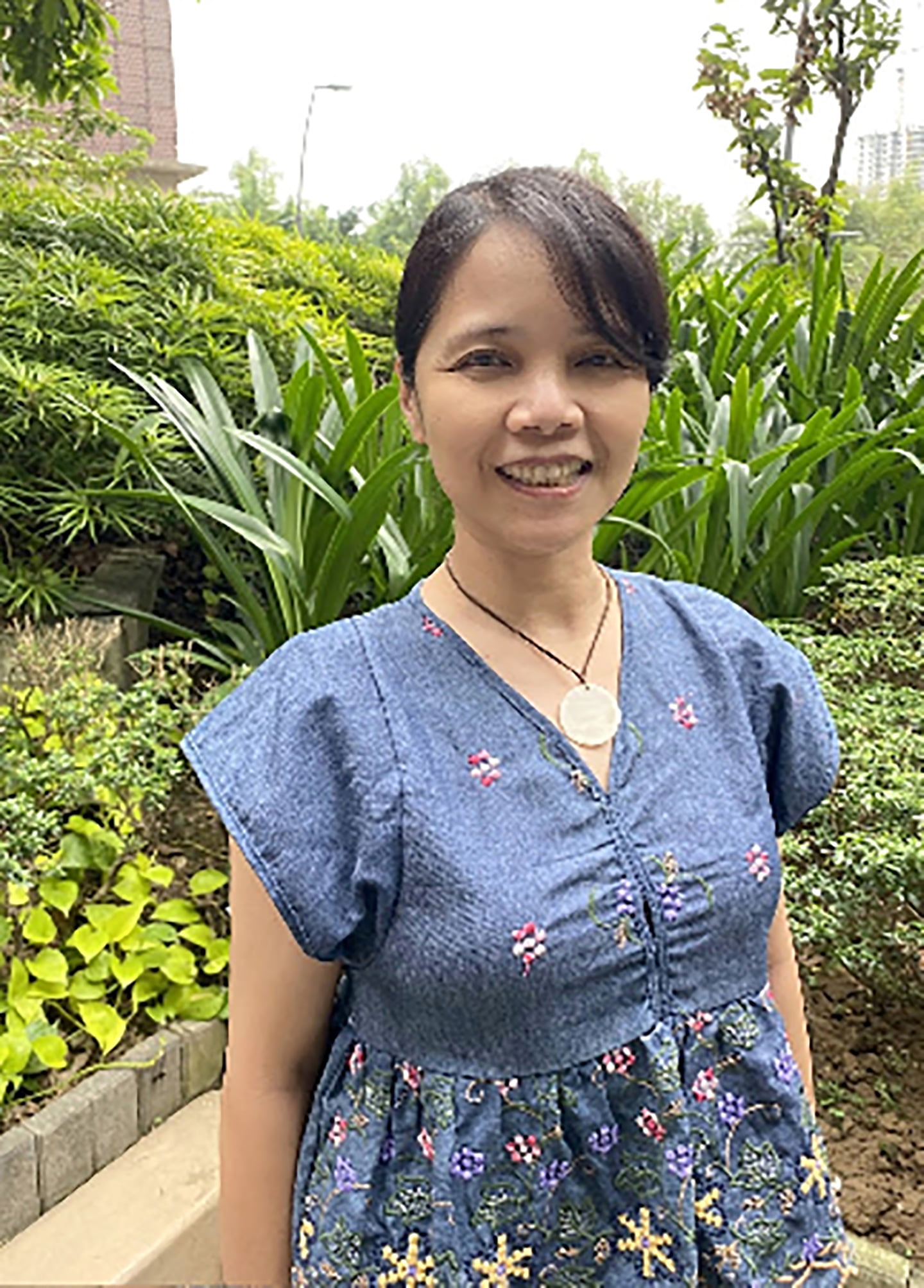
MANILA, PHILIPPINES — Filipina artist Cynthia Bauzon-Arre fell in love with illustration long before she pursued it as a career. She fondly recalls her childhood years, when her father was a professor based in Japan and would always bring home oil pastels and watercolor sets for her to play around with. Without knowledge of it then, this would set her on a lifelong creative path.
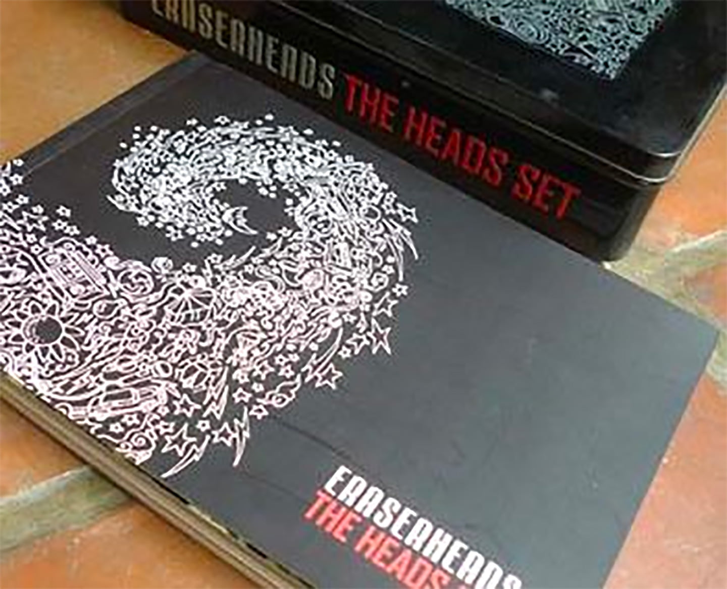
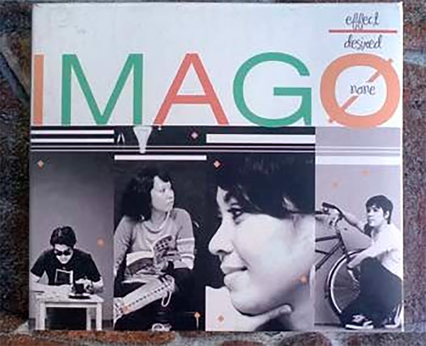
Right after graduating from the UP College of Fine Arts, Cynthia entered the advertising industry where she stayed for the next nine years. During this time, she also designed music packaging for legendary Filipino rock bands such as the Eraserheads, Sandwich, Itchyworms, and Imago. An interest in graphic design led her to Parsons School of Design in New York City where she took courses for a semester.
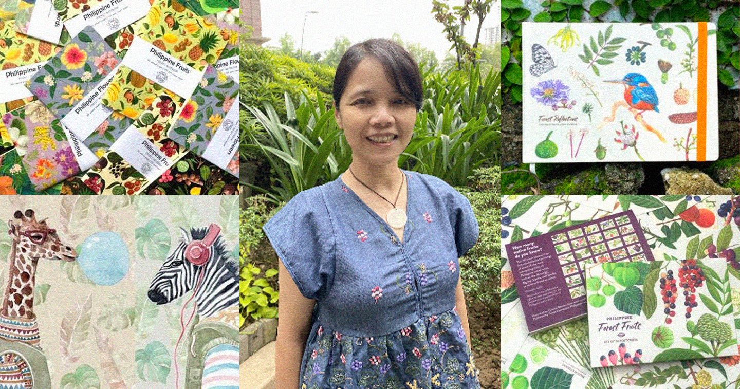
In recent years, Cynthia rekindled her love for painting with a focus on Philippine flora and fauna. She often pairs her intricately detailed illustrations with fantastical elements to stir
adobo Magazine: Can you tell us what encouraged you to become a designer and illustrator?
Cynthia: I’ve always felt that I communicate better through visuals compared to words. My parents often gave me art materials when I was small and I remember drawing all the time so it was a natural progression for me to take up Visual Communication in college. After graduation, I worked in advertising for a while and enjoyed the art direction side of work. Once I went freelance, I decided to concentrate on design and illustration.
I’m curious, how did you make the leap from designing album covers for some of the country’s most iconic bands to illustrating these beautiful, nature-inspired artworks?
The leap was brought on by a change in lifestyle. After we got married, my husband Arnold (who is a graphic novelist and animator) and I spent less time attending musician friends’ gigs and much more time at home. As artists, we’re able to work without leaving the house. That’s when I learned how to appreciate a calm, slower-paced life and I found joy in listening closely to bird calls and trying to identify plants and flowers. Nature inevitably found its way into my drawings.
Local flora and fauna take center stage in most of your current works. Where does that interest stem from?
Spending time in nature reminded me of my childhood so I started drawing flowers that I was familiar with growing up such as Santan, Sampaguita, and Gumamela. I always assumed they were native but, as it turns out, these commonplace flora are actually introduced exotic species. I became obsessed with learning more about indigenous varieties and through my research, I found out that many of them are dwindling in number. This news was distressing so I thought that maybe I could use my art as a way to bring attention to this fact.
What is your artistic process like, from conceptualization to execution?
Since I come from an advertising background, I start by asking, “What is the big idea” or “What do I want to communicate through the work?” I make rough sketches and once I’m happy with the overall design, I proceed to drawing the individual elements. Once these elements are done, I place them on different layers in my image software where I arrange them into a layout.
Aside from your professional work, you also carry some advocacies close to your heart. Can you tell us about #DrawNativeTreesPh? What prompted the idea and how was that experience?
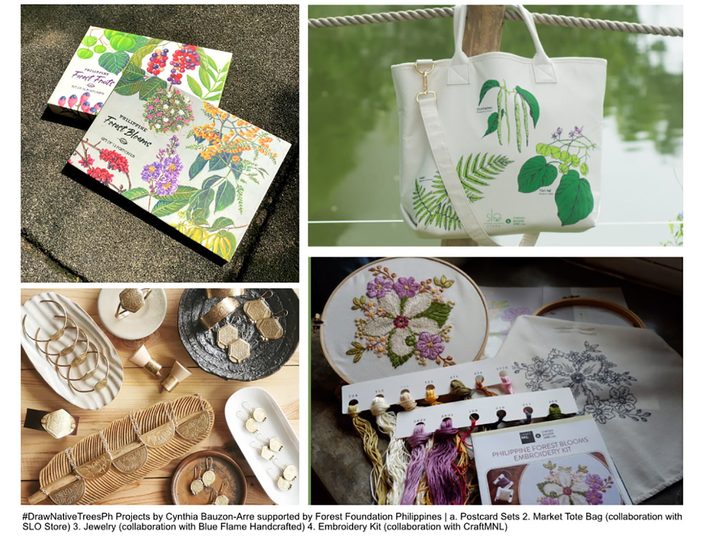
#DrawNativeTreesPh is a dream project that cemented my conservation journey. In 2018, I received an invitation from Forest Foundation Philippines to work together in raising awareness for the importance of native trees in forest conservation. We began with a contest that encouraged artists to draw Philippine native trees and share the posts on Instagram and Facebook. It was quite effective so we followed it up with watercolor workshops. We also came up with a planner, postcard sets, and other materials that could help bring the cause to a wider audience. The Foundation gave me a lot of creative freedom so it’s been really fun coming up with more projects from paper products to a memory game app, an embroidery kit, and even jewelry. The best part is that all the outputs are self-sustaining. I use a portion of the profits from their sales to reproduce the materials, and some of the earnings have also helped fund forest community conservation efforts.
Do you approach commissioned work differently from self-started projects?
I approach commissioned work with a lot of care and caution since the client’s guidelines, brand image, and vision all need to be taken into account, whereas with self-started projects, I can run free with full creative control. Fortunately, clients approach me specifically for my illustration style and advocacy so there isn’t much of a difference between my commissioned and self-started outputs.
I noticed you produce lots of wonderful free and downloadable materials such as wallpapers and e-cards. Can you tell us why it’s important for you, as an artist, to make your works accessible in this way?
Through the years, I’ve accumulated a library of native flora drawings. I felt that it would be a waste to keep them hidden away, so I used them to frame Filipino motivational sayings, like “Kapit lang,” and turned these designs into free desktop and mobile wallpapers. During the lockdowns, many people told me that seeing the wallpapers on their screens gave them hope and energy to face the day. As an artist, having your work resonate with others is the best thing ever so I was really touched to hear that. Making the artworks accessible is also a helpful way to spread information, education, and awareness about our native species.
What are some achievements or projects that you feel particularly proud of in 2022?
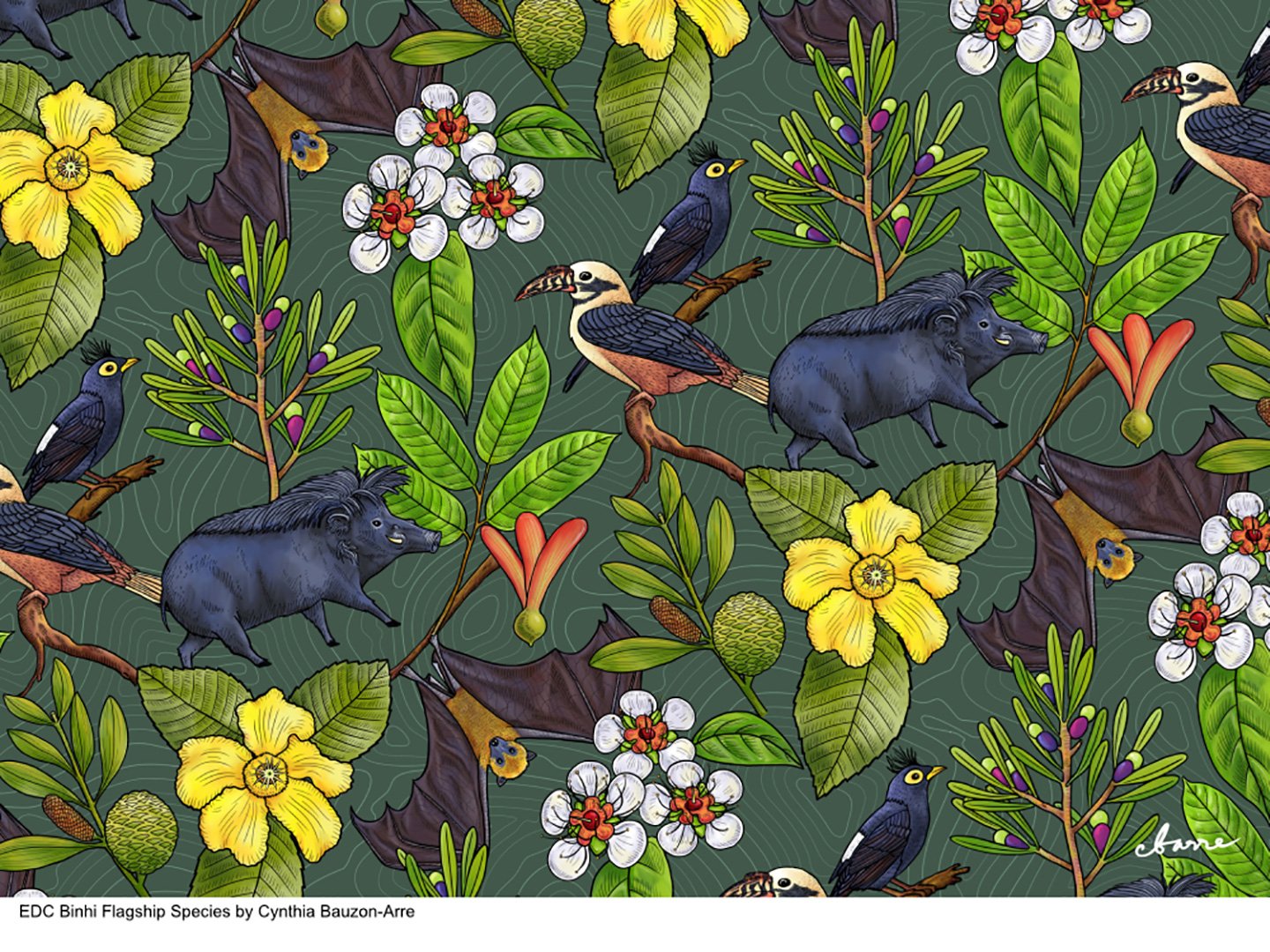
Among last year’s outputs, I particularly enjoyed my projects with EDC Binhi where I got to illustrate its flagship fauna species, the Philippine Warty Pig, Golden-crowned Flying Fox, the Apo Myna, and Visayan Hornbill, along with a selection of threatened endemic flora, the Almaciga, Igem-dagat, Mapilig, Red Lauan, and Katmon-bayani. The flagship species initiative is a biodiversity conservation project of the Energy Development Corporation (EDC) which aims to protect selected flora and fauna species in its geothermal and wind project sites, and Binhi is its forest restoration program. The company’s expert foresters oversaw the project and made sure that my drawings were accurately done, and I was given complete freedom for the overall look and illustration style.
Another one is the Philippine Endemic Hoya postcard set which was a collaboration with the Hoya Lovers of the Philippines and Beyond Facebook group. Prior to this project, I didn’t know that so many beautiful hoyas can only be found in the Philippines. I drew 12 hoya flowers with meticulous care through the guidance of the group’s experts.
It was also fun making an illustration for Tatler Philippines’ Alphabet City. I was assigned the letter T and got to draw a very shy Tarsier in the midst of native flora it typically nests in.
What can we expect to see from you next in this new year?
 I’m currently working with Forest Foundation Philippines on a new project. This time, we will be focusing on forest conservation as a whole. Some of my other upcoming work will explore subjects other than native flora and fauna, but they will still be tied to biodiversity conservation and heritage preservation.
Finally, do you have any advice for those starting in design and illustration?
If you’re still starting out, aim to make art every day, compile your favorite works, and build a portfolio. Try to accumulate a collection of designs and artworks that reflect the kind of projects that you want to do professionally and present those in an online gallery. This way, potential employers and clients will have a clear idea of your particular style. Make sure to infuse your work with something personal to you in order for you to stand out from among the sea of illustrators and designers and help you connect with your dream client or employer.