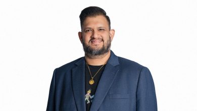

SHANGHAI, CHINA — F5 Shanghai hires husband-and-wife tandem Kelvin Co and Sarah de Joya, further cementing its position as China’s creative shop that holds global thinking and practice at its core. The team handles Midea, Pfizer, Baidu, Alibaba, and Tencent, spearheading campaigns that are rolled out across China, Europe, and the United States.
Kelvin first joined F5 Shanghai in 2016, helping this boutique agency win its first Cannes Lion in 2017, merely a year after the shop was founded by CCO Adams Fan. Kelvin brings with him over 12 years of industry experience, having worked with DDB Philippines, BBDO Interone Beijing, and McCann Shanghai. He handled various accounts, such as Coca-Cola, BMW, Tencent NBA, Nestea, and Baidu and won local and international awards for his projects.
Sarah provides creative, strategic, and business-acquiring ideas to the agency, benefiting from 11 years of industry experience working with DDB Philippines and MRM Manila//McCann Worldgroup, and freelancing for various agencies in Singapore and Australia. Her previous accounts include Nestlé, Coca-Cola, Johnson & Johnson, Samsung, and Adobe, among others with work that produced several local and international awards.
Streamlined for the future
“We live in a world of constant disruption and if you want to stay relevant, you have to constantly reinvent yourself,” Creative Group Head Kelvin enthuses. “In F5, we believe that change and new discoveries lead to new golden ages and if something doesn’t exist, invent it.”
Sarah continues, “It’s interesting in F5 because they’ve created a structure and process that works for the Now. In traditional agencies, people are specialized in doing just one job, but here, we all get to be hybrids.” Sarah expounds on how copywriting is just one of the many tasks in her role as Creative Lead and how being a Technologist, an Account Manager managing clients, making negotiations, and closing contracts are some of the things she has to do and personas she has to be on a daily basis.
Kelvin explains, “When an agency is composed of such hybrids, not only does it get to future-proof itself, but as individuals, being able to take on multiple roles and honing different skills allow you to future-proof your career as well. And this agility that both the agency and you display can only serve clients’ advantage”.
“I’m pretty lucky because I wasn’t expecting to receive two job offers during the pandemic. One offer was from a 4As agency, but I chose to go with F5. I’ve been working for multinational agencies since 2010, so I wanted to experience a different environment that required more flexibility, which a small hotshot shop like F5 offers,” Sarah states.
Tech-infused, purpose-driven campaigns
The team also works closely with in-house technologists and engineers, creating materials that are not just heavy on insight and purpose, but on technology as well. Technology, design, insight, and unique brand experiences are key traits of the work the couple churns out for their clients. Their work for Baidu, Pfizer, and Midea relied heavily on tech, but human truth and purpose were at their core.
The two continue to expound on how working with overseas partners and suppliers helps them generate better executions for their clients. Kelvin explains, “It’s quite unorthodox because usually agencies would stick with local suppliers or go-to partners from their vendor lists. In relation to how this affects the work, our process helps us create more mind-blowing ideas which is now more crucial than ever.”
“We always tell our clients not to treat campaigns as advertising materials but to treat them as real-world experiences. What would wow people and what could be the brand or product’s role in providing that experience.” Sarah continues, “Clients are also your creative partners, so treat the relationship as such. A leaner system allows closer collaboration and working closely makes it easier to give them the service they deserve and expect.”
Advice for couples working together
“It is commonly believed that it’s smarter and safer for partners not to work together so they can cover more ground,” Kelvin says. But the couple expresses that if you feel you work well together professionally and can afford to take the risk, then go for it.

“Keep your ego in check,” Sarah enthuses, “because that’s usually the downfall of teams, not just in advertising.” The couple emphasizes how one should always have a beginner mindset because this helps not just in creating better ideas but also activates constant self-improvement.