HONG KONG — Nantou City, also known as the ancient city of Xin’an, and located at the centre of Nanshan District in Shenzhen, has unveiled a refreshed brand identity that aims to “activate” Nantou City, bringing both Chinese traditions and modern creativity, as well as sustainable development and vitality to the town.

WPP agency Superunion led the complete brand overhaul that included brand strategy, experience and communications planning alongside a total revamp of visual identity.
After Vanke, a leading town developer and city service provider, took over the renovation of the city, Nantou City has evolved into a landmark location embedded with four major parts – cultural and creative retail, trendy art experiences, high-quality and innovative F&B, and cultural residencies.
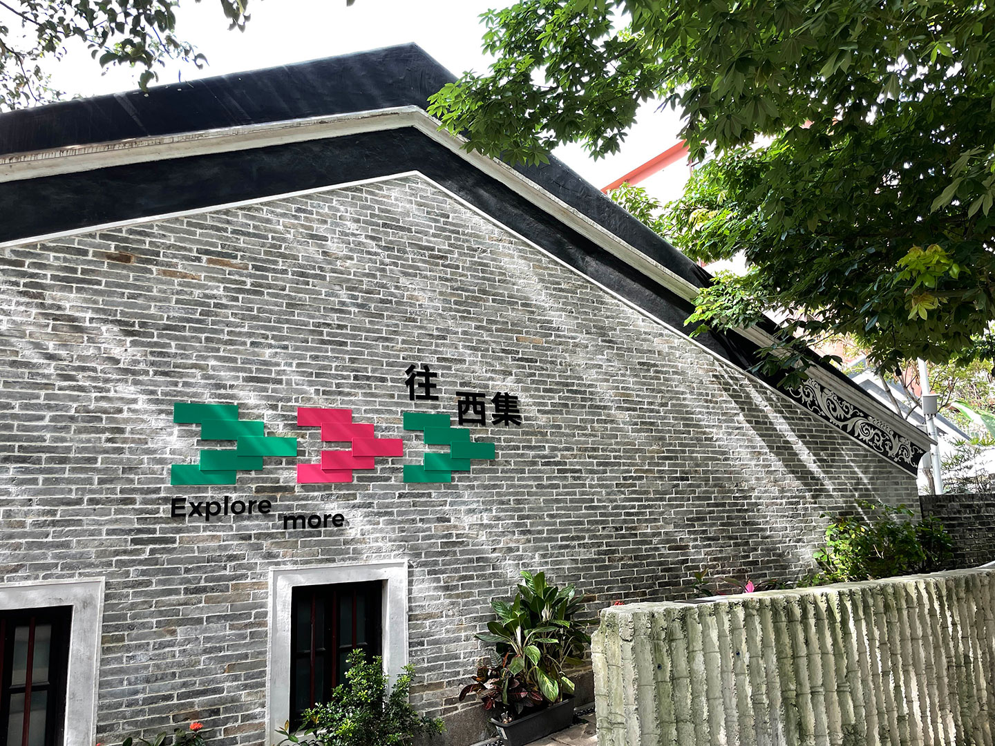 The core idea behind the brand refresh ‘Collide to Create’ positions Nantou as a place of contrasts and a meeting point for people and ideas to come together. The brand tagline 為每一種想像而來 translates to “a place for every imagination” which led to the central creative idea of the semi-colon, with its literal function of connecting independent clauses or ideas leading to a more symbolic meaning: Nantou as a focal point connecting individuals, ideas and cultures.
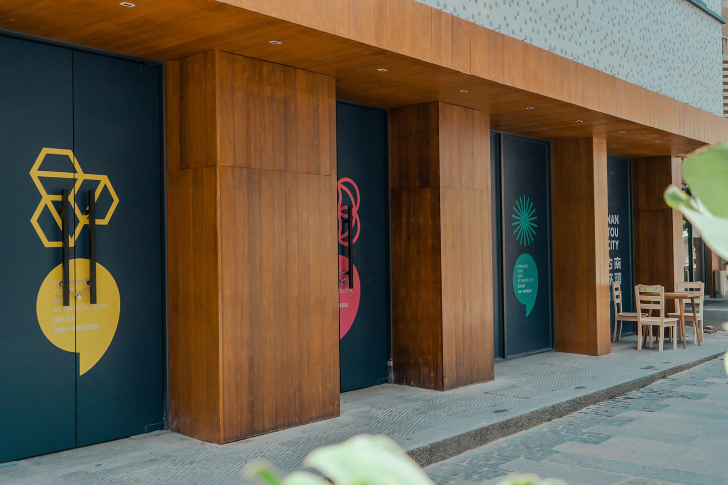
Maggie Chien, business director for Superunion China said, “Using this iconic visual metaphor we created a whole design language for Nantou City across a range of physical and digital applications, from website to wayfinding. Nantou City is not just a historical landmark that you visit once, but a place that you want to come back to time and time again, to relax, to stay, and to grow with. Instead of commercializing, we want to build the city into a sustainable cultural center and integrate it with the local lifestyle
Huang Nan, general manager of Shenzhen Nantou City renovation project said, “As we see the Greater Bay Area continue to thrive and develop, our goal is for Nantou City to retain it’s original architecture but also embrace contrast; old versus new, tranquility versus energy, simplicity versus intricacy. It is an expressive yet harmonious place, encouraging the organic and sustainable growth of all beings. We feel the new identity encapsulates this sentiment whilst being engaging and memorable.”

CREDITS:
Ray Lan – Managing Creative Director
Maggie Chien – Client Director
Ami Chan – Client Manager
Erin Zhang – Designer
Tommy Xiong – Associate Design Director
Sungmin Bae – Strategy Director
Irene Wu – Strategist