NEW YORK, USA — The early days of video gaming are the main inspiration behind sleek new identity and brand building work for agency Liquid+Arcade by creative studio and artist rep firm Sunday Afternoon.

Previously known as Liquid Advertising, the agency has worked with some of the biggest names in gaming and entertainment. The El Segundo, CA-based shop recently changed its name to Liquid+Arcade to reflect its full-service offering, from strategic development and creative work to authentic fan-based integrated experiences and media valuations.
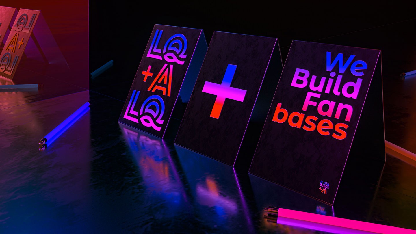
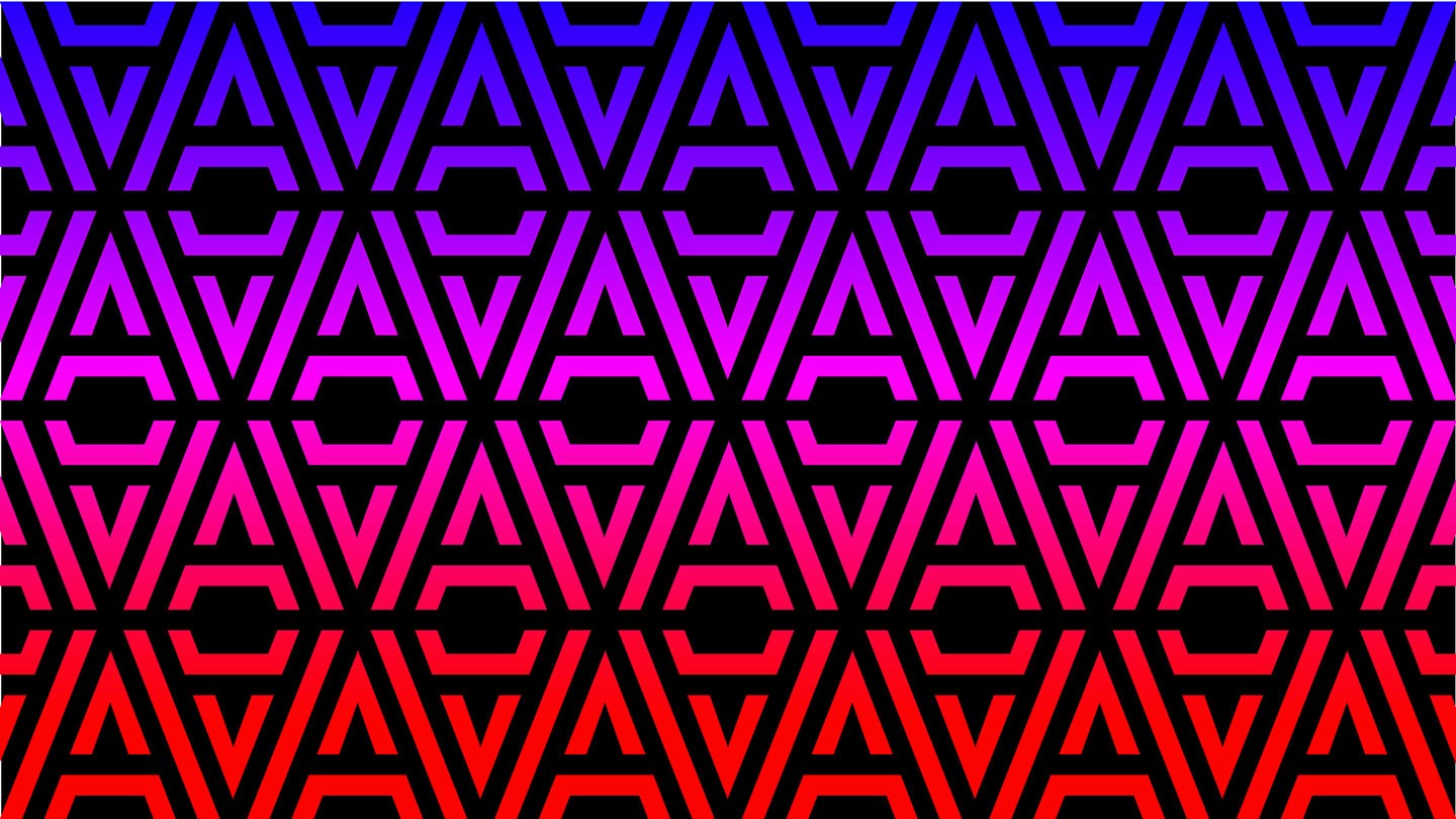
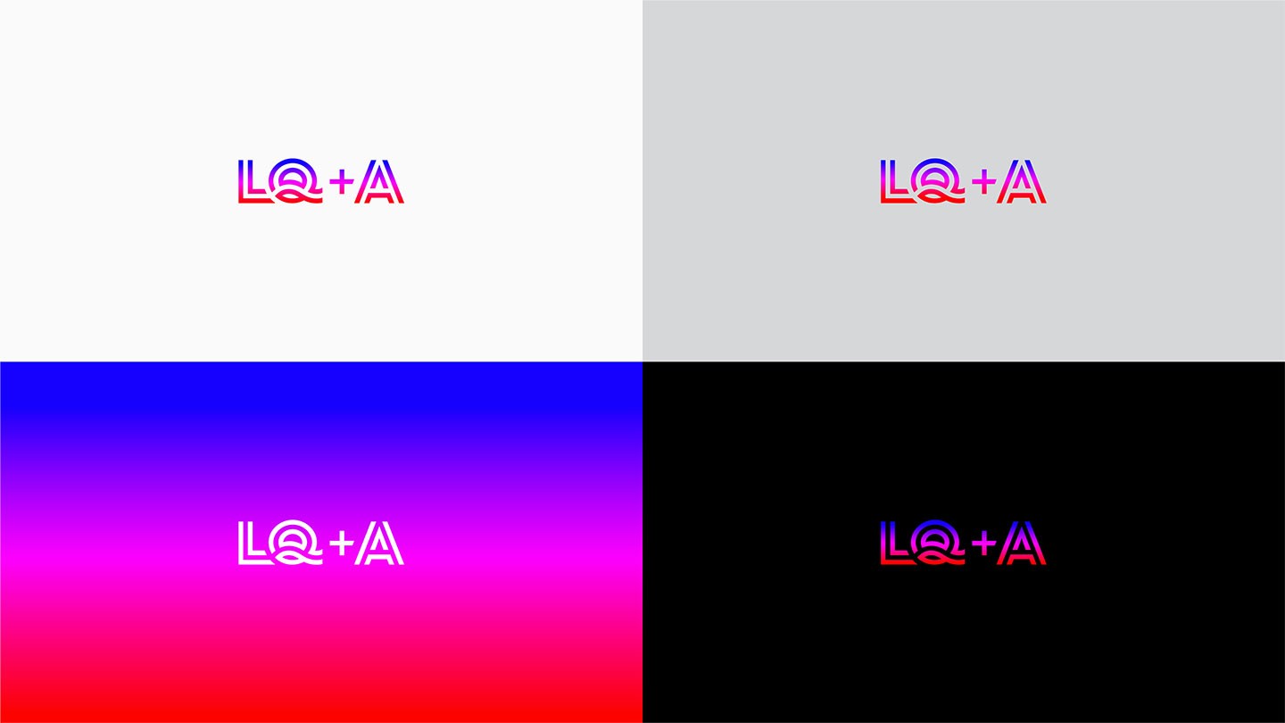
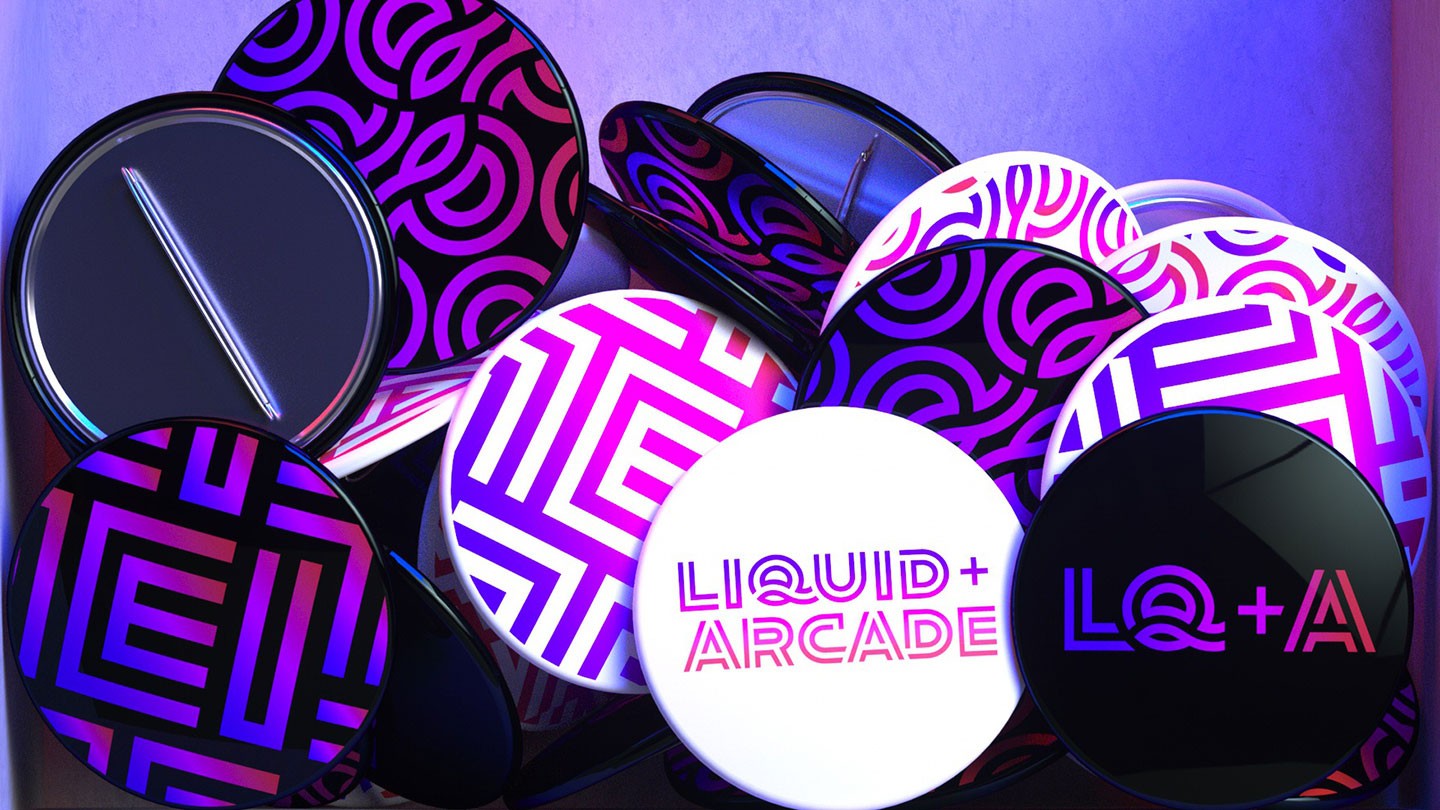
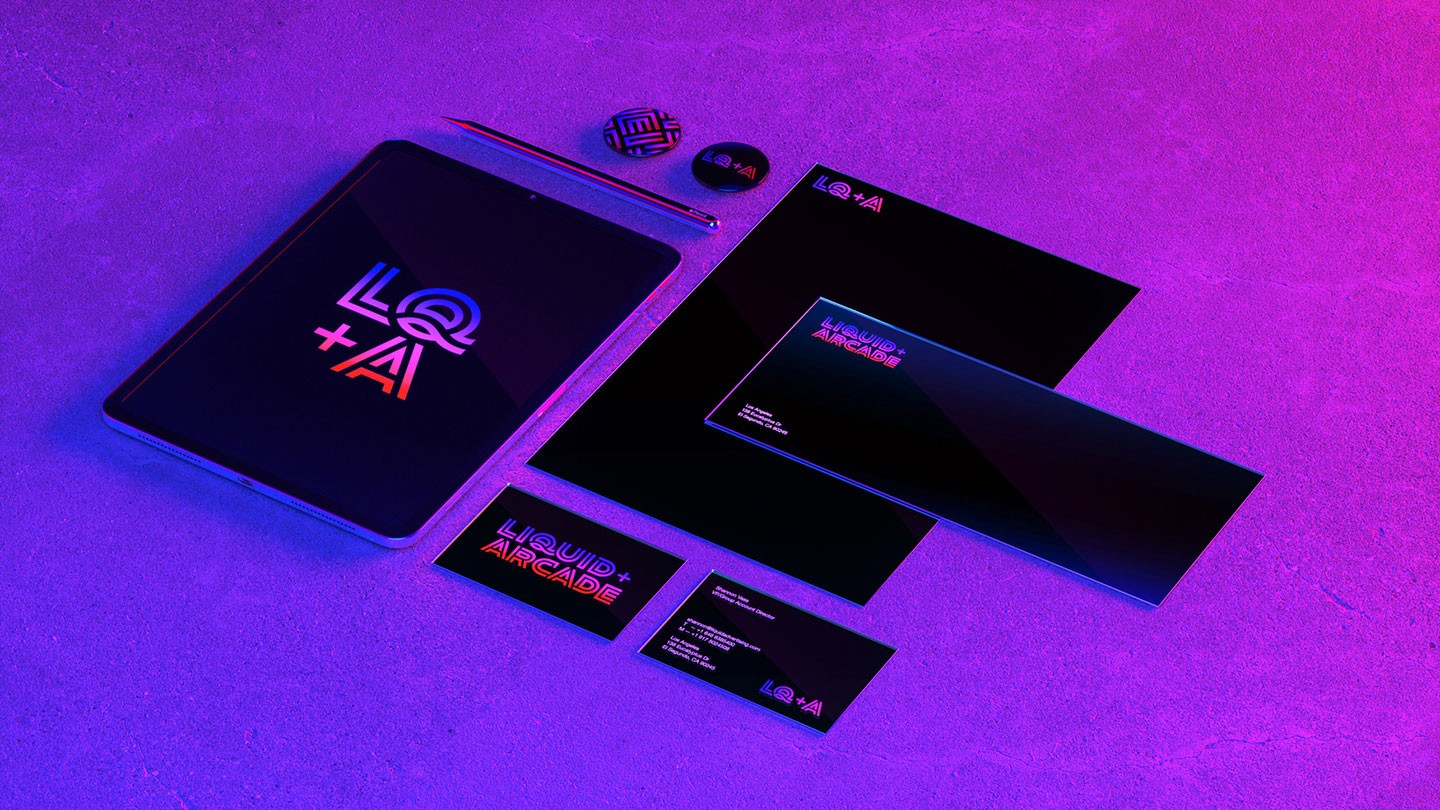
Sunday Afternoon worked with the agency to develop a new logo mark rooted in the world of early 1990s video games and arcades, then created a custom logotype inspired by neon signage using shades of white, blue, red and magenta. Each character consists of an inner and outer stroke to symbolize the duality of Liquid+Arcade as both a media and creative service agency.
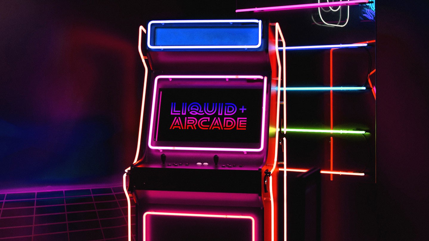
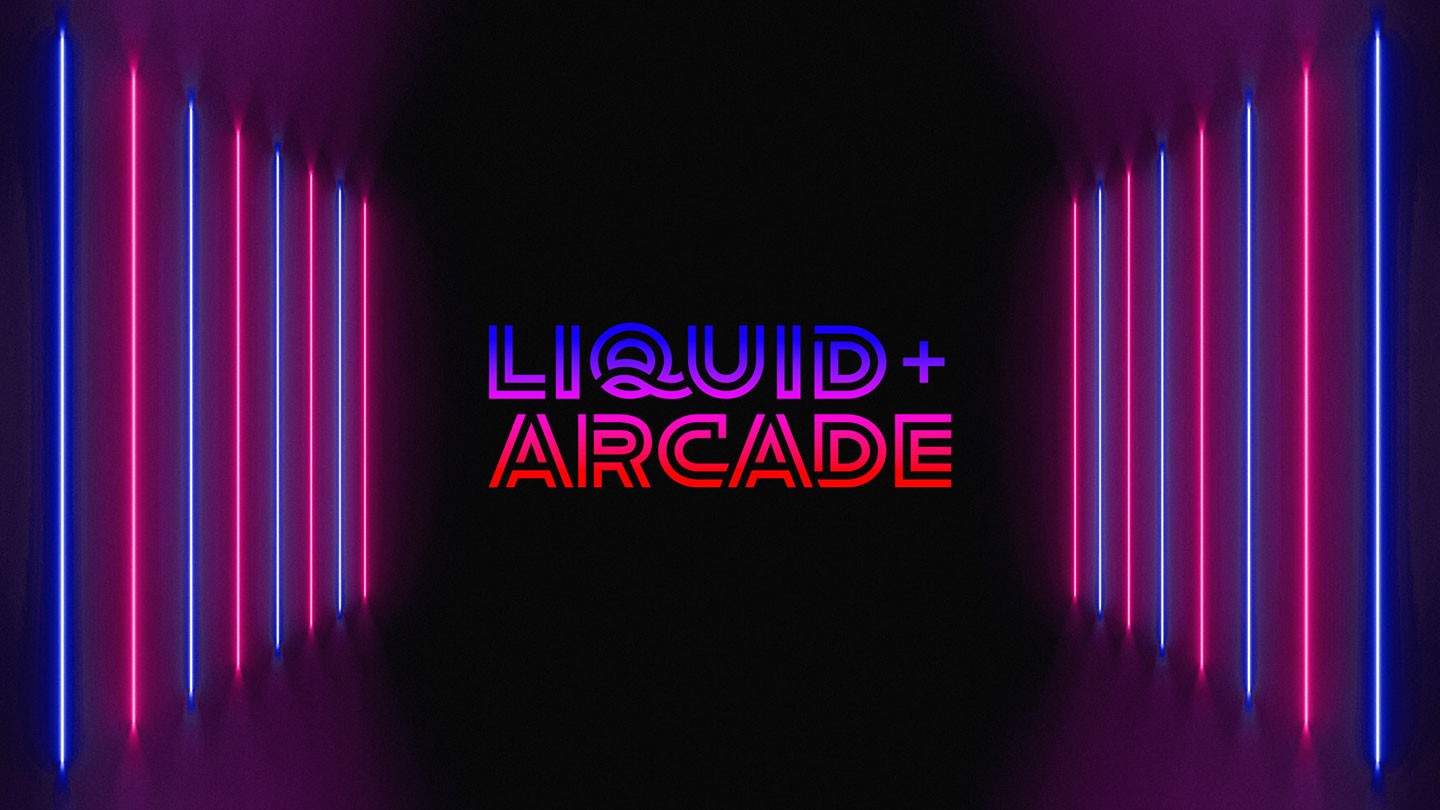


“Liquid+Arcade is an agency born out of the video gaming space, so that gave us a tremendous opportunity to lean into video game history and nostalgia,” said Juan Carlos Pagan, Co-Founder and partner, Sunday Afternoon, New York. “I spent many hours of my youth in arcades, and aimed to capture that neo-noir look and feel for the agency’s new identity.”
The project is the latest example of Sunday Afternoon’s branding work for creative agencies.


The studio built the complete identity system for Joan, founded by Lisa Clunie and Jamie Robinson. Taking inspiration from the agency’s ethos of continuously challenging, questioning and changing the status quo, Sunday Afternoon built a custom logotype around the sword, wielded by one of the greatest and most famous Joan’s of all time, Joan of Arc.
When Figliulo & Partners, a full-service agency founded by former TBWA CCO Mark Figliulo, wanted a new identity to mark their fifth anniversary, Sunday Afternoon suggested rebranding to the easier to pronounce FIG, a simpler and more youthful moniker. Playing off the agency’s comfortable and nurturing culture, the studio designed a modern mark displaying the new name written in beautiful sans, living amongst the branches of a ficus tree.