SYDNEY, AUSTRALIA — Heritage brand YHA has unveiled a contemporary new look and feel, underpinned by a new brand proposition, “Always Exploring,” via Houston Group.
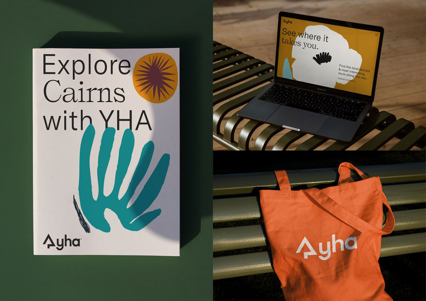
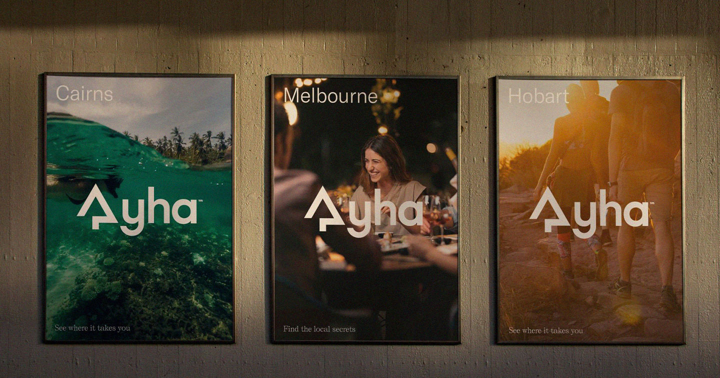
Houston created a new brand framework for YHA, including an evolved purpose and mission, updated values, and social impacts and brand positioning, ultimately creating a complete identity update with refreshed logo, design system, colours and photography.
Houston CEO Stu O’Brien said, “We entered into a partnership with YHA amidst Covid when the travel industry was facing its most challenging time. We knew it was time to ask some hard questions about ‘what does YHA want to be known for?’ and we quickly realized that sometimes accommodation marketing is about looking back at a brand’s heritage in order to look forward.”
“Our aim was to transform the brand to a contemporary, purpose driven, travel organization to engage new audiences and adapt to travellers’ rapidly changing accommodation needs. We were fortunate YHA’s team were equally invested in the change and were brave enough to empower the brand’s future. The brand’s history and heritage were essential foundations to YHA’s story, but we had to strike a delicate balance between the history and the need to be a contemporary and modern brand in order to compete in today’s – and tomorrow’s – competitive market,” Stu furthered.
The new brand positioning, “Always Exploring” is a core element of YHA’s brand evolution: “Developed with the intent to help the brand move forward addressing the outdated brand barriers head on, and promoting the core YHA offer,” explained Stu.
The new proposition and positioning is built from a core truth and social purpose that YHA makes travel more accessible by offering a range of different products, at different price points, in locations around Australia.

The refreshed look and feel inspires different experiences for every type of traveller. The diversity of locations (more than 49 around Australia) is showcased through the new place-inspired illustrations and connecting photography style, core elements of the new identity. The focus was to create a digital first, practical brand system adaptable across multiple elements, ensuring customers experience consistency, no matter how they are interacting with YHA.
The heritage and history have been retained by preserving the iconic “tree and hut” logo but the evolved logo also embeds the “Always Exploring” positioning through the arrow form and provides a modern new feel; green is still recognized as the brand’s core brand color, but is now supported by a broad color palette that stands out and provides cut-through across multiple assets.
“The brand story pays tribute to YHA’s heritage but supports the current and future plans for the organisation,” Stu concluded.
YHA CEO Paul McGrath commented, “Post-Covid customers expect more. YHA needed to reach new audiences and adapt to rapidly changing accommodation needs. Our new brand story and proposition “always exploring” perfectly aligns with the aspirational brand journey we are on as a business, and we are confident we now have the foundations to meet new business and market challenges.”
“The final result is a modern, contemporary and fun brand, that re-establishes YHA in the travel and accommodation category,” he concluded.
YHA’s brand refresh will be rolled out across all 49 Australian YHA locations in the coming months, including conducting photo-shoots to update images from all locations and properties.
CREDITS:
Houston Group
Stuart O’Brien – CEO
Allison Sims – Head of Strategy
Alex Toohey – Executive Creative Director
Michelle Whitehead – Senior Designer
Rachel Taylor – Account Director
YHA
Paul McGrath – CEO
Gieta Seymour – Head of Commercial
Alicia Crosariol – Senior Marketing Manager


