By Mark Tungate, editorial director, Epica
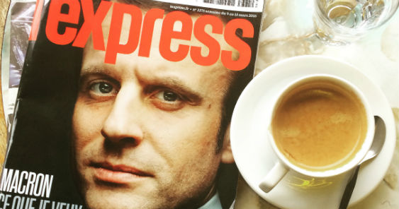
PARIS – When the highly regarded designer of the UK’s Guardian newspaper revamped the lackluster French newsweekly L’Express, the result was…well, newsworthy.
The man behind the redesign is Mark Porter, who set up his London studio Mark Porter Associates in 2010 after 14 years as creative director of The Guardian, where he oversaw the paper’s switch to the “Berliner” format in 2005.
So far, The Guardian has seen no reason to tamper with Porter’s award-winning design. With a touch of self-deprecation, he says: “It’s gratifying, but to be frank I think most of their energy is going into digital now, so they can’t be bothered to start redesigning the newspaper.”
His redesign of L’Express injects a sense of vibrancy and purpose into the 63-year-old newsweekly at a pivotal moment in its history. Under new ownership – it was acquired by entrepreneur Patrick Drahi’s Altice Media Group last year – and in the midst of a dramatic cost-cutting exercise, it is shedding staff and circulation.
Design-wise the magazine had been treading water: its covers were functional but unlikely to jump out from a kiosk. Porter’s new look incorporates a bold sans serif typeface and a visual pun that turns the title’s apostrophe into a speech bubble.
Porter says the redesign was completed on a short deadline. “We started talking late last year. I came to Paris to meet the publishers and the editors, and we had a good conversation about what media brands need to be these days, and how the design needs to work harder than just in the magazine.”
The next step was a solid brief – and Porter says L’Express had a clear idea of the challenges it faced. “Print in general is declining – in fact it’s remarkable that France still has four news weeklies – and they realised the design was tired and not working very hard for them.”

After that the research process began. “L’Express has an incredible history. It’s been a very important part of French cultural life in the past. Albert Camus wrote for the magazine; Françoise Sagan reported from Cuba. So of course we wanted to reflect that.”
Porter spent “a fantastic day” in the magazine’s basement looking through its archives. Among the treasures he came across was a 1970s design by legendary US graphic designers Milton Glaser and Walter Bernard. In fact, the witty use of the apostrophe is a nod to their vision.
“There were some graphic elements from the 60s and 70s that still seemed potent and felt very contemporary again now, so they fed into our design.”
He also took a close look at the competition. It immediately struck Mark that two of the rival titles looked more or less the same as L’Express, with a white logo on a red background. There was clearly an opportunity to break out of the pack, hence the graphically strong title piece.
“One of the things about designing a magazine now, as opposed to 15 or even 10 years ago, is that it’s not enough to just have a logo that works on the front page of the magazine – you need a logo that can work in other contexts: on the web, social media and so on.”
Inside the magazine, an “extremely readable” typeface was chosen. “Although the redesign was done partly to attract younger readers, the magazine still has a lot of older readers, so we wanted to make the text comfortable. After that, we tried to bring in some typefaces that looked contemporary and fresh, but were still recognisably the kind of typographic language you would find in a newsweekly. We were not trying to break away from the conventions of news magazine design, but to reinvent them in a more contemporary form.”
One trick, he reveals, is to bring a sense of scale to news stories by using bigger type for headlines. “There’s a kind of urgency about news presentation that makes it appropriate. The old design was very monotone, so we’ve tried to move up and down the scale more.”
Porter’s team also improved navigation by dividing the magazine clearly into sections – news, analysis, culture and so on – by colour coding them and “almost giving each section its own cover and table of contents”.
Although Mark hasn’t worked on the magazine’s web site, he says that with any print project, other platforms must be borne in mind: “We’re very aware that we have to create a logo with a strong personality so it can go out into the world. We also try to create a set of typographic conventions that are recognisable wherever they appear, so you get a feel for the brand in other contexts.”
Unusually, Porter is a self-taught designer. He studied Modern Languages at Oxford and learned design on the job, with stints at Benetton’s Colors magazine and the UK edition of Wired. But he admits to being inspired by 60s and 70s design, citing the iconic German magazine Twen and its art director Willy Fleckhaus.
As for Mark Porter Associates, it’s anything but underemployed. Right now its myriad projects include launching a new online newspaper called El Nacional in Barcelona (“This being 2016, when you launch a new newspaper you don’t do it in print, you do it on the web”) and continuing a partnership with the influential Rome-based news magazine (and website) Internazionale.
“One of the best things about what we do is that we get to work in so many different places,” Porter says. “I can’t design like a French person, because I’m not French, but we do try to immerse ourselves in the local design culture in order to do something that’s appropriate, without being a pastiche. It’s tricky – but fun.”