We’re seeing design shifts in 2015 that make for better viewing experiences, quicker information gathering experiences, and richer interactions with our software and hardware. It’s summed up as “giving you what you need, how you need, requiring less of your effort than ever before.”
RESPONSIVE DESIGN
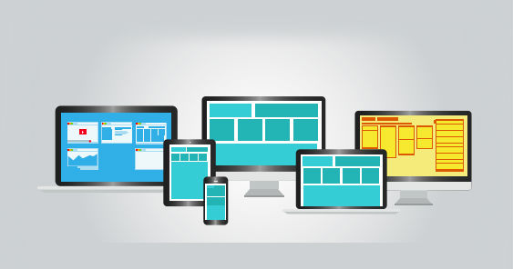
While responsive sites were considered avant-garde in 2012, most of the web stuck to “go with what you know.” However Google’s recent mobile-friendly update or “Mobilegeddon” means sites that don’t render well on mobile screens will now plummet in the rankings. This will push more businesses to adopt responsive sites, which redraw themselves on the fly to render perfectly on any screen size.
CONTENT-CENTERED DESIGN
“Look at me” design is shifting to “look at this” design–sites, their elements, and apps that serve visitors exactly what they want, with as little time spent looking for it as possible. This means graphic-heavy sliders are falling out of favor and large hero images are trending. Where appropriate, images and text are being replaced by icons, reflecting the visitors’ aversion to visual excess and desire to effortlessly reach their objective. Clean, minimalist styles like Flat Design and Material Design will continue to be adopted. Driven by the rise of mobile internet browsing, card-style layouts are another iteration of contentcentered design, allowing users to organize vast amounts of content, yet access what they need in the blink of an eye (see http://trello.com for an example). Cards serve as an entry point to more detailed information. Type “Jose Rizal” into Google. You are served several cards on the right: images, a bio, books, and search suggestions. These cards are delivered so that you can resolve your query without having to navigate to other sites and assemble the information manually. Card design is a paradigm shift away from content residing in pages that are linked together, towards individual pieces of content aggregated together into one, often personalized, experience.
MICROINTERACTION DESIGN
Microinteractions are product moments that have one primary task. Hitting snooze on your alarm clock, pairing your Bluetooth headset, logging in to a website, deleting an app, liking something on Facebook, and dropping the kickstand on your motorcycle are all microinteractions: they are omnipresent in our lives. Microinteractions have four elements: (1) a Trigger (e.g. press snooze button); (2) the Rules (e.g. music stops); (3) Feedback (e.g. LED turns red indicating snooze mode); and (4) Loops and Modes which determine the meta-rules (e.g. music comes on 10 minutes later). A well-crafted microinteraction pays attention to all four elements, and we’ll be seeing an increased focus on superbly designed microinteractions both online and in the Internet of Things.
About the author: Tony Ahn is credited with bringing reputation management to the country after opening the first reputation management consultancy in Manila, which has grown into a full-service digital public relations agency Tony Ahn & Co. He does training/consulting for brands such as Unilab, PLDT and Singapore Medical Group.
This article was first published in the May-June Issue of adobo magazine.