


Some of the most compelling creative work begins not with a campaign idea, but with a brand belief. This holds, even as global brands continue to seek more authentic ways to tell their stories,
That was the case for NIKKA Whisky’s dear difference, created by dentsu Tokyo, which earned a Gold and Bronze in Industry Craft and a Silver in Design at the Cannes Lions International Festival of Creativity 2026.
Rather than discussing copywriting or visual techniques alone, Cannes jurors reflected on the philosophy behind Taketsuru Pure Malt, especially on how the distinct personalities of whiskies from Yoichi and Miyagikyo are blended into something richer, and how the life of founder Masataka Taketsuru, known as the Father of Japanese whisky, remains inseparable from the brand’s identity.
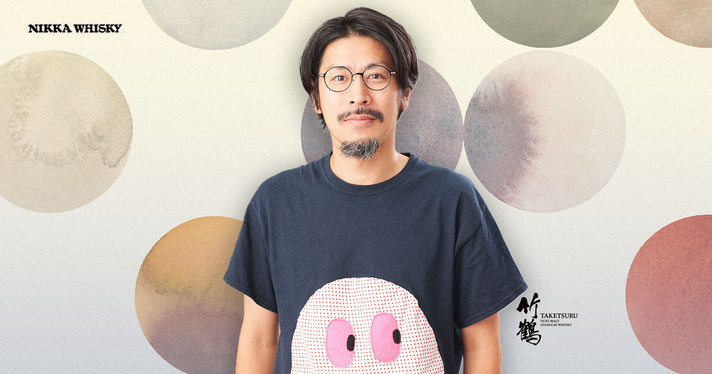
“What was ultimately recognized was not a single campaign, but the consistent way we translated that philosophy into design, craft, and brand experiences,” dentsu Inc. Creative Director Shohei Maeda said in an exclusive interview with adobo Magazine.
The recognition also marks a significant milestone for the agency, following last year’s Gold Lion-winning “NO LABELS” campaign. Together, these projects reflect a long-term creative partnership built around the agency’s long-term commitment to building the brand around the concept “Savour the joy of life.”
From blending whisky to blending worlds
Instead of treating Masataka’s biography as historical background, Shohei sees it as the campaign’s creative blueprint. The founder’s decision to travel to Scotland, learn the craft of whisky-making, and later establish Japan’s whisky industry alongside his Scottish wife, Rita, became proof that entirely new possibilities emerge when different people, cultures, and perspectives come together.
“The idea that when different things come together, they create richness that could never exist alone is something that was embodied by Masataka Taketsuru’s life itself.”
Masataka’s journey was one of constant encounters with difference. His education in Scotland laid the technical foundation for Japanese whisky, while his marriage to Rita challenged cultural norms at the time.
According to Shohei, although the couple faced challenges, those experiences became central to building a new whisky culture in Japan.
The same philosophy, he explained, is reflected in Taketsuru Pure Malt itself—a whisky created by blending malt whiskies with distinct personalities from NIKKA’s Yoichi and Miyagikyo distilleries. The concept of “difference” connects the founder’s life and the product.
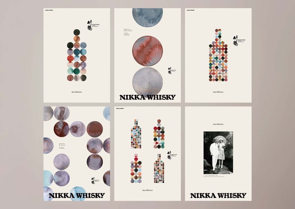
Hence, that realization became the creative team’s starting point. Rather than producing another premium whisky campaign centered on bottles, amber liquid, and luxury aesthetics, they searched for a visual language that could communicate blending as an idea rather than simply depicting the product.
“From there, we wanted to move beyond traditional whisky advertising. Rather than making the bottle the hero, we deconstructed the concept of blending into its smallest unit and arrived at a visual language built from dots,” Shohei explained.
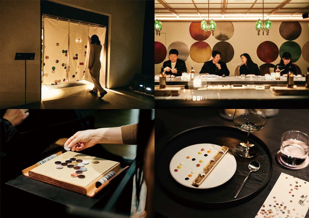
Each dot was designed to represent an individual character. As they overlap, separate, collide, and reconnect, they generate new forms, mirroring not only the blending of whisky but also the interactions between people, cultures, and ideas.
“Being different is not a flaw,” he said. “When different things meet and accept one another, new value emerges. The title, dear difference, became our way of expressing that belief.”
For Shohei, the idea extended beyond the campaign itself. He described the creative process as an embodiment of the concept, shaped through years of collaboration between dentsu Tokyo and NIKKA Whisky.
“This way of thinking emerged through countless conversations with our client as we searched for the true essence of the brand together,” he shared.
Building on the relationship established through last year’s Lion-winning “NO LABELS” campaign, both teams continued challenging each other’s perspectives.
“Looking back, the project itself may have been an example of dear difference. The client brought deep knowledge of the brand while the creative team brought new perspectives. Because we came from different backgrounds and viewpoints, we were able to challenge, inspire, and ultimately learn from one another, arriving at ideas that none of us could have created alone.”
Designing a new language for whisky
Finding that visual system required breaking away from conventions that have long defined whisky advertising.
Per Shohei, their “biggest challenge” was finding a visual language for Taketsuru Pure Malt that did not rely on conventional luxury codes. He noted that whisky campaigns in Europe often revolve around beautifully photographed bottles, glasses, and liquid, while Japanese brands frequently lean into traditional imagery associated with Japanese craftsmanship and heritage.
As they didn’t want to rely on either of those codes, the team asked what kind of visual identity could belong only to NIKKA.
“Taketsuru Pure Malt is an innovative whisky that creates new value by blending whiskies with different personalities. We believed the visual expression should embody that same philosophy. It needed to be something neither conventionally Western nor Japanese, something uniquely NIKKA.”
That thinking then shaped every movement within the film.
“Every dot in the film plays a different role,” Shohei explained, adding that the movement of the dots became a metaphor for both human relationships and whisky-making itself.
“Some move closer together; others pass by one another. Some influence each other, while some never meet. Sometimes a seemingly insignificant dot creates harmony only when it encounters another.”
He continued, “We saw this as a reflection both of human relationships and of the nature of Taketsuru Pure Malt, where distinct whiskies come together to create entirely new flavors.”
Through these dots, the team sought to convey the emotional stories behind them rather than literally illustrating the blending process. The result, Shohei said, became “a new kind of whisky visual expression, something that could only have come from this brand.”
“By continually exploring the essence of the brand, we aimed to create something that went beyond simply representing blending. We wanted viewers to feel the human stories behind it.”
When craft embraces chance
Although dear difference appears meticulously designed, much of its beauty comes from relinquishing control.
The team initially explored producing the visuals entirely through CGI (computer-generated imagery) and advanced digital techniques. However, as development progressed, they realized that precision alone could not capture the campaign’s central idea.
“We considered creating the entire project digitally, using CGI and other advanced technologies. But we eventually felt that approach couldn’t fully express what dear difference was trying to communicate: the moment when different elements meet and create new value.”
Instead, the creative process embraced experimentation.
“We weren’t seeking perfectly controlled beauty. We were seeking beauty created through collaboration between craftsmanship, nature, and chance,” Shohei said.
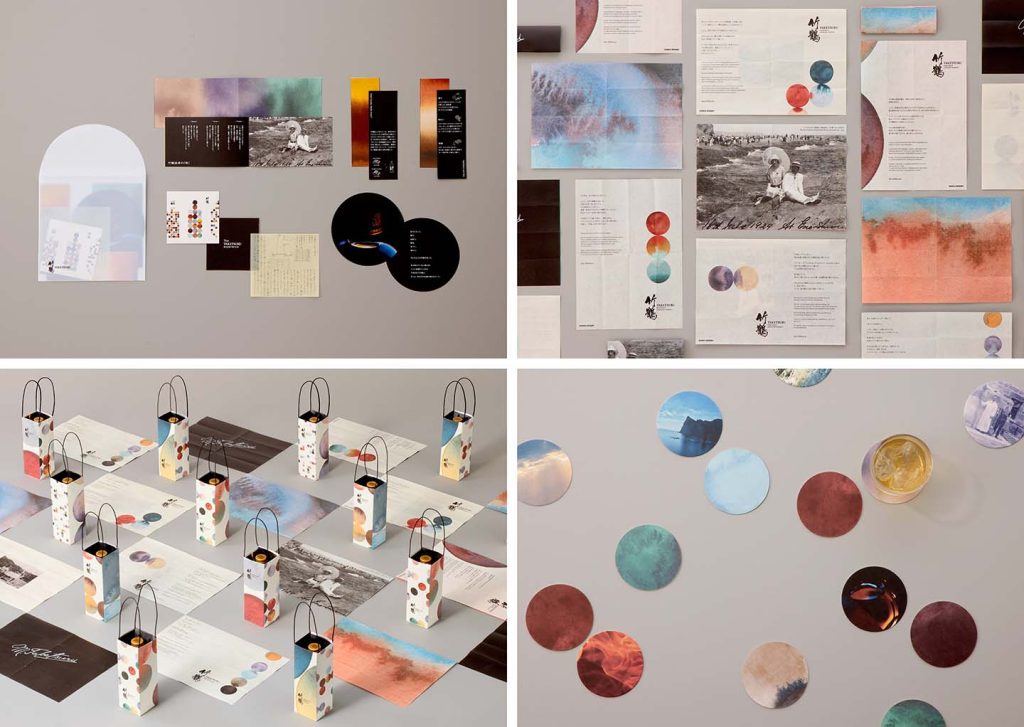
To achieve that, the team mixed ink by hand and documented unpredictable physical reactions, believing that these uncontrollable moments reflected the philosophy behind Taketsuru Pure Malt more truthfully than computer-generated imagery ever could.
“Just as whisky itself is created through a dialogue between human intention and natural forces, we wanted unpredictability to become part of the visual system.”
The production ultimately involved more than a thousand experiments, testing different materials, techniques, and filming methods in search of moments that nature itself could create.
Technology still played an important role, not by replacing craftsmanship but by revealing what is usually invisible.
“The high-speed Phantom cameras and time-lapse photography served a similar purpose. They allowed us to reveal transformations that are normally invisible to the human eye.”
Because whisky derives much of its character through aging, the team also treated time itself as a creative medium.
“Whisky is a product whose value is shaped by time. We wanted time itself to become one of our creative materials,” Shohei said.
Beyond cultural labels
While many audiences have interpreted dear difference as distinctly Japanese, Shohei revealed that expressing “Japaneseness” was never the objective. Instead, the team frequently returned to the philosophy of “wakon yosai” or “Japanese spirit, Western learning,” a principle that also shaped NIKKA’s own history by combining authentic European whisky-making with a distinctly Japanese approach.
“We also shared a strong appreciation for the Japanese aesthetic of restraint. We valued space, silence, and ambiguity. Rather than explaining everything, we wanted to create a world audiences could interpret and imagine for themselves,” Shohei underscored.
The team eventually uplifted the nature of whisky itself, saying that it is not something that can be fully explained through words but something experienced through aroma, flavor, and emotion.
The team was surprised when people in Cannes discovered how audiences connected with the campaign’s apparently universal message.
“At Cannes, many jurors connected deeply with the idea of celebrating ‘difference’ itself,” Shohei recalled.
“What surprised us was realizing that dear difference was not simply a Japanese idea.”
He continued, “Regardless of nationality or culture, people grow through encounters with different perspectives, cultures, and individuals. Perhaps that is why the work was ultimately received less as a whisky advertisement and more as a human story.”
Ultimately, Shohei believes meaningful creativity transcends geography.
“What we wanted to express was not ‘Japaneseness,’ but Masataka Taketsuru’s lifelong belief that new value emerges when differences are embraced. In that sense, there may be no real boundary between local and global. What truly moves people is not local symbolism, but universal human experiences and emotions,” he said.
“If, through sincerely exploring that truth, the work naturally reflects values unique to Taketsuru and Japan, then we couldn’t be happier with the result,” he noted.
Uplifting the true essence of brands
Reflecting on the campaign’s global success, Shohei hopes emerging creatives across Asia resist the temptation to chase cultural stereotypes in pursuit of international recognition. Instead, he encourages creatives to begin with a much simpler question: what is the true essence of each respective brand?
“My advice would be, ‘Don’t start by trying to create something that looks ‘Japanese.’ We certainly didn’t. Instead, we kept asking ourselves what the true essence of the Taketsuru brand was. Through that process, we arrived at the idea of dear difference.”
Although the campaign originated from a uniquely Japanese story, he believes its emotional resonance came from speaking to something universal, where authenticity remains the strongest bridge between local culture and global relevance.
“Rather than trying to export local culture, focus on thoroughly exploring the values you genuinely believe in. If you honestly do that, I believe your work will resonate across borders.”
He concluded, “Winning at Cannes this year once again reminded us of that.”
READ MORE:
dentsu Day 2026 explores the future of brands in the age of AI and cultural transformation