MANILA, PHILIPPINES — A brand refresh is a perfect route to take for a business that wants to update and revamp its identity while still keeping its core image. But how exactly do you go about putting a new spin on established brands that Filipinos have known and loved for many decades?

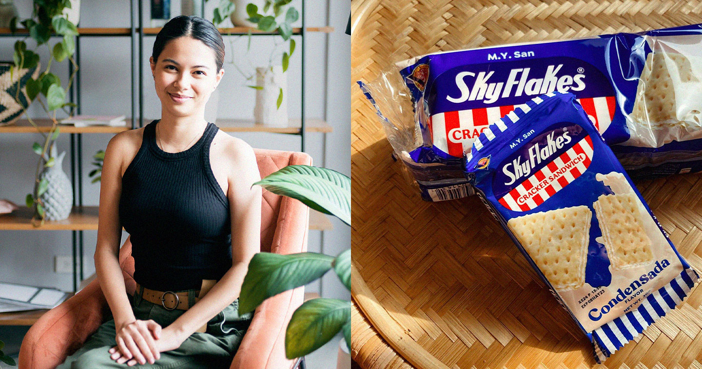
While projects like these pose a tricky challenge, designer Marla Darwin and the rest of the team at Natural Selection Design (NS Design) definitely hit the nail on the head for the recent brand refresh of leading Filipino cracker brand SkyFlakes.
Having been around since the 1960s, Monde M.Y. San’s SkyFlakes is probably one of the first things that come to mind when local customers think of a classic cracker. You’d be hard-pressed to find a Filipino who can’t easily pick out a SkyFlakes pack or box in a shelf full of snacks within seconds without even taking the time to read any brand names. However, just because the brand recognition that SkyFlakes has built throughout the years makes it instantly recognizable doesn’t mean that there’s no room for a brand refresh that can modernize its image. It just means that it’s the kind of project that needs even more care woven into the creative process.
“With a brand as big as SkyFlakes, we’re working with decades worth of brand equity. Every Filipino has a relationship with this brand and any change has to be navigated with care,” said Marla. “There’s a lot of back and forth during this process. Often the brand will do some tests and then come back to us with new things to adjust. Which is why it takes a long, long time to see something we design on the computer actually make it to a supermarket shelf.”
A lot of care and thought particularly goes into which parts of the iconic branding the team wanted to keep and which ones they wanted to refresh.
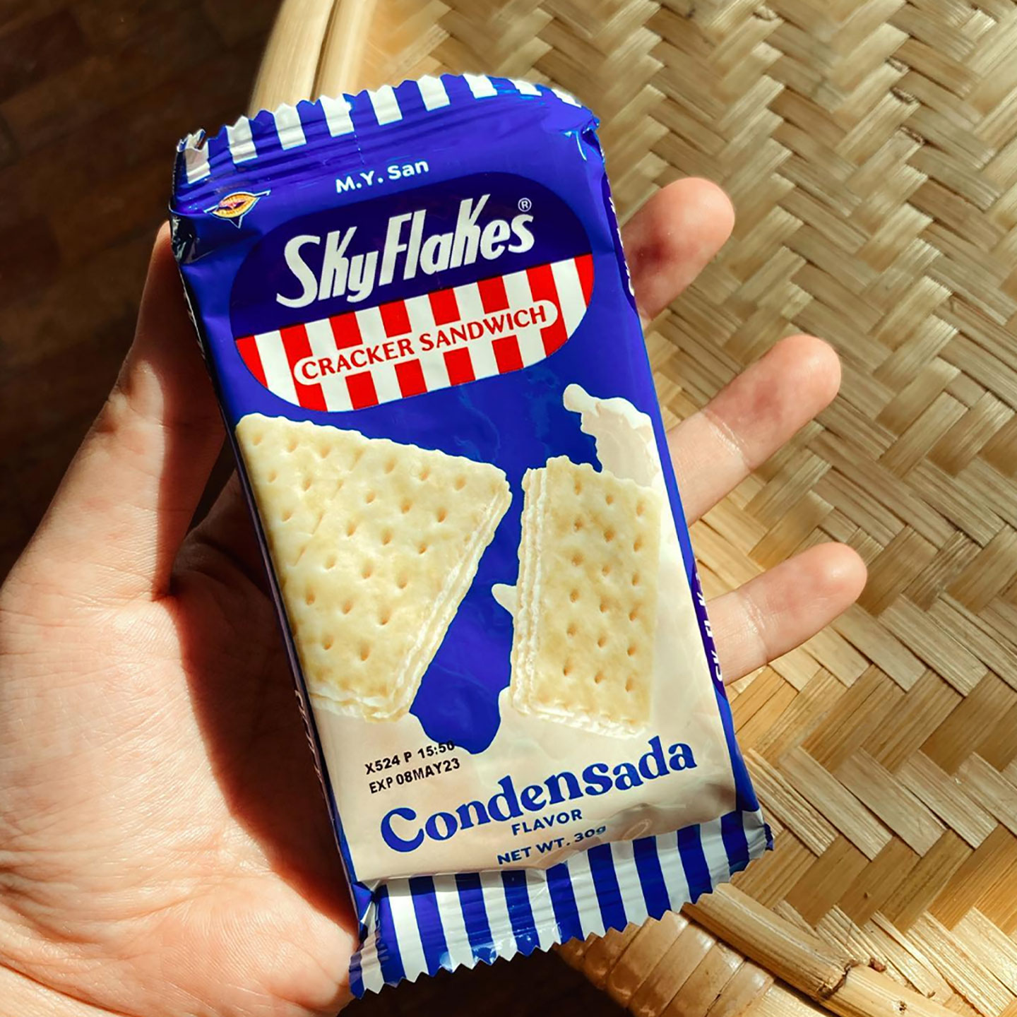
“In the case of SkyFlakes, we don’t touch the logo, especially the most recognizable elements. These would be the red and blue. The SkyFlakes typeface. The rounded rectangle shape. The stripes. [However,] we felt like we could update the type for ‘Crackers’ and ‘Cracker Sandwich.’ A lot of the directive was to honor the legacy of the brand while bringing it to the future,” Marla explained. “For type selection, this translates to studying vintage type and then finding versions that have cleaner lines. It’s a practical decision as well, not just an aesthetic one. When you clean up type, it becomes more legible and becomes a main cast member on the package.”
“Another big decision was to free ‘M.Y. San’ from the rounded rectangle,” she added. “There are other brands under the M.Y. San mother brand and giving it a designated space above the logo gave order and consistency (e.g., another M.Y. San brand we handle is Fita).”
Marla said that this decision to go for the round, sans serif for M.Y. San achieves this friendlier feel. “The consumer base of SkyFlakes is very broad, and as much as possible we want to be able to speak to all its demographics. SkyFlakes is enjoyed across generations and it’s a staple in office drawers and school lunch boxes. This kind of familiarity feels like family. It’s the same type family we use for the net weights and declarations. These are singular changes that make a big difference in organizing elements within small spaces, which is so much of packaging design.”
She also expounded on the team’s decision to go even friendlier with the product variant. “We wanted the eye to travel down this hierarchy: SkyFlakes = enduring, dependable, M.Y. San = familiar, friendly. Then, when the eye finally gets to the bottom, we wanted it to be an invitation to flavor and excitement. The type still has that fresh serif-but-not-so-serif look — [which combines the] old world and the new world! Then, we set the individual letters in such a way that they look like they’re dancing.”
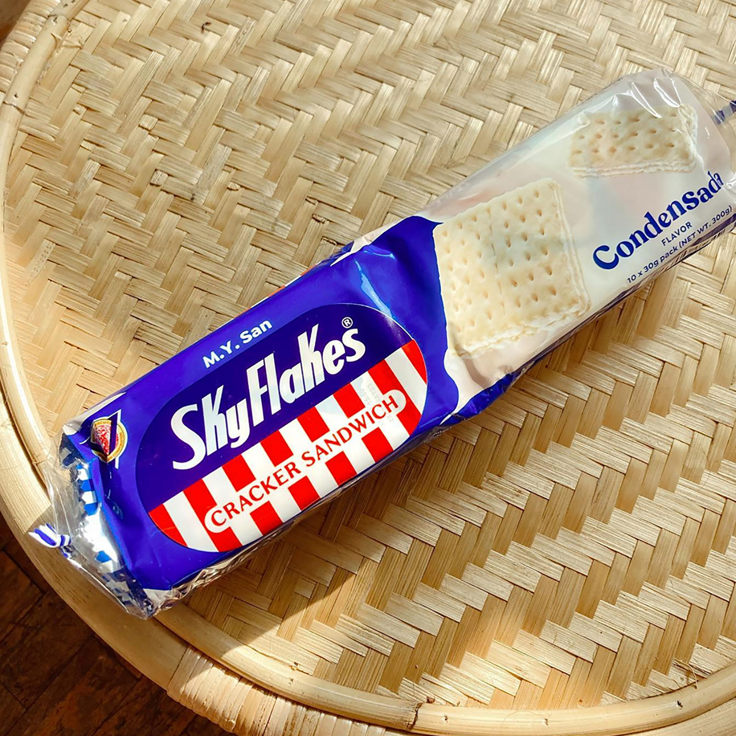
According to Marla, though, the most labor-intensive change in the pack design is the product shot. “The brand managers told us that they wanted to do away with the original angle, wherein the cracker sandwich is intact and slanted. This time they wanted the cracker sandwich broken in half in order to communicate how crisp and filling the product is. Then behind the cracker sandwich, splashes of cream filling,” she recalled. “Our project manager actually broke up pieces of the sandwich cracker and took pictures of proposed placements with her phone. This is how we figured out the ideal shapes and lines. Once that was finalized with the SkyFlakes team, we organized a shoot with a photographer and stylist to translate the approved forms. Then we outsourced the splash fillings to a 3D artist, who designed how the splashes will interact based on the product photos we submitted to him. It’s many, many moving parts.”
The work NS Design has done on this refresh captures exactly what the team was going for: something that brings SkyFlakes to the future while keeping it grounded in what makes it a classic Filipino brand. It’s the kind of result that can be expected when creatives truly understand a brand’s essence, and with a working relationship like NS Design and SkyFlakes, it’s not a surprise that that was exactly the case for this project.
“SkyFlakes has been a client of ours for a few years now. We closely work with their brand managers and I can’t imagine it any other way,” shared Marla. “It kind of feels like a team sport or an assembly line, because after we do our parts, we pass it back to the brand managers and they’re the ones who work with the printers and material selection. There’s trust between our studio and SkyFlakes, and it’s something we’re very grateful to have.”
This successful brand refresh is just one of the many stunning projects for food brands that Marla has taken on, and it definitely won’t be the last. Especially not with the abundance of inspiration at her disposal. When it comes to finding the inspiration for projects like this one, Marla said that she finds a lot of it in the same place the designs end up: on supermarket shelves.
“I am obsessed with packaged goods because it’s a brand touchpoint that’s so tactile. It’s something that has to catch your attention and that’s not even enough,” she expressed. “The design has to compel you to pick it up and examine it. You don’t have to be a designer to recognize elements that excite you. But it will take a designer’s eye to break down those elements and figure out how to get them to interact harmoniously.”
“This is a very long-winded way to say that I love markets, any market,” Marla added. “It can be Whole Foods or a curated shop like Foxtrot in the States, or it can be the local talipapa. Our local markets give you an idea of what colors and textures are part of our zeitgeist – which are crucial in understanding the visual cues that resonate with Filipinos.”