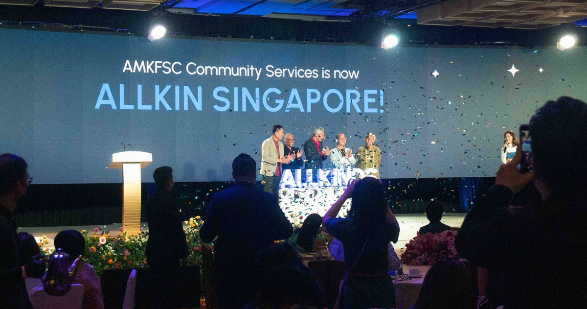
SINGAPORE — AMKFSC Community Services unveiled its rebrand to Allkin Singapore at its 45th Anniversary Charity Dinner at Marina Bay Sands Convention Centre. Officially launched by the agency’s Guest-of-Honor and Patron, Prime Minister Lee Hsien Loong, the new brand was the result of months of hard work by creative agency Design Bridge and Partners, which was appointed to take on this project in 2022.
Allkin Singapore began in 1978 as Ang Mo Kio Social Service Centre, which was Singapore’s first Family Service Centre (FSC) and the pilot model for all FSCs nationwide. The agency later changed its name to AMKFSC Community Services upon corporatization in 2014.
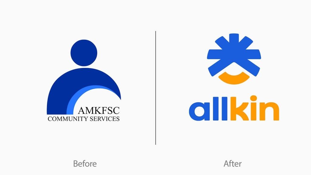
The new brand name, a compound of the words “all” and “kin,” captures the spirit of the organization – one that embraces inclusivity, fosters togetherness, and kindles connections between employees, beneficiaries and communities. The refreshed identity signals Allkin Singapore’s aspirations to not only serve those in-need, but also open new doors for people from all walks of life to make a positive impact on their communities. It also reaffirms the agency’s identity and aspiration as an inclusive, forward-looking, and community-centric organization.
Dr Vincent Ng, CEO of Allkin Singapore, said: “To reflect our growth over the last 45 years and to reinforce our identity as an inclusive, forward-looking, and community-centric organization, it is crucial for us to strengthen our identity to better encapsulate our renewed strategy, expanded scope of services, and geographical boundaries more accurately. We look forward to opening doors to new possibilities for Singapore’s social service sector, by continuing to go above and beyond meeting the shifting needs of our society. Design Bridge and Partners were able to capture and bring to life this vision through Allkin.”


The new logo was designed to embody the essence of the Allkin brand, with fresh blue hues that evoke a sense of being grounded and trust, and the introduction of a new orange that evokes hope and optimism. The sparkle symbol was chosen to illustrate the intersection of people, sparking new connections, ideas and beginnings, with the smile representing its welcoming, people-first nature. The subtle integration of the letter “A” represents a nod to Allkin Singapore’s history and legacy.
Ambrish Chaudhry, Head of Strategy at Design Bridge and Partners, said: “We take great pride in helping homegrown Singaporean brands reach their full potential. It has been a pleasure to work alongside the Allkin team, seeing them make a positive impact in the lives of Singaporeans every day. Our aim was to create an approachable identity that lives up to their ethos. The Allkin name alludes to their openness and willingness to serve the community, as they journey beyond a family service centre. The visual identity brings in patterns sourced from the neighborhoods they serve to make the brand feel fresh and familiar at the same time.”
Design Bridge and Partners have been involved in several high-profile branding projects in Singapore including FairPrice Group, SGX Group, Lazada, Carousell, Great Eastern and Trust Bank.
CREDITS:
Ambrish Chaudhry, Head of Strategy
Lena Lee, Strategist
Charlotte Cheong, Senior Client Manager
Lorraine Kong, Client Manager
Jie Ni Liew, Design Director
Johnson Tan, Designer