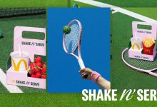
McDonald’s is arguably one of the most well-known brands in the world, and its visual identity overhaul is long overdue and actually comes as no surprise. In late 2017, the company tapped Turner Duckworth to lead the food chain’s makeover, the same guys behind Burger King and Subway’s visual rebranding. And we’re really lovin’ it.
Turner Duckworth’s San Francisco team broke the project down into three steps: decluttering; highlighting standouts about the brand; and identifying latent opportunities that weren’t already being mined.

Inspired by all of McDonald’s visual symbols – the Golden Arches, a Big Mac, a red container of fries, Ronald McDonald — these elements were then brought together, simplified and unified. The team took inspiration from McDonald’s ‘You Deserve A Break Today’ campaign from 1971 created by Needham, Harper & Steers in Chicago, and decided it wanted to bring that joyful legacy to every consumer interaction, including the design.
Golden Arches Takes Center Stage in New Identity


Turner Duckworth has put McDonald’s Golden Arches at the cornerstone of the new identity, creating a simple yet playful and dynamic look throughout the brand’s communications. Red has always been the predominant color in McDonald’s brand but with the overhaul, the Arches’ golden yellow takes the spotlight.
“We’ve really aimed to embrace the “Golden” part of the Golden Arches. We also slightly tweaked the colour targets for McDonald’s gold and red for legibility and optimum ‘foodiness’.” says Colin Mitchell, McDonald’s VP-Director Global Brand. “Too much red in the brand felt aggressive and shouty.”
Speedee: The Answer To Too Many Typefaces


From a mishmash of fonts, Turner Duckworth opted to ditch those and introduce the new visual identity with one standard font: Speedee. The new typeface — developed by Dalton Maag who also worked with Netflix, Airbnb and BT, aimed to simplify the branding.
“We sketched up initial letterforms taking inspiration from the form of the Golden Arches and the McDonald’s wordmark, and the typeface used in the iconic McDonald’s ‘You deserve a break today’ ads from 1971. Speedee is friendly and characterful, but also highly legible and functional.” The font name is derived from McDonald’s Speedee Service System.
Simplified Patterns and Icons? Simply Delightful.


McDonald’s new visual identity embraces the principal of “flawesome,” celebrating the quirks and irregularities that naturally occur with food. The spunky concept will be incorporated in the new merchandise sold; interior design at the company’s headquarters (with walls displaying cheese and french fry–inspired graphics) and on animations that will be public soon through various platforms.


The new visual identity is simple, yet creates a more dynamic and consistent feeling to McDonald’s overall look and brand. The focus on the burger chain’s well-loved Golden Arches visual — undisputedly the highlight of this overhaul — gives off a more minimal and playful vibe that adapts with the modern aesthetic of today’s design trend, at the same time capturing the qualities we all love and embrace about McDonald’s. While there are still more designs in the works and to be revealed, we can’t wait for the new identity to hit stores all over the world.