DIGITAL – You’re probably thinking, “no, they didn’t.”
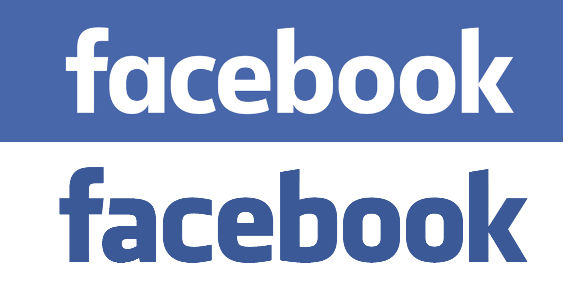
It might seem like they did not redesign their iconic 10-year-old but they actually did. Take a look at the juxtaposed old and new logo.
See it now? You will initially notice the difference in the letter ‘a’ that went from a double-story character to a single-story. The letters also seem more rounded and not just on the edges. The letter ‘b’ also already has a noticeable tail. The font type, Klavika, however, was retained.
The new wordmark was first revealed publicly through a tweet by Facebook product designer, Christophe Tauziet.
Say hello to the new Facebook logo pic.twitter.com/ofoFm4JQmK
— Christophe Tauziet (@ChrisTauziet) June 30, 2015
On a follow up tweet by Tauziet, he mentioned that the new logo was the doings of Facebook Creative Director Josh Higgins and Graphic Designer Tim Belonax together with Eric Olson and his crew over at Process Type Foundry.
In a report by design website Brand New, Higgins shared a statement regarding the subtle redesign:
“When Facebook’s logo was first created in 2005, the company was just getting started and we wanted the logo to feel grown up and to be taken seriously. Now that we are established, we set out to modernize the logo to make it feel more friendly and approachable. While we explored many directions, ultimately we decided that we only needed an update, and not a full redesign. We worked with Eric Olson—whose typeface Klavika was used in the original logo—and developed a custom typeface to reflect where we are now and where we are headed.”
We’ll start seeing the new wordmark, starting probably in the Facebook homepage in the next few months.