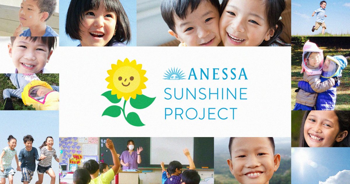
MANILA, PHILIPPINES — As we step into a new era where wellness and outdoor activity are at the forefront of child development, ANESSA is proud to launch the #ANESSASunshineProject – an initiative designed to nurture children’s holistic well-being through safe and healthy outdoor experiences. The initiative goes beyond simply protecting children from the sun; it empowers them to embrace its benefits while promoting lifelong habits of health, joy, and outdoor adventure.
A vision that begins in Japan and expands across Asia
The Sunshine Project is more than just a campaign – it’s a movement that started in Japan and will eventually span across 12 countries and regions in Asia where ANESSA products are available, including the Philippines. With a goal of reaching over 300,000 children by 2030, the project seeks to make a lasting impact on children’s lives by fostering an understanding of the sun’s power and how to enjoy it responsibly.
Through this expansive reach, ANESSA aims to provide educational experiences, tangible support, and opportunities for children to safely play under the sun. The initiative embodies the brand’s core purpose, “Free to Shine: Let people shine infinitely under the sun,” and reflects ANESSA’s dedication to giving children the tools they need for physical and emotional well-being.
Three pillars of holistic wellness
The #ANESSASunshineProject is built upon three main activities that focus on fostering lifelong well-being through outdoor play and sun safety:
Participatory events for children
The first pillar centers on creating opportunities for children to engage in outdoor activities that support their overall well-being. ANESSA will host a series of exciting and interactive events that encourage children to step outside, explore, and have fun. These events will provide a safe, structured environment for kids to embrace the benefits of physical activity in nature – whether it’s playing games, running through obstacle courses, or simply enjoying the fresh air. The goal is to give children the freedom to experience the joy of being outside, without the worry of sun exposure, thanks to the effective protection of ANESSA’s sunscreen products.
By making outdoor play an enjoyable and educational experience, ANESSA hopes to inspire children to develop a positive relationship with the sun. These events are designed to show children that spending time outside doesn’t have to come with fear of harmful UV rays. Instead, it’s about empowerment – equipping them with the knowledge and tools they need to enjoy outdoor activities safely.
UV Education: Empowering the next generation
Knowledge is power, and the Sunshine Project places a strong emphasis on UV education. ANESSA will continue to educate children, parents, and schools about the importance of UV protection and how to enjoy the outdoors safely. Understanding the science behind UV rays and the damage they can cause is crucial in preventing future health issues like skin cancer.
The project will provide schools and communities with the resources to teach children about UV safety, using fun and engaging methods to ensure that the message is received loud and clear. In addition, parents will be equipped with the tools to protect their children from the harmful effects of the sun while still allowing them to have fun and be active outside. This will include everything from sunscreen education to the importance of wearing hats, sunglasses, and UV-protective clothing.
By integrating UV education into daily life, ANESSA ensures that children grow up with the awareness and habits necessary to enjoy the sun without fear, while maximizing the benefits of outdoor time.
Suppot for Xeroderma Pigmentosum (XP) patients
For some children, exposure to the sun is not just a matter of choice – it’s a medical challenge. ANESSA is committed to supporting those who suffer from Xeroderma Pigmentosum (XP), a rare genetic condition that makes the skin hypersensitive to UV light. Those with XP are unable to naturally protect themselves from UV rays, which can cause severe damage and increase the risk of skin cancer.
As part of the Sunshine Project, ANESSA provides sunscreen products and financial support to individuals living with XP. This initiative ensures that families dealing with the challenges of XP have access to the resources they need to protect their children. By offering both practical and financial assistance, ANESSA is working to make the world a safer and more inclusive place for all children, regardless of their health conditions.
Building a future of sun-safe fun and wellness
The #ANESSASunshineProject is more than just sunscreen – it’s about fostering healthier, happier lives for children through outdoor play, sun safety, and UV education. By empowering the next generation with the knowledge and habits to thrive under the sun, ANESSA is helping children build a foundation for lifelong well-being. Join ANESSA in making the world a brighter, healthier place for children everywhere.