The values a nation holds can give birth to a design identity, and in-turn, can become a country’s own branding.
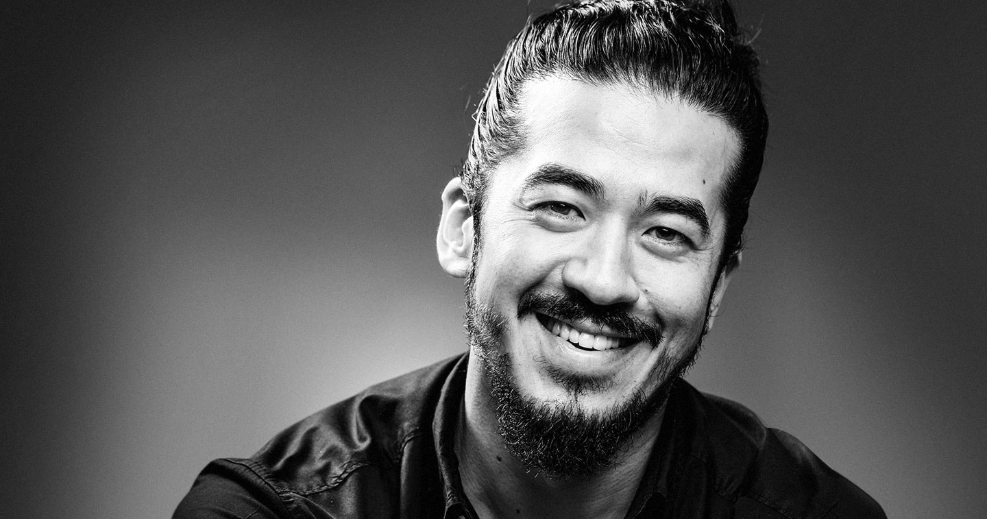
In a press conference held at the Department of Trade and Industry (DTI) to announce Scandinavia’s leading design studio, Jacob Jensen Design’s (JJD) plans of putting up a studio in the Philippines as well as its future involvement with the country’s Creative Economy Program in the Philippines, Timothy Jacob Jensen (CEO and Chief Designer) began his presentation with introducing the values of Scandinavian design: Honest. Caring. Peaceful.
DO AS THE DANISH DO
Denmark is known as one of the world’s leading design hubs, as well as one of the most peaceful nations. They are the highest tax paying country in the world, but because of this, the benefits of the nation are given tenfold to its citizens, bringing economic prosperity throughout. Danes are proud of their nation, proud of who they are and their cultural heritage, something that other nations lack. This trust and confidence allows them to recognize their identities and projects this into their design capabilities.
Timothy’s father, the man behind the creation of JJD, held on to the values of the Danish and brought those values into the products his team designs. It’s no wonder that the JJD group is the leading Scandinavian design group in the world, and it’s no wonder that their influence has spread into other nations, the Philippines included.
Sharp, sleek, and functional, the products of JJD are vast with a design that’s flexible but incomparable. Jacob Jensen, a pioneer of Danish design and the first to become an industrial designer, labelled his design language as “different bsut not strange.”
“If I were to describe the design process, together the client and I define the product, the solution. We make three concepts, for example a triangular one, a round one and a square one. We always put models. It takes eight weeks,” Timothy Jacob Jensen explains as he goes through their process in the studio.
They surrounded his company with three principles, which also served as a center of the JJD branding: Pure + perfect + enduring = night and day.
Pure. Represents the square in their logo, “pure form, pure function.” It means to stay true to its form, “if it looks like glass, it is glass; if it looks like metal, it is metal,” as written in their portfolio.
Perfect. The line in their logo that represents perfection and the search and want of it.
Enduring. To be enduring as a leader in design and a representation of sustainability.
With Timothy at the helm, he has brought these values into global recognition and has formed an identity that’s familiar and striking. Other countries have sought to emulate the skills of the Danes, and thus have tried to find an identity of their own. Timothy, during the press conference says that he wants the Philippines to find its own design identity and present themselves to the world and show that Filipinos have a talent for the industry.
Watch our full interview with Timothy Jacob Jensen here: