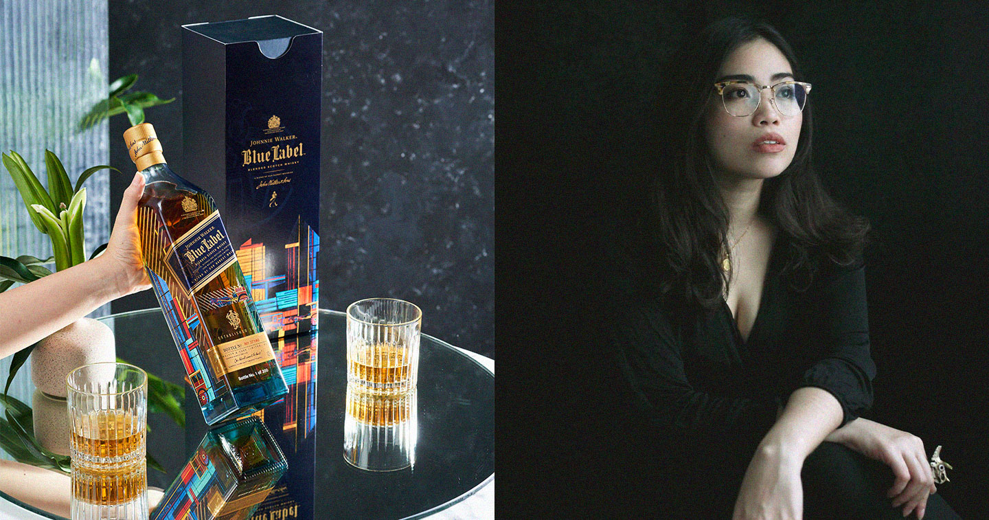
MANILA, PHILIPPINES — In its desire to pay homage to the Philippines, Scotch whisky brand Johnnie Walker tells the visual story of the country’s limitless treasures through artistic collaboration with Young Gun Awardee and acclaimed illustrator Raxenne Maniquiz.
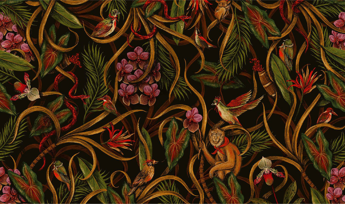
Often inspired by her surroundings, Raxenne is a widely celebrated artist whose work typically depicts images of flora and fauna, mostly the kind endemic to the Philippines, drawn with deep, painterly strokes and brilliant contrasts. These finely textured illustrations appear in brand campaigns, product packaging, apparel design, stationery, and published materials.
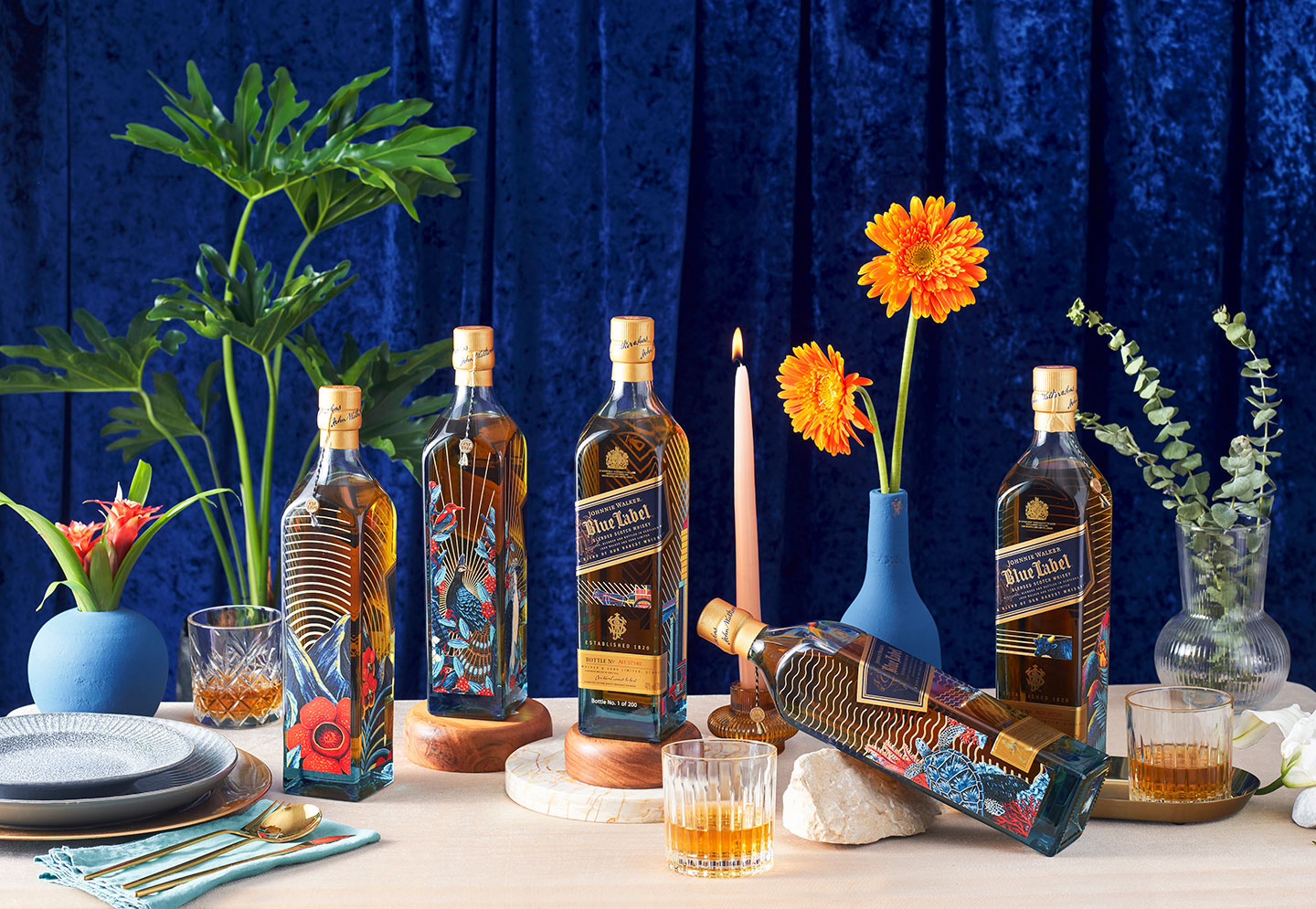
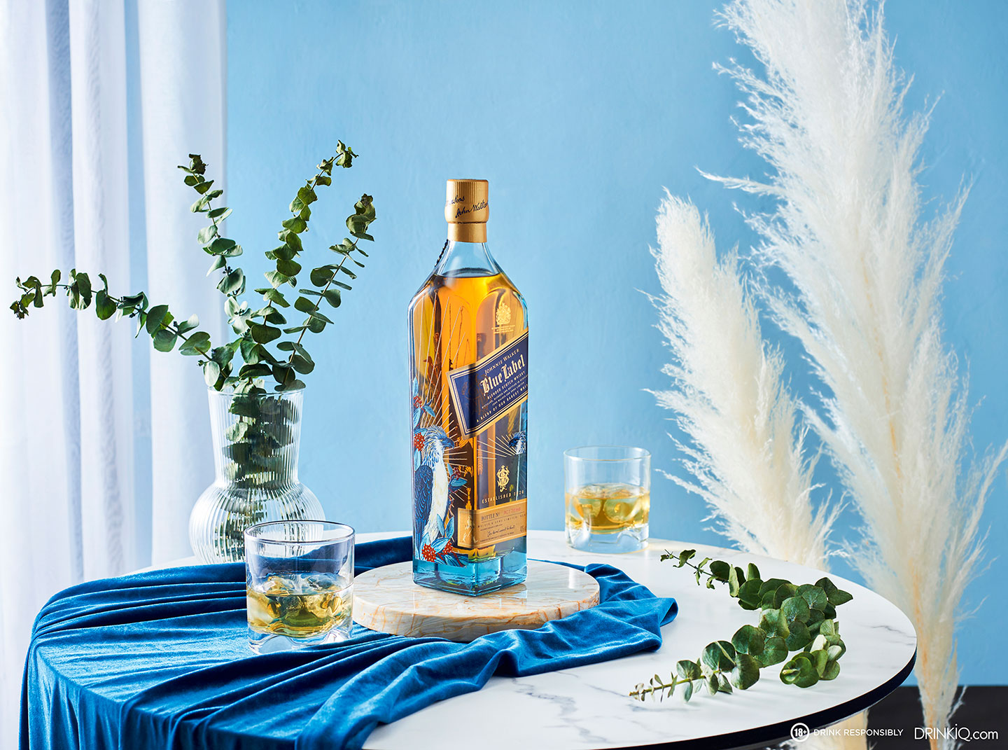
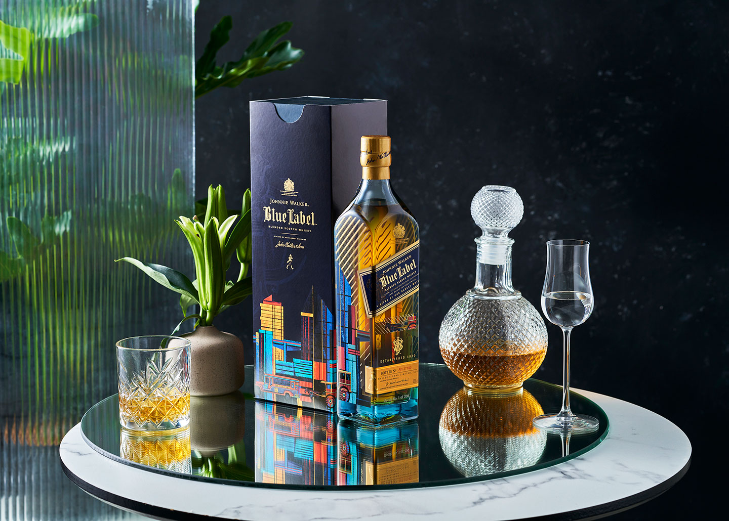
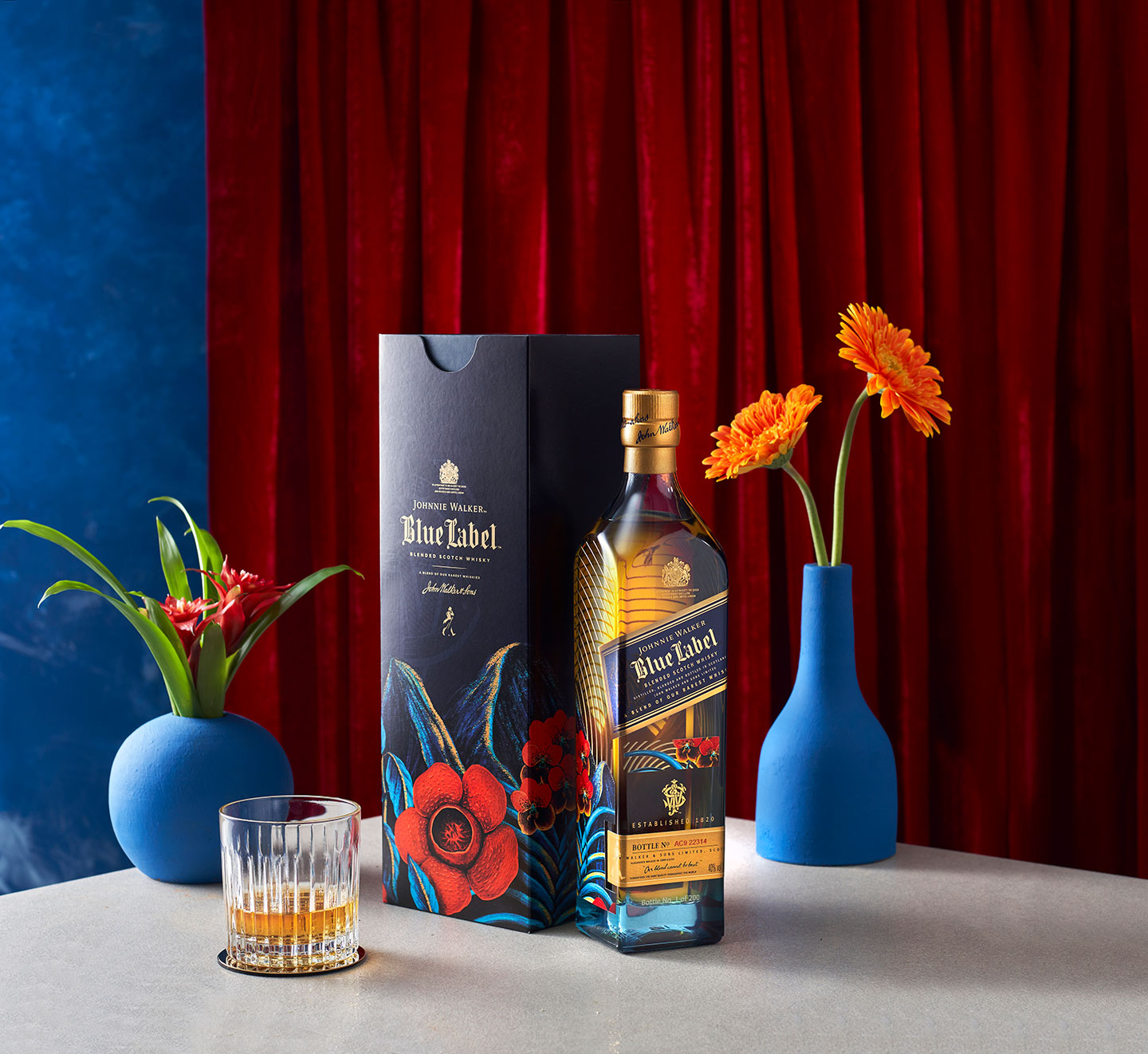
Her work for Johnnie Walker’s luxury artists collection, “Elements of Blue,” centers around Raxenne’s creative interpretation of five elements (air, earth, fire, water, and metal) that unify her work in the brand’s latest artist series. Lending a communicative dimension of her art to the Johnnie Walker Blue packaging, Raxenne beautifully explores and vividly showcases the natural beauty and landmarks of the Philippine archipelago through five unique designs.
In an exclusive interview, adobo Magazine sat down with Raxenne to talk about how she used her signature style to bring to life the Philippines’ beauty and diversity in this artistic collaboration with Johnnie Walker.
adobo: Hi Raxenne! Congratulations on your work with Johnnie Walker Blue. How did this collaboration come to life?
Raxenne: I am known for drawing Philippine flora and fauna. The Johnnie Walker team wanted to explore that idea and bring it to life in their new Luxury Artist Series.
What was your goal for this project and how did you bring the brand’s story to life?
We have one of the richest biodiversities in the world which I wanted to highlight in this collection. I looked for species that can represent each element. For AIR, you have our endemic birds like the iconic Philippine Eagle. EARTH recognizes our Philippine fields with scenes such as the Chocolate Hills and Banaue rice terraces. FIRE features the richest reds our country has to offer such as the Rafflesia. METAL is different in that it celebrates our built heritage and cityscapes. WATER takes us under the sea, featuring known Philippine marine life like the pawikan and taklobo.
Speaking of “Metal,” we noticed that this artistic collaboration sits a little bit outside of what you usually draw, which is flora and fauna.
I wanted to showcase Philippine icons and of course, that includes jeepney and kalesa. It’s a nice contrast to the rest of the designs.
Let’s talk about your creative process for this collaboration. Particularly, how did you initially interpret the theme (Elements of Blue), and how did you arrive at the final design?
My creative process always starts with sketching my ideas on paper. That way, it’s easier to explore ideas. For this project, I sketched concepts inspired by the Philippines. When I was creating the designs, I thought of creating a whole picture, like a continuous landscape where you can see different Philippine icons. The colors are inspired by our Philippine flag. Rich reds, cool shades of blues, and bright golden yellows paint a rich scenery.
What’s something unique or fun that you discovered throughout your creative process for this?
It’s a different experience designing for bottles. It’s amazing to see my work translated into different surfaces. These bottles are a first.
How do you want people to interpret your design/artwork in this collaboration?
I combined elements that are uniquely Filipino: from recognizable icons like the jeepney, to the rare flower like the Rafflesia. I wanted people to feel how diverse and beautiful our country is.
In three words, this collaboration is lush, vivid, and intricate.
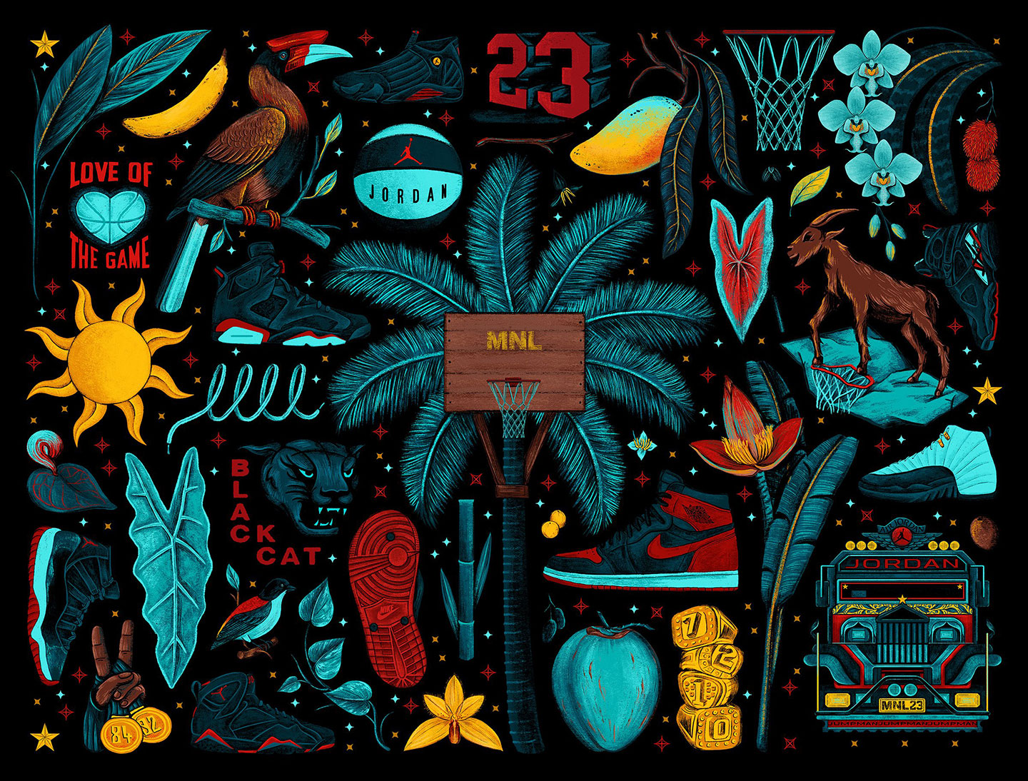
Thanks, Raxenne! As a seasoned artist, you have worked with a lot of very big brands like Johnnie Walker, MAC, Nike/Jordan Manila, and Uniqlo. What do you think is key to a successful brand collaboration and what advice would you give to artists who aim to work with these kinds of brands?
The key is understanding the brand and figuring out how your own artistic vision factors into the whole picture. You also have to remember the brand came to you for a reason, and you have the power to interpret the project the best way you can.