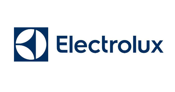
STOCKHOLM – Electrolux introduced a new visual identity for the company brand. Refreshing the iconic logotype and setting new distinctive standards for imagery and colors, the design is created to have more stopping power and stand out from the crowd wherever consumers meet Electrolux.
“Electrolux is on a journey to become a world-class consumer marketing company, with a clear focus on consumer driven innovation and strong brands. A key ingredient of this is to create an exciting and differentiating brand experience that is consistent across every consumer touch point. Our new visual identity will help us achieve that, in a digital and retail landscape that has changed dramatically over the past years,” said MaryKay Kopf, Chief Marketing Officer of the Electrolux Group.
The new logotype introduces the company name in a new font, exclusive for Electrolux, and puts greater emphasis on Electrolux’s timeless symbol, first used in 1962. “With such a distinctive symbol at the forefront, it communicates modern and innovative while maintaining the associations of trust and quality that consumers have come to expect from our brand,” MaryKay Kopf said.
“A visual identity is much more than a change of logo and color palette. It represents a new sense of Electrolux as a brand, what we and our products and services stand for and how we want to be perceived,” MaryKay Kopf said. “The new visual identity will build greater recognition by engaging people in a positive and emotional way; helping to inspire them, identify key benefits and find what they are looking for.”
The new visual identity will be seen everywhere where consumers meet Electrolux – in-store, online, on packaging and through mobile devices. The roll-out will happen in phases as from January 14, 2015.