Words by Nadz Ruiz
Homegrown graphic design studio and lifestyle and clothing brand Team Manila has become one of the premier design outfits in the Philippines. The brand was first popularly known for its clothes and accessories that showcase Filipino culture and pop culture, places, history, and most of all, Pinoy pride. Yet, Team Manila’s founders also established a graphic design studio which partner with many different brands, businesses, individuals, and institutions in the country to work on different design projects and products.
While Team Manila is now known to be one of the frontrunners and flag-bearers of Filipino design, co- founder Jowee Alviar owes their work to the country’s rich history of graphic design. Philippine graphic design styles of today are heavily influenced by American and western styles, Spanish history, Asian and Japanese culture, and other foreign styles. Alviar wanted to dig deeper to know what Filipino design really is.
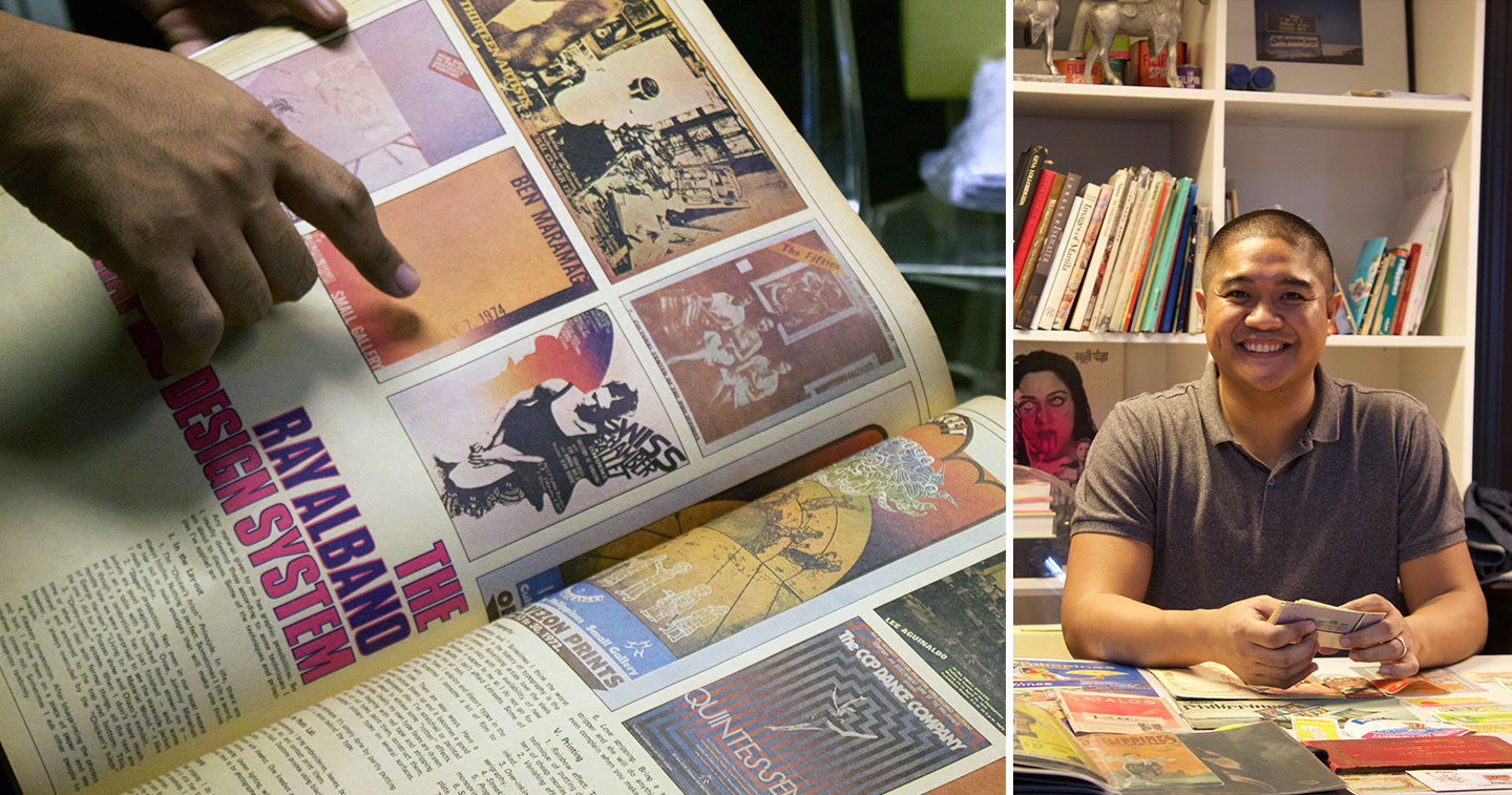
Alviar said we need to know our history. What are the images in our history that came from the Philippines or talks about the Philippines?” During his stay in California Institute of the Arts or CalArts, one of the top art schools in the world, Alviar undertook a research study on Philippine imagery to further understand where Filipino design came from and how it evolved through the centuries.
Alviar started his research looking at the Pintados and the pre-colonial Filipinos’ craftsmanship of gold jewelry. The Baybayin which came from Sanskrit, an Eastern form of lettering, is an early form of design, which today can be thought of as typography. The famous copper plate of Laguna bears the Baybayin script, one of the few artifacts and proofs of this form of writing that survived time and the elements.
When the Spaniards came and spread Christianity, the people whom they reached also changed the way they designed their patterns. The early Filipinos created patterns with symbols of the sun, spirit animals like the bayawak, snakes, frogs, and other pagan icons. With the Spanish influence, these patterns became crosses, diamonds, and other geometric shapes.
Yet, some of these early patterns and designs still exist today. According to Alviar, mountain tribes such as the Bontoc were able to preserve their culture and icons, because the Spanish missionaries found it hard to reach their location.
Event the Katipunan, the secret revolutionary group that sought independence from the Spaniards, also made use of iconography inspired by Freemasonry symbols.
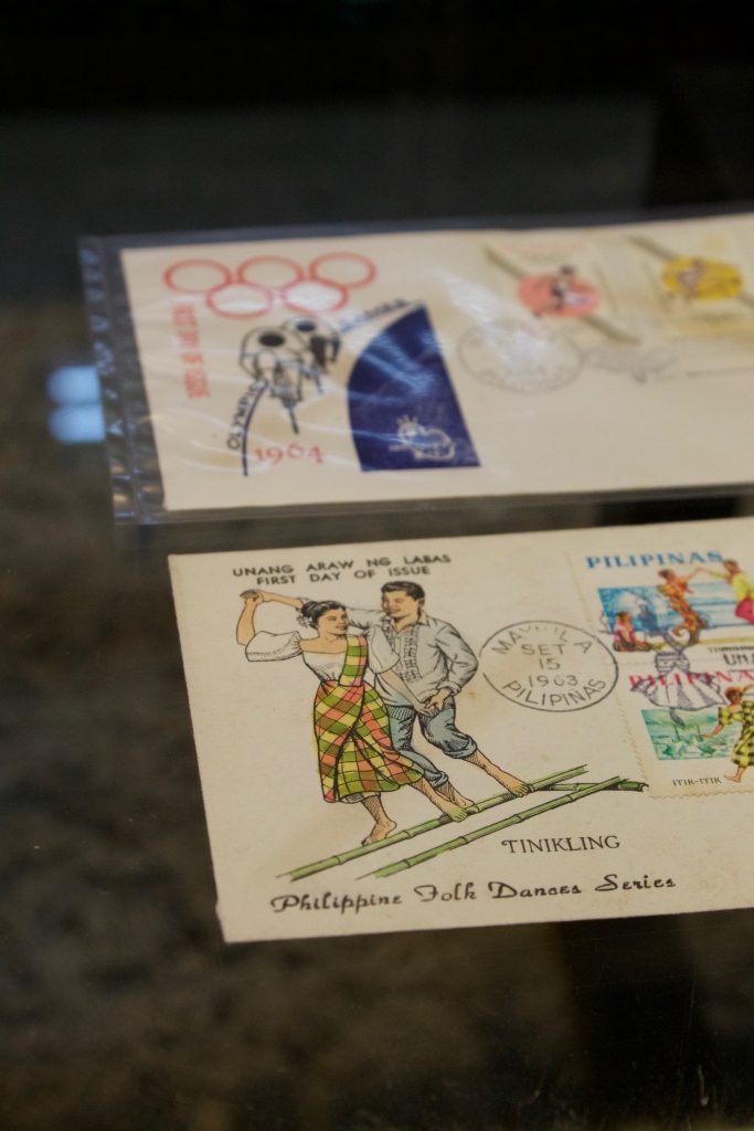
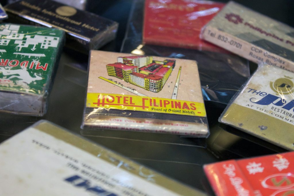
Fast forward into the turn of the 19th century, Alviar looked into how companies and businesses created and designed the packaging of their products. He said that these designs also heavily influenced contemporary and modern Filipino graphic design. Cigarette manufacturers La Campana, Balita, Tatlong Diwata, and Kayamanan used illustrations of nature and even the image of hero Jose Rizal. In fact, many Filipino businesses have used Rizal’s image in their packaging. Other products like Katialis and match boxes produced packaging that depicted culture and life in the provinces with illustrations of carabaos, farmers, fields, fiestas, and tinikling dancers. Alviar observed that these designs were a mix of typography and patterns influenced by European styles. Yet, their content meaning is uniquely Filipino.
Promotional materials to events were already prevalent in the early 1900s. During the World Exposition Fair at St. Louis which was meant to showcase the “cultures” of different countries, Americans brought Filipino natives with native huts and materials. The promotional brochures depicted Filipinos as dark-skinned savages. In the Philippines, the Manila Carnival, an early beauty pageant show used posters to promote the different competing provinces and their pavilions, queens, and other elements they are known for. Theaters in the old district of Manila like the Manila Grand Opera House loved creating posters with loud typography, layouts, and design elements.
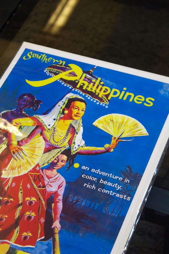
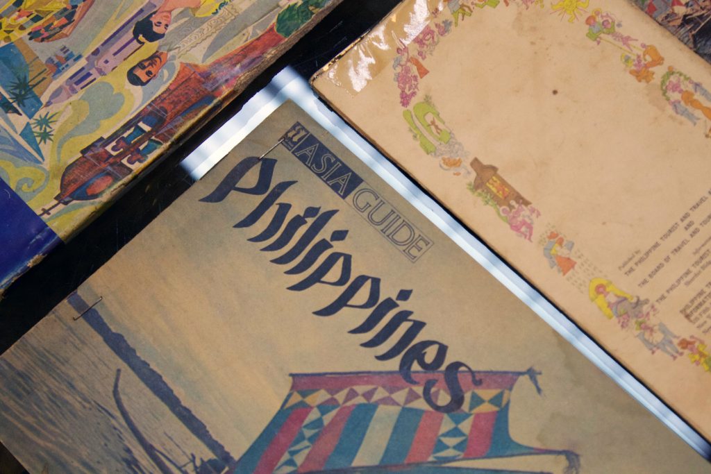
In the 1920s, as air and sea travel has become more accessible, there also sprung travel and tourism promotional materials. Travel brochures by airlines and hotels showcased beautiful illustrations of Philippine sceneries and landmarks.
“These are the things that we seldom see, but this is part of our continuous creation of visuals talking about the Philippines,” Alviar enthused.
He also noticed a certain typeface that was consistent with Philippine cultural materials. “This is a Sulu-like (font) with shapes of Sarimanok that we see in different materials,” he stressed.
After the war, National Artists like Fernando Amorsolo and Malang started out as illustrators for magazines. Amorsolo did illustrations and covers for Liwayway Magazine. He even created satirical comic strips with writer Lope K. Santos. On the other hand, Malang was an illustrator who loved drawing the streets of Manila.
Alviar further went on to stress that Philippine art is everywhere, even along Manila streets. Aside from the Art Deco architecture seen along Avenida Rizal and Escolta, Quiapo is full of hand drawn movie poster billboards, signages of tarot card readings, and shirts with drawings of anting-antings. These are all part of the Filipino narrative, said Alviar.
The Philippines even with its many influences, has its own history and brand of graphic design. Alviar has high hopes for the young generation of Filipino graphic designers today. “Hopefully we turn this to something we can pass on to our students. Hopefully there will be more materials talking about the rich history of graphic designs,” he said.
This article first appeared in the 75th issue of adobo magazine: The Mobile Issue