
SHANGHAI, CHINA — WPP global design agency Design Bridge and Partners has partnered with Kungfu Pu’er Tea, a producer of fine tea in Yunnan, to refresh its brand positioning, identity, and packaging design system. The new brand repositions Kungfu Pu’er as a wellness lifestyle brand, “made for urban knights,” created to rejuvenate the body and mind of a new generation of tea drinkers.
Kungfu Pu’er is produced in Yunnan province, using a traditional production method of the Ancient Tea Horse Road, or “Chamagudao,” a tea trade route that followed through China’s Sichuan Province to Tibet for over 1,300 years.
Design Bridge and Partners worked closely with Kungfu Pu’er tea makers, to create a brand that connects contemporary audiences with the ancient tea-drinking tradition. The brand celebrates the notion of tea as the “antidote” to the overwhelming, fast-paced lifestyle of modern society. The functional attributes of refreshing the body and mind are rich in the emotional value of joyful spirit, positioning tea as a bridge for consumers to explore their own hearts, and to live their lives with meaning.
With the brand statement, “drink with the world and live a transparent heart”, the visual identity is inspired by the spirit of Chinese martial artists, Kung Fu warriors, a symbol of living life with a pure heart dedicated to others.
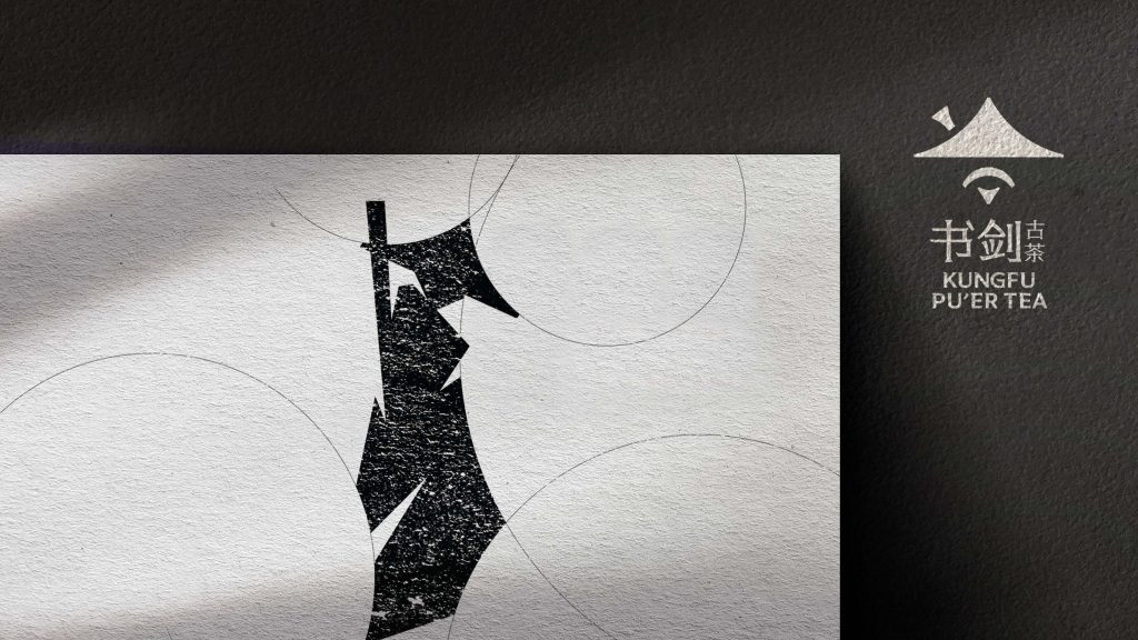
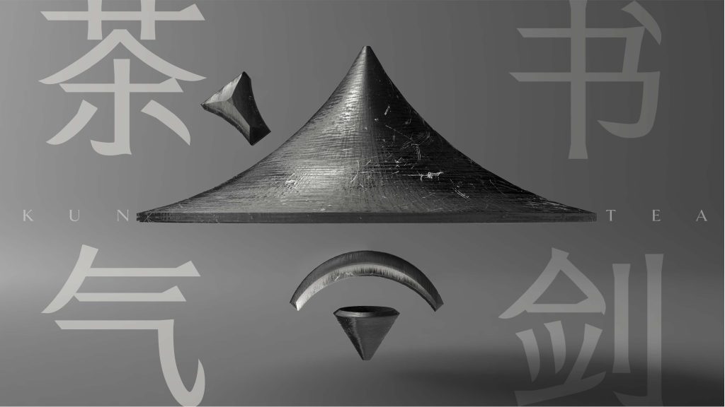
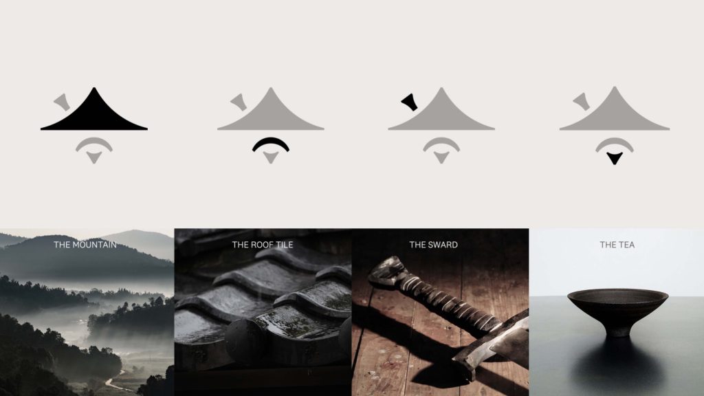
The distinctive swordsman logo of Kungfu Pu’er tea has evolved from the traditional Chinese Wuxia knight to a contemporary marque, a symbol of Kungfu Pu’er tea as “a drink made for urban knights.” Each element of the marque evokes the story of the traveling knight: the “bowa” curve of Diaojiaolou, the line of a Shujian teacup, the tip of the sword, and the shape of the sky, protecting the knight on his journey.
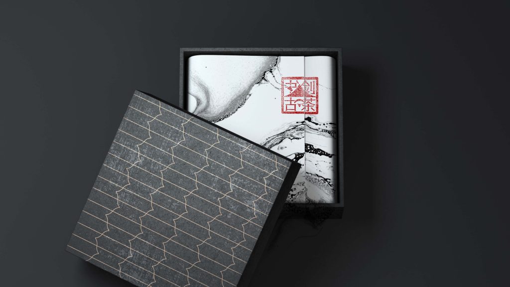
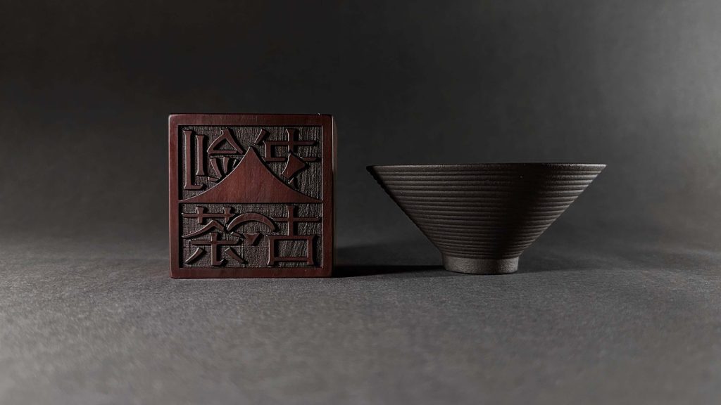
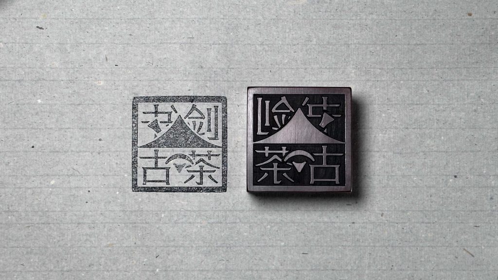
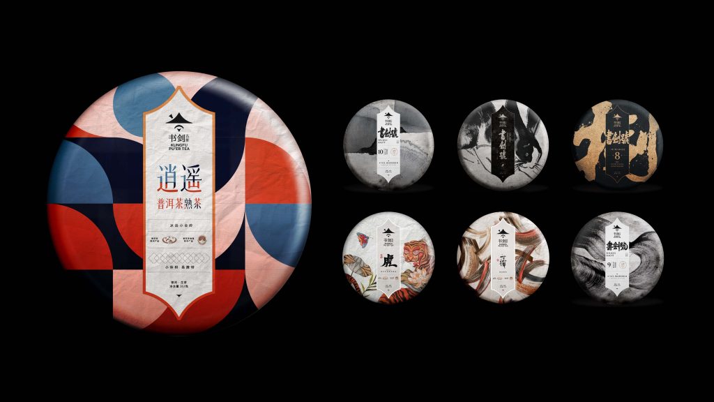
The visual language for packaging and communications is formed as an artistic reinterpretation of Chinese traditional watercolor paintings, calligraphy, sculpture, rice paper and seal carving textures, reaffirming the spirit of ancient Wuxia knights and tea culture in the brand expression. The signature pattern is designed in the shape of an ancient sword and applied to packaging, brand merchandise, and gifting. The color palette draws on traditional tones – in ink, red, gold, and black, with black and white photography evoking the ancient Tea Horse Road landscapes.
Kungfu Pu’er’s new identity will be adopted across communications and sales channels. Products with the new look and packaging are now on sale in TMall and JDMall stores.
Find out more about Kungfu Pu’er tea here: http://www.shujianhao.com/Home/#/
Credits:
Ray Lan – Executive Creative Director
Aaron Zhang – Senior Designer
Linxuan Lyu – Senior Designer
Aimee Liu – Managing Client Director
Iris Qi – Client Director
Ceres Gu – Senior Client Executive
Chuhan Wang – Client Manager
Denis Deng – Senior Strategist