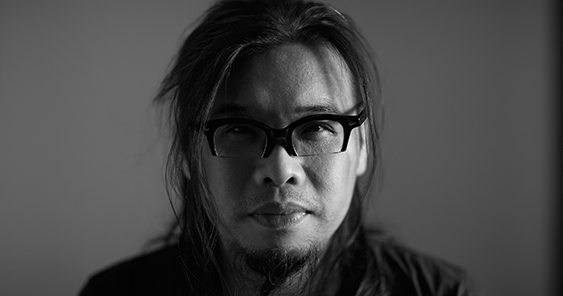
Pann Lim is the Co-Founder and Creative Director of Kinetic Singapore, K+, Holycrap.sg and Rubbish Famzine. He is addicted to design, advertising and communications and strongly believes that creating work without an idea is a sin.
This belief has earned him over 450 industry awards locally and abroad, including Singapore’s highest design accolade — the President’s Design Award in 2013 and 2015, Gold Pencils at the New York One Show, Cannes Lions and a Yellow Pencil at the 2016 D&AD. Through his career, Pann has been invited to judge at numerous award shows from the Singapore Creative Circle Awards (The Gong Show), the Effie Awards, Malaysia Kancil Awards, Miami Clio Awards, Webby Awards and British D&AD Awards. In 2016, Pann had the honor of chairing The Gong Show. Most recently, he has been named the Crafts for Design Jury President in the 2017 D&AD Awards.
Pann strongly believes in nurturing fledglings and sharing his passion for creativity. He is a founding member of The Design Society and a frequent guest at Singapore’s design schools. Pann was also an adjunct lecturer at Temasek Polytechnic from 2012 to 2013.
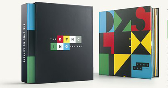
Wood Pencil / Book Design / Children_s & Young Adult Books / 2017
Agency: McCann World Group, Mumbai
Client: Maharashtra Dyslexia Association
“I really love the intention and thought put into The Dancing Letters. It is a book designed for dyslexia kids and every alphabet/letter that have effects on the reading disorder is clearly demonstrated in a ‘fun’ and intuitive way. I managed to judge this piece of work at both Adfest and D&AD and the reactions from the two differing jury panels were both the same. Both panels were torn between a thoughtful idea vs the average design execution outcome. In my opinion, the design direction and typography execution could have be done better so as to fully justify the effort, research and paper engineering put into making the book. Whether it wins an award or not, this book was really designed for a good cause, so winning becomes a bonus.”
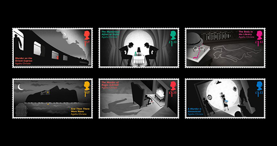
Yellow Pencil / Crafts for Design / Illustration for Design / 2017
Agency: Royal Mail Stamps & Collectibles
Client: Royal Mail Stamps & Collectibles
“Beautifully executed stamps to mark the centenary of Agatha Christie’s first crime novel and her 40th death anniversary. Brilliant thinking to use the act of investigation to uncover all the hidden visual clues using techniques like thermal ink, UV varnish and micro text that could only be read using a magnifying glass. The photos online of this project does not do justice as it was such a great experience discovering the clues using a magnifying glass (that came together with this special collector’s edition), when touching the stamps, the heat from your fingers revealed more clues (thermal ink). While it was beautifully and flawlessly illustrated, I am torn whether it was a D&AD yellow pencil winner because the illustration technique is not groundbreaking nor fresh since it was submitted under the category crafts for design / illustration.”
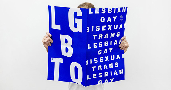
Graphite Pencil / Graphic Design / Annual Reports / 2017
Agency: Design Army
Client: Human Rights Campaign
“Not sure whether my opinion is biased but I have always loved projects designed beautifully using one color. Another love of mine is bold typography set against a strong colour. Annual reports are usually perceived as boring ‘publications’ but in this case, designed to be read in a newsy ‘broadsheet’ style, it brings to mind that the topic on LGBT should be made more aware because I do believe love is love.”
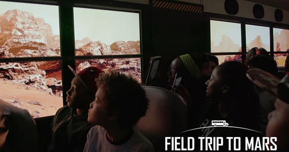
Yellow Pencil / Digital Design / Digital Installations / 2017
Agency: McCann New York
Client: Lockheed Mars
“This project never fails to put a smile on my face. I am a huge advocate for anything relating to education and I fell in love with this idea because I can imagine the impact it had on the kids. I have watched the case film since it was launched and months later, watching it again still makes me jealous. There are many case videos out there that over dramatized the promise with visual effects, clever edits, attractive motion design and emotive music but I know for sure that this ‘Field Trip To Mars’ school bus is definitely a magical ride with or without a case video. While the idea might look simple, it is packed with awesome relevant tech stuff. Here are the specs lifted off their writeup online ‘The bus was gutted and equipped with custom electric glass that switched from transparent to opaque, plus 4K transparent LCDs, while preserving its school bus appearance. Integrating our Mars landscape, custom screens, GPS, accelerometer, magnetometer and laser velocimeter, the bus became a VR headset. When it moved, Mars moved and when it turned, it turned on Mars.’ Wow cool!”
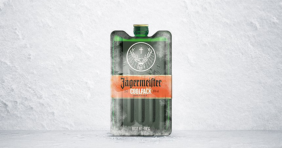
Yellow Pencil / Packaging Design / Consumer Packaging Design / 2017
Agency: Cheil Germany GmbH
Client: Mast-Jägermeister SE
“Not many Jägermeister drinkers knows that this herbal liqueur taste best when served very cold at -18°C. To make this fact known, it was appropriated through the design change from its original bottle shape to a ‘CoolPack’ form and I think it is just brilliant. Even though the coolpack bottle is very iconic and recognizable, Jägermeister still managed to keep its identity through the clever use of their strong brand elements like their word mark, glowing christian cross and stag horn sitting on the signature green glass bottle. And you know a design is successful when you have the desire to keep the packaging after consuming the contents.”
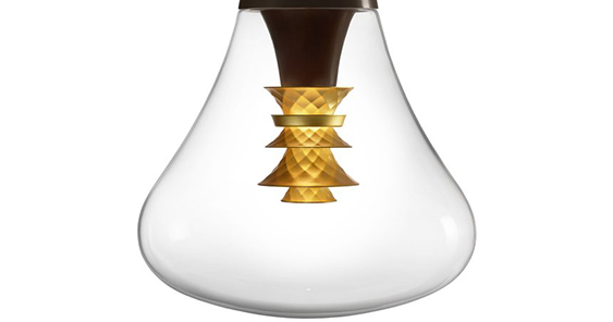
Graphite Pencil / Product Design / Consumer Product Design / 2017
Agency: Plumen
Client: Plumen
“I was a huge fan of Plumen 001, not a fan of Plumen 002 and I have never seen Plumen 003 other than all the images online. If I have to talk about how it looks as a product, the design is really beautiful, elegant and alluring. However I cannot give comments on my experience using the bulb because it will only be launch commercially sometime late august this year. This write up I found online painted quite a convincing picture for me, for a while I believed I could turn into a moth. ‘This new, patented format of LED bulb gives you two lights in one. A bright downward spotlight serves to illuminate a task, whether you’re working, reading, writing or eating. Simultaneously, the crafted gold elements at the centre of the bulb reflect the warmed light outwards, illuminating faces around with a flattering glow. Each metallic part was carefully faceted by a jeweler, bringing the light to life and making the bulb sparkle like a gem. I cannot wait to purchase one when it’s available.”
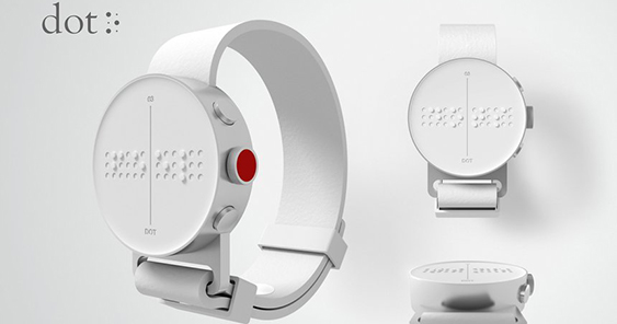
DOT. The first Braille Smartwatch
Black Pencil / Digital Design / Technological Innovation / 2017
Agency Serviceplan/Serviceplan Korea
Client Dot Incorporation
“I have seen the case video before judging this product. Yes, the video was touching and well made, it connected to me, it made a strong point that this product was made with one thing in mind, to assist and raise the quality of living for the visually impaired at an affordable cost. I won’t deny that my initial skepticism was that this is just another well produced case video with a ‘prototype’ soon to be made real and created in the name for the advancement of mankind type of submission. During the judging for D&AD Black Pencil, the room was filled with all the Yellow pencil winners (Design category), all the jury presidents went round inspecting every single winner and I must say this project stood out for many reasons. It was not a prototype, it felt good, materials used on the product feels authentic (lightweight anodized aluminum casing with soft leather strap), it felt real (after judging and looking at many unconvincing prototypes this year) and it was simply mind blowing to see the little dimensional braille dots pop in and out of the 12 by 3 grid on the watch face while creating a nice soft soothing clicking sound. I really love what this project stood for, it’s about creating a cool product that has a deeper purpose which will advance the life of the blind. And if I have to nitpick, I have huge issues with the charging dock, the watch totally does not seat well on it and that is definitely something worth updating because so much work have gone into it, it does not make sense to not perfect that whole experience. Think Apple.”
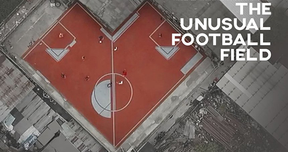
The Unusual Football Field Project
Wood Pencil / Spatial & Experiential Design / Design for Public Spaces / 2017
Agency CJ WORX
Client AP THAILAND
“When I first judged this piece of work in Adfest, some remarks from other jury members included ‘Why not develop that odd shape piece of unused land into a park, why not make it into a public gym area.’ But I know making it into a park or gym (while intentions are still good) will not have the same mileage and media impact as creating an unconventional football court out of plots of unusable land due to its shape and size. By taking advantage of the disadvantaged odd land shapes and repurposing it makes this project very fresh and charming in my opinion. Moreover, it checks all the tick boxes for creating a better environment. From the case video, dirty areas infested with stagnant water are cleaned up and made way for these unusual football courts. This football courts encourages positive social activities and created a new way of playing football as there are now more than four corners. It’s no surprise why TIME magazine named it the 25 best innovations of 2016.”