SINGAPORE – The merger of Mullen and Lowe partners earlier in 2015 has come full circle. Now known as MullenLowe Group, the global network recently revealed it’s new brand identity.
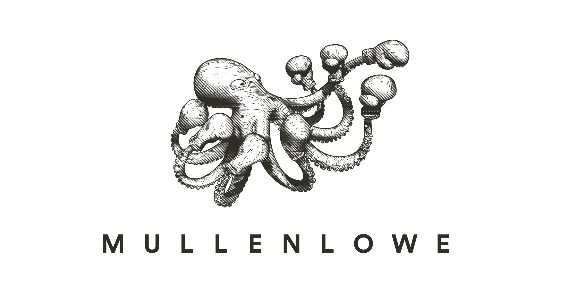
Designed in-house, the logo retains the sans serif typeface that spells out MullenLowe but the space between Mullen and Lowe has been omitted. A marque developed by MullenLowe Brazil was added that will be known from this day on as the “Challenger Octopus.”
“The new ‘Challenger Octopus’ brand identity perfectly embodies the positioning of MullenLowe Group, as a creative company with a challenger attitude that is willing to take risks, and underscores a key competitive advantage of our network with our hyperbundled offering,” explained Jose Miguel Sokoloff, President of Mullen Lowe Group Global Creative Council.
The new identity will have four variants to represent MullenLowe’s main brands:
MullenLowe, delivering integrated marketing communications solutions (pictured above);

MullenLowe Profero, the digital pure-play network;

MullenLowe Mediahub, providing media planning and buying solutions;

MullenLowe Open, offering behavior driven activation and shopper marketing.
“The creation of MullenLowe Group has given us the opportunity to create a whole new type of global communications network. A network not defined by silos. A network with integrated communications planning built into the model. A network where we bring together the best cross section of our talent across all disciplines to work on client business challenges and drive more creativity,” said Alex Leikikh, Global CEO, MullenLowe Group.
Starting this year, all agencies that are still carrying the Lowe name will be known as MullenLowe across the 90 offices in over 65 markets globally.