MANILA, PHILIPPINES – To double down on the values that its founders have started the agency on, DDB introduces a new design that captures the essence of their identity as agency: creativity and humanity.
The use of the agency’s full name, Doyle Dane Bernbach, within the mark, was a deliberate decision, says DDB’s Regional Marketing Manager, Marie Green. She continues that to this day, Bill Bernbach remains one of the most creative and impactful people ever to work in the advertising industry. His thinking, his ideas, and his words colour the agency’s presentations, halls and most importantly, the work DDB produces.
Green talks to adobo magazine about the agency’s rebranding and it being an outward symbol of their thinking, their work, and their people. She describes the evolution of DDB’s visual identity as a timeless and timely update for one of advertising’s most enduring and celebrated brands.
Why was now the right time to make this change to DDB’s visual identity?
Marie Green: In line with much of the new positioning work underway for the global network, it was a natural time to reflect on the visual identity to ensure it accurately captured this exciting moment for the agency network.
When will the changes/full rebrand be complete? What will come first, what will come last?
MG: This is a rolling change and each market will customize it to their local market needs.
What inspired this change?
MG: We believe storied and iconic great brands have a foot in their past and a foot in the future. We are the fortunate inheritors of an incredible 70-year legacy of Doyle Dane Bernbach. This visual identity system celebrates our heritage and legacy while positioning us for the future.
Will there be any additional changes that will be rolled out along with the new visual identity?
MG: All channels will be evolved over time. Digital channels will be faster than fixed and static channels. But all will evolve over time.
Why visual identity rather than logo?
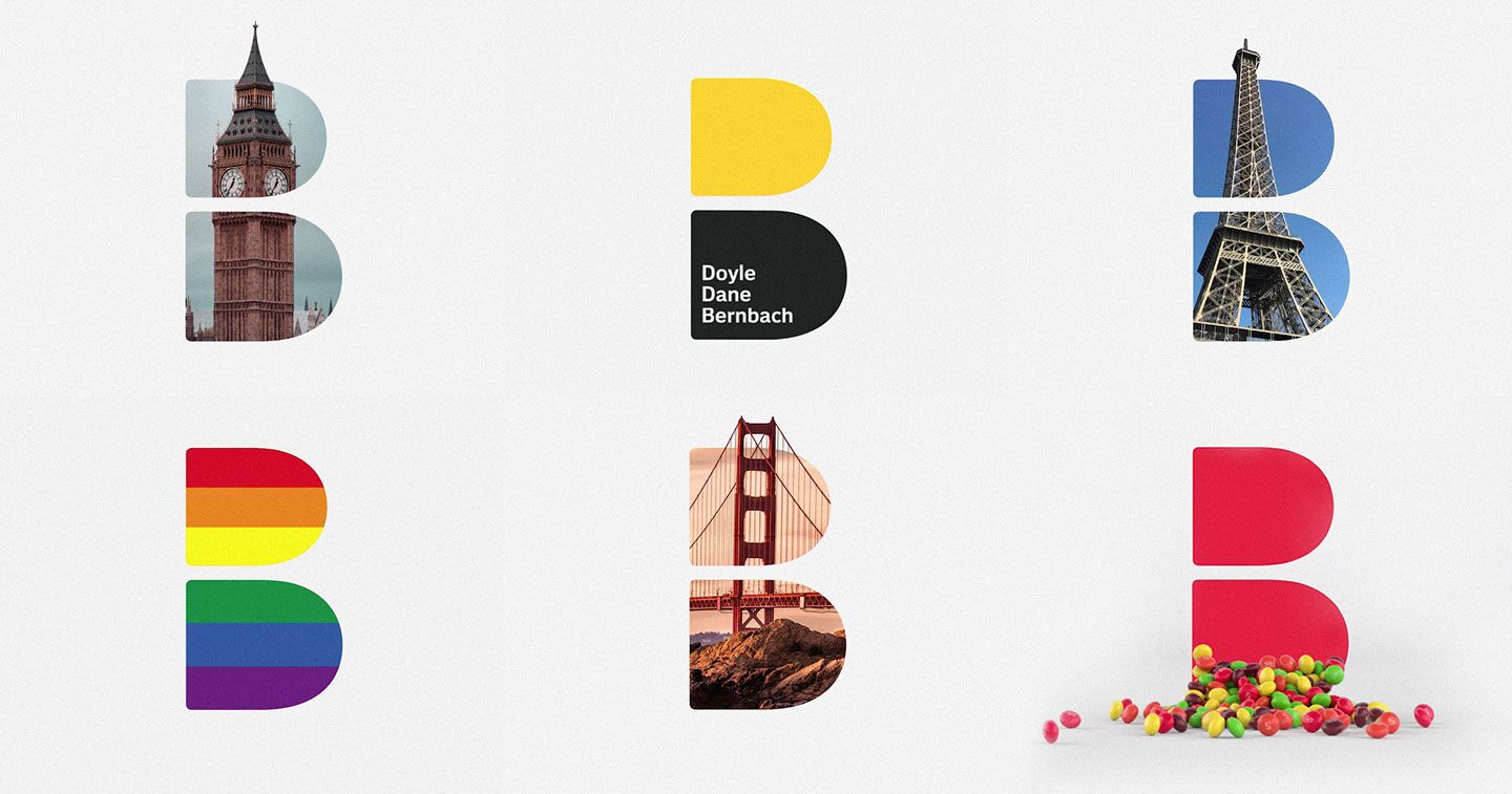
MG: The redesign does include a new mark, but it goes far beyond that. Included in our visual identity is a new, exclusively-licensed font, refreshed color palette, and a return to the full name of the agency in our operations and external assets – Doyle Dane Bernbach.
How long has this transformation been in the works?
MG: We’ve been working on our evolved positioning and identity for the past 6 months.
How many iterations of the logo were discussed before landing on the final?
MG: We completed a full brand exploration and design process. This mark rose to the top because it was the best representation of where we’ve been and where we’re going.
Who oversaw the development of this new visual identity?
MG: Ari Weiss, CCO of DDB North America and Barry Quinn, Chief Design Officer of DDB North America
How did the DDB team react to the change? Any feedback?
MG: We revealed it internally this week. Our talented people are our most important audience and wanted them to see it first. Early feedback has been very positive and agencies are already underway in their implementation plans.
What are your clients’ feedback?
MG: Our clients will see our brand evolution as we implement it across our agencies.
Is there meaning behind the use of the other colors? What’s the meaning behind the design?
MG: Inspired by the simplicity and creativity of the original mark, the new visual identity for DDB is a contemporary interpretation of the very essence of our agency. Including our founders names – Doyle Dane Bernbach – in our visual identity focuses on the humanity of our company (the letters are people!), while the distinct B shape of the mark deliberately celebrates the creativity of Bill Bernbach and his enduring impact on the agency.
How do you think the public and industry at large will react to the rebrand?
MG: Our visual identity is a celebration of our people and our work, we believe the 11,000+ DDBers around the world feel proud and excited.
What was the creative process like?
MG: Like most Identity projects we developed a strategy and audited the utility of the brand elements. We examined the agency’s history and where it was going. The design team worked closely with the agency leaders across the world to understand the agency’s position in local markets.
Highlighting the creativity and interconnectivity of the worldwide DDB team, the evolved logo was created internally by the DDB North America design team – serving as a great example of the agency’s design capabilities.
“Great brands have a foot in their past and a foot in the future. This visual identity perfectly captures our heritage and legacy, the contemporary thinking and work we’re known for now, and positions us for the future we intend to claim,” said Wendy Clark, CEO, DDB Worldwide.
This change to visual identity will be implemented across all internal and external marketing materials on a rolling basis. The modernized mark serves as a frame so that each DDB office can make it their own to reflect their work, local geography, and clients.
—
About DDB Worldwide
DDB Worldwide is one of the world’s largest and most influential advertising and marketing networks. DDB has been named Agency of the Year numerous times by the Cannes International Festival of Creativity and the industry’s leading advertising publications and awards shows. The Gunn Report has listed DDB as one of the Top 3 Global Networks for 12 of the last 15 years. The agency’s clients include Volkswagen, McDonald’s, Unilever, Mars, Johnson & Johnson, and Exxon Mobil, among others.
Founded in 1949, DDB is part of the Omnicom Group (NYSE) and consists of more than 200 offices in over 100 countries with its flagship office in New York, NY.